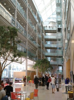
Early evenings are upon us, bringing the concomitant pleasure of looking at dusk into the lit rooms of strangers. To assuage the curiosity partial views of private places elicit we have London Open House, the scheme which allows you to get inside quite a number of the buildings that these glimpsed rooms make you wonder about. This year it fell on 17 and 18 September. Walking the streets of Bloomsbury, I crossed the paths of others in search of Open Houses, recognisable as much by their determined walk as by the green cover of the guidebook they held. It is an excellent scheme, particularly revealing in the case of buildings of the last 150 years, which often achieve their best effects in unpredictable atriums, entrances and, when function demands it, interiors of industrial proportions.
I wanted, in particular, to get inside the new headquarters of the Wellcome Trust, the Gibbs Building on the Euston Road, designed by Hopkins Architects. I pass it two or three times a week; you can look right through its width from front entrance to back door. In New York spaces like this are often public as part of a deal the developer has struck with the planners; here the us-and-them confrontation is a mild affront, like the envy-inducing view into any other desirable enclosure.
What the view from outside does not tell you is that the front-to-back look crosses an atrium which runs the length of the building and stretches up between parallel blocks of offices – ten storeys on one side, five on the other. I sat there, on a bright orange chair, drinking my coffee, eating a banana and looking up through the ficus leaves (this kind of space attracts large-scale planting), past balustraded balconies to the angled glass roof. The generous use of space, not just in the atrium but in the entrance areas and in common areas like the upstairs canteen which has a view south across London, is opulence of a modern kind – what might be expressed in gilt and marble in an older building. Here the style is a cool version of Modern which makes use of very large panes of glass, cross-braced columns, glass balustrades, glass elevators, and a modicum of stainless steel and wood. The aesthetic of early Modern architectural fantasies (in particular Mies’s early skyscraper drawings) adumbrated such things, but real buildings did not achieve details on this scale. The smaller basic window unit in a classic curtain wall of the 1950s, set in a façade dominated by pinstripe verticals in extruded aluminium or steel, is light, almost fragile in its detailing. Beside such buildings the sculptural effects of post-Corbusian concrete architecture – what was called Brutalism in Britain – showed that the historical sequence of heavy to light (Romanesque to Gothic, Baroque to Neoclassical) can equally well run from light to heavy. Only comparatively recently have buildings begun to give one the experience of a modernity which is both transparent and robust. The parts seem to be as sophisticated and highly finished as those of an aircraft or a motor car. The result, in the best work of this kind – in buildings like the Wellcome – is not an invention of individual genius, for the elements, their conjunction and the uses they are put to are part of a shared language.
The virtues of this style are not unlike those of some Neoclassical styles where expressiveness is subordinated to a syntax extrapolated from archaeological sources. In those buildings decoration was supplied as sculpture and carved or modelled detail which drew in part on the same sources as the orders that governed the proportions of the architecture. In the case of the Wellcome building a sculpture was commissioned from the Thomas Heatherwick Studio and it bears an analogously close relationship to the style of the building. Both building and sculpture are technically accomplished, coolly anonymous and assured. The sculpture consists of almost 27,000 fine, closely spaced wires stretching from the top of the atrium space to a shallow water-filled tray at the bottom. Glass balls strung on these wires, which are never quite still, are clustered to make tight falling clouds. The model was the patterns made by molten metal poured into water. The sculpture is called Bleigiessen, ‘lead guessing’, after a New Year’s Eve custom in Germany and Central Europe, where the shapes made by molten lead poured into water are used to tell fortunes. The effect of shimmering light, reflected and refracted by this great weight of glass (14 tonnes, one is told) and wire, is to make the whole construction seem insubstantial; alive, but calm.
Not every Open House door is an architecturally significant one. In an obscure back street near Tottenham Court Road it was possible to visit the Government Art Collection’s headquarters. The collection was set up in 1898, got its first curator in 1946 and now has a modest annual acquisitions fund of £200,000. It has some of the appurtenances of the reserve collection of any public gallery – racks of paintings can be slid in and out and there are facilities for framing and conservation. The difference here is that 80 per cent of the works are off site – in 10 Downing Street, British embassies and any number of less grand places. It was pointed out to us that the collection is not principally for the private delectation of ambassadors and ministers: works tend to be hung in rooms which see considerable, and quite mixed, human traffic. While they have to be careful not to send pictures of ham sandwiches to the Middle East (a real case that one), on the whole appropriate and informative decoration is the achieved aim. The William Hodges view of a mosque at Raj Mahal, for example, which is in England at the moment (it was lent to the Hodges exhibition in Greenwich), will shortly be on its way back to India. Not surprisingly, the general effect is the opposite of the ‘wonderful, but I wouldn’t want it on my wall at home’, which more significant collections can elicit. There are many small, agreeable pictures: recent purchases include a very neat, pretty oil painting of the shop of John Young and Sons, fishmongers, by the 19th-century Swiss artist Jacques-Laurent Agasse (the Queen owns his best-known picture, which is of a giraffe) and Compulsory Obsolescence, a meticulous drawing by Michael Landy in which he has copied line by line, letter by letter, documents relevant to the destruction of everything he owned (everything – his car, his passport, his father’s old jacket) during an event he set up in an empty store in Oxford Street. It was an intriguing happening, and effective, even if the moral didn’t have quite the bite it would have had if it had been a prelude to hermit-like seclusion. I don’t know where this drawing has been hung but there must be ministries in which it would have offered a talking point.
Send Letters To:
The Editor
London Review of Books,
28 Little Russell Street
London, WC1A 2HN
letters@lrb.co.uk
Please include name, address, and a telephone number.


