Dear Anna,
Here are some snapshots of Italy. Long ago, when you were still almost young enough to have a use for one, I promised you a proper picture book. Sorry I didn’t cough up; take these as a kind of apology.
You would take different pictures and see different things in them. These notes are about what I looked at and noticed. Looking and noticing are not, of course, the only reasons for making pictures. There are all sorts of makers and lookers – that is clear in the number of words we have for kinds of picture: icon, view, diagram, altarpiece, portrait, conversation piece, still life, perspective and so on and so on.
If a botanist or architect had taken the pictures she might have been noticing kinds of plant and kinds of building. I was more interested in the way the world offers itself up as a series of ready-made pictures. It does this because whatever I, or anyone else, sees is shaped by pictures which I have already seen. All makers of images borrow from each other. When people say this or that landscape is ‘picturesque’, they usually mean that it already looks like a picture to them because they remember a painter or photographer made a picture of something like it. Painting is not a language in any strict sense. The beauty of it is that it does not have to be translated, that it is simpler and more primitive than true language. But some of the ideas which come naturally when you make the comparison, in particular the notion that painting and speaking both depend on convention, seem valid. So these snaps are of bits of Italy which look like pictures or bits of pictures, and the words are about what I notice when I notice picture-like scenes.
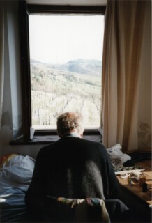
A lot of painting is done from people’s heads. This photograph is of me doing one of the other sort – pictures of subjects in front of you. Sitting looking out of the window, I was trying to make marks equivalent to what I was seeing. But I was not trying to paint exactly what I saw; you could say I was trying to find a kind of handwriting to imitate bits of it. I have noticed that people are very fond of views out of windows which show the window in the picture. I think the idea that the picture itself is a kind of window, that the view comes ready framed, is part of it.
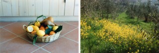
The yellow may be wild mustard; the yellow is lemons. The olive trees make a pattern; the tiles do too. These are now two of the commonest kinds of picture – landscape and still life. There was a time when people would have expected them to be about something (particularly landscapes). Now we would be surprised to find that we were supposed to think the lemons or the olives symbolised anything. The pictures are very simple, much simpler than the world. I took the fruit basket off the table so the picture would be just of it and the wall and the tiles, and I avoided getting any houses or the road or people into the landscape. This has its advantages, and lots of paintings work by making less stand for more. But getting hold of the complexity of the world, getting everything in as Bonnard, say, or Rubens sometimes seem to, is the best and most difficult game.
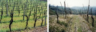
Those vines out of the window. Two ways of making complexity legible – put it in perspective or make a pattern of it. When you paint landscapes the man-made bits, like rows of vines, are ready-made patterns, created by the person who planted and pruned them. These rhythms are won at a price; the pruned, tended landscape is easier to paint because the true complexity of nature has already been simplified, often brutally so. Van Gogh had a wonderful gift in his drawings for the things in the foreground of landscapes such as grass and crops. These vines are the kind of thing you can paint with single calligraphic strokes that match the twists of the trunks.
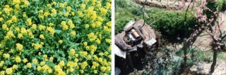
The true confusion of the world. If you don’t let your eye skid over them you will note the toothed outlines of the leaves among the yellow flowers, and the black and white cat in the shade. These are uncomposed pictures, very unlike the perspective of vines. You cannot even see what they represent unless you spend a little time peering into them. That is another thing paintings do: they control the speed and direction of the eye as it scans the field.
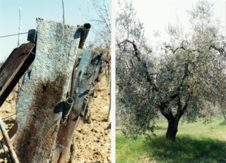
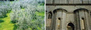
The olive trees were wonderful. The grey-green was beautiful, and even more beautiful when there was green grass to see it against; trunks, often gnarled, and huge stumps sometimes proved that young-looking trees grew on ancient roots. The post was a fine grey too. When it came to thinking about pictures they were not so different.
All pattern is regularity of some sort. Orvieto cathedral is geometrically regular. Stripes repeat; the projecting chapels are like big columns attached to the building; the real attached columns echo them. Making pictures of buildings is like building them again. You notice which parts are the same as other parts.
With the olive trees same is different. None is identical, yet all start as trunks which bifurcate and then bifurcate again into twigs and finally leaves. In some ways the structure of the twig is the same as the structure of the whole tree. A picture of olive trees which notes every leaf can be wonderful, but every leaf is not the only thing to notice.
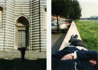
The structure of the little bench can be read. The struts stop the seat sagging and hold in the feet, which would otherwise splay out. The pieces running along under the seat make it stronger too. The visual structure of the picture is equally simple. The light is behind, and the shadow of the tiles which edge the roof make a pattern on the gravel. Could that be painted so that the existence of the roof could be guessed? And if it could, what would the effect be? Shadows have a sinister side: they tell you something is blocking the light, and aren’t clear about what that thing is. This façade could be sinister too. Or maybe it’s a joke. It reminds me of motorcycle messengers who arrive in leathers, visored helmets, and lots of zips and straps. The little bench needs its struts. This wall has nothing to do with structure. The angled stones over the doorway are not supporting an arch. The lions whose great paws project over the windows on each side seem to be doing more work than the keystones that press down on them. But the shadows are delicious; painting this kind of building you find that the hollowed out parts are dramatic in the same way that faces are when lit to look threatening in movies.
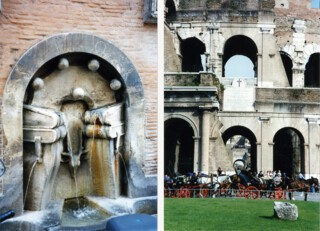
Arches. I do not know why the books are bleeding water, I do not know if it is old or new. I know SPQR says that the senate and people of Rome had something to do with it. But it says that on the manhole covers in the street too. Even when an arch is not holding anything up it feels as though it is. The tunnels through the wall of the Colosseum would still be good to draw had they been done yesterday. Walls with holes (doors, windows) are not neutral. In paintings which put architecture around scenes the space sets the tone. Red wheels are too good to miss. Adding a little bit of bright red is a famous way of catching the eye. There is a story of Turner adding a red buoy to a seascape because he thought Constable’s painting hanging next to it (of the Royal Barge, if I remember rightly) was going to steal the show.
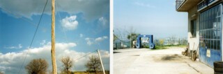
The bits which are not picturesque are more satisfying in some ways. I believe I find them for myself. But these too are partly seen through other people’s eyes. I might not have noticed and liked the blue carwash machine and the blue door if I didn’t know Hopper’s pictures of petrol pumps and old locomotives. Posts and wires, which embarrass filmmakers working in old towns, have much to be said for them. They stitch the picture together.
Composing pictures is making things look as though they have been arranged. But if they look too arranged, if they look too much like other pictures, there is no fun in it. Same with snapshots. The van and the red signs and Orvieto on the hill behind please me very much. They please me because they are not well organised. But the verticals, the way the shadows fall, the two figures – in the end these add up to something interesting. What differentiates painters of views is the views they choose. Sometimes you see guides showing people where to take the picture from, which is like having someone finish off your sentence for you. Bad manners? The step and the stones (Orvieto stripes of course) seem, as in the other picture, to be disconnected. But there they are, a kind of sampler of geometry and lithology.
Against the light. One of the things which makes the light in pictures convincing is noticing how things really look. It is hard to persuade yourself just how small a bright patch is, or how dark this area or that one is. The layers, like the flats which were used in old-fashioned stage sets, of pines, columns and so on are easy to represent. It is a cheat in a way, or feels so to people who, with justice, want the reality behind things, not what they call, again with justice, ‘mere appearance’.
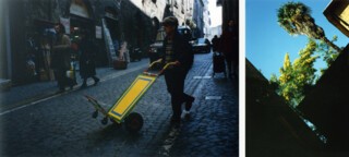
Yellow, green and blue. The sky and mimosa, the board on the barrow. Sometimes the colour is all you want. The question isn’t: ‘How difficult is it?’ Because, although it is harder than you might think to paint a canvas just yellow, or just blue, the interesting question is what happens when you look at it. Looking at the yellow board with its green and blue border I wonder if that isn’t closer to the experience of enjoying looking at the mimosa than any picture of the mimosa would be.
People. They have been about before, but these are big enough to catch your eye. They don’t look very like people in many old paintings. One of the great inventions of art was a way of putting people close together in interesting poses – in real life people do not touch each other, bend, twist, grapple in the way they do in the great Depositions, Annunciations, Crucifixions and so on. Only in photographs of sports do you get the kind of tangle which any respectable team of cherubim lay on in the sky of a Rubens allegory. People separated, being themselves, are on the whole comic rather than serious. Two people in step please me the way a chorus line, all perfectly synchronised, does. The paintings I like best take account of this; but it is partly a matter of manners. In Dutch 17th-century pictures one finds the kinds of pose K. and B. and W. show here (not to mention the policeman); in Italian pictures of the same period you usually have more operatic gestures.
Perspective and elevation. When you are some distance from a scene it crowds up, the difference in apparent size between the people close by and the people behind is less. (Look at photographs of a football match taken with a telephoto lens. The players and the crowd look much closer together than they really are.) Wide-angled perspective is dramatic. Elevation is dignified. The long wall leads your eye away. The wall behind the man in profile reading the newspaper holds him and stops the eye.
Noticing, here, that the reflection is darker than the thing reflected, and the edge of the shadow inside the pot is sharper than the edge of the white wall above it, is the beginning of representing it. But why represent these things? Maybe they look better in photographs. One thing photography did was reveal more about how things really are (how horses’ feet touch the ground and so on). They also made it possible for painters to say: ‘I won’t bother with that. It looks better in a photograph.’
Dogs. I thought it was the dog I wanted pictures of, then I found it was dog plus shadows and dog plus spots plus green grass. But I didn’t know that until I had taken the pictures. Snapshots are a way of thinking after you have seen something, otherwise you could just have a camera with no film.
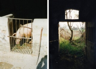
Pig inside, us outside. Us, inside, the world outside. There is no reason why pictures shouldn’t be about something. Notice that cartoonists go on being needed (think of Steve Bell) because there are some things which can only be said with pictures that are unambiguous. These pictures could be made shocking or comforting with words. The condition of the pig, the things which went on in the cellar would colour them, depending on how they were described. If they were cartoons the meaning could be put in by the way they were drawn.
And, of course you like pigs, and an open door is always a good end, suggesting that there are no ends, only pauses before the next beginning.
All the best
Peter
(Peter Campbell for Anna Fender)
Send Letters To:
The Editor
London Review of Books,
28 Little Russell Street
London, WC1A 2HN
letters@lrb.co.uk
Please include name, address, and a telephone number.

