If you go to The Cambridge Illuminations: Ten Centuries of Book Production in the Medieval West, make sure it’s not on a Sunday or a Monday. The exhibition, which runs until 11 December, is spread between the Fitzwilliam Museum (open Tuesdays to Sundays) and the University Library (open Mondays to Saturdays).
In or around 735, the year of his death, a copy of Bede’s Historia ecclesiastica gentis Anglorum was written out by a scribe in Wearmouth-Jarrow. The manuscript, which had made its way to Charlemagne’s court by the late eighth century, is now in the Cambridge University Library. There are no illustrations, only line after line of text with no word breaks, many abbreviations and many errors (missing words, wrong tenses, even wrong word order). It was, the exhibition catalogue suggests, ‘written at speed to meet some unknown deadline’.* The script, on the other hand, is masterly: fluent, rhythmical and regular.
The swift, even script of the History has a modern urgency. It is exhibited beside a Pontifical – a book listing the ceremonies only a bishop can perform – that was made in France in the early 1300s. The Pontifical, one of the most perfectly constructed and elegantly articulated manuscripts in the exhibition, uses the text as the basis for a work of art. The Jarrow scribe’s pen unreels the text character by character, line by line. The letters made by the scribe of the Pontifical are blacker, more condensed, more carefully constructed and judiciously placed. He has had time to add terminal hairlines to letters and to thicken the ends of strokes with serifs. The architecture of the page balances words and pictures with absolute assurance. The contrast between the two – between the functional and the decorative, the utilitarian and the demonstrative, the more than adequately fluent and the highly finished – is just one which the depth and breadth of the resources of the Cambridge libraries have made it possible for this single exhibition to show. The Pontifical, usefully from the point of view of manuscript studies, is unfinished: maybe the artists failed to meet a deadline. In the later pages the illustrations are left as uncoloured ink outlines; there are unfinished paintings in which it is possible to follow a sequence from first outline, through penwork, white underpainting and laying on of gold, to final colouring in.
The exhibition is arranged thematically as well as by chronology, which makes it possible to get a grasp of how the needs of public liturgy, personal devotion and scholarship shaped texts differently. Some wonders and curiosities, however, need no explanation. Gold borders dotted with insects, flowers and fruit are self-justifying embellishments; as are the creatures that take part in comic encounters (like the huge snail doing battle with a knight in the Fitzwilliam’s recently acquired 14th-century Macclesfield Psalter), or those that perch in marginal flourishes like birds in an ivy bush.
The illuminations of the 12th-century Bury Bible or the mid-12th-century manuscript of Peter Lombard’s Magna glossatura on the Psalms are equally brilliantly coloured, but stranger, less sweet, more stylised and more exciting. In these, illuminated initials articulate the work as well as decorating it, identifying layers of text, commentary, and commentary on commentary. On one page of the mid-12th-century Eadwine Psalter (a ‘Triple Psalter with Glossa ordinaria’), there are three Latin texts in parallel columns. The principal version, the Gallicanum, is written larger than the other two and has interlinear and marginal glosses. The others have interlinear translations into Old English and Anglo-Norman French respectively (these, like the glosses, written small). At the top of the page there is a large illustration in which tiny figures, all the same size, constructed with strokes as regular and repetitive as those that make up the letters of the text, do battle, look to the hand of God coming from a cloud, and hang a selection of harps on trees by the waters of Babylon. There is a homogeneity to the page which is lost when, later in the 15th century, illustrations become windows opening on scenes. In the catalogue, Paul Binski quotes ‘one of the most famous (and controversial) put-downs in the history of art’, by Erwin Panofsky: ‘It has been said that book illumination was killed by the invention of printing; but it had already begun to commit suicide by converting itself into painting. Even without Gutenberg it would have died of an overdose of perspective.’ It’s not easy to avoid the sense that a more trivial taste for the intricate and elegant has replaced something simpler and grander. Moving from case to case, I found it hard not to succumb to prejudices like those that colour my response to Gothic architecture. The Romanesque of Durham has weight, power and sobriety; invidious comparisons with over-twiddly, flamboyant French Gothic come easily. Similarly, the strength and formalised simplicity of the illustrations in the Bury Bible, which marry seamlessly with the text and initials, can become a standard with which to denigrate a pretty book of hours in which a crucifixion is surrounded by flowers, birds and a monkey. But there is so much to see here that aesthetic fastidiousness is an avoidable distraction.
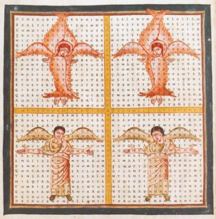
Textual engineering has its own aesthetic, and anyone who starts the day with a crossword or a Sudoku puzzle will have an inkling of the pleasure scribes must have had in orchestrating the layered meanings of manuscripts like the Triple Psalter, or in creating the ingenious form of Hraban Maur’s poem in praise of the Holy Cross, in which the text, all in capitals, is laid out in a cruciform array.
The search for antique authority joins one end of the exhibition timeline to the other. The Humanist manuscripts and illuminated printed books on show are set or written in the minuscule which scribes, looking for classical precedents, derived from the Carolingian minuscule of the oldest manuscripts they knew. And it was the written and printed alphabets developed by the Humanists (in particular the types of Nicolas Jenson) that Emery Walker, Morris and Cobden Sanderson turned to when they looked for models in the late 1900s.
Send Letters To:
The Editor
London Review of Books,
28 Little Russell Street
London, WC1A 2HN
letters@lrb.co.uk
Please include name, address, and a telephone number.


