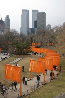
‘The Gates’, the orange portals and banners that punctuated many of the paths in Central Park from 12 to 27 February, were greeted with great delight. People were first softened up by the numbers – 7532 portals, 5290 tons of steel, 60 miles of vinyl tubing, 116,389 miles of pleated nylon, 23 miles of trails, $21 million in costs – and then worked over by all the wacky presentations by the Bulgarian-born Christo and his French-born partner Jeanne-Claude (she of the punk-red hair). Contemporary art is big, bright, expensive and eager to please, right? So maximise these qualities, involve as many people as possible (640 paid workers to assemble the gates and 340 volunteer ‘ambassadors’ to open them), and you have a winning formula. Scale of work and size of audience will trump everything else (the hero of the piece might be the head engineer), and the piece will triumph as spectacle. If the actual location of The Gates was the park, its effective site was the global media (including the souvenir market online): that is to say, its site was everywhere.
But what if we consider the piece, perversely, in terms of the old criteria of colour and line? Christo and Jeanne-Claude chose dead winter to open The Gates so that it might be seen to greatest effect. Yet the hue was off, at least to my eyes: the light orange was too close to both the bleached green of the grass and the smoky grey of the trees to make for a vivid contrast. Sometimes the banners did catch the light or the breeze to flow like veils or shimmer like kites, but often the nylon hung rather dull and limp like big tarps or giant laundry. Red would have been better, or black or white, but all these colours have political associations, and everything about The Gates was dictated by an assiduous avoidance of any such significance. It’s easy to understand why: Christo and Jeanne-Claude first petitioned to do the piece in 1979 but acquired the permit only in 2003 (their lawyers might be considered co-authors as well). Perhaps as a result, the colour, the materials, the very design are bland, stripped of any edge. It was quite a feat to set up so many gates in America today and not prompt any reference to security checks and immigration outrages. But no colour is entirely without association. ‘It’s the orange of police cones,’ my wife said as we entered the park; ‘it looks like a Princeton reunion run amok.’ Princeton’s ‘school colour’ is taken from William of Orange, and if this work were placed in Belfast, a civil war would break out; even in this city in another time The Gates might have turned into ‘The Gangs of New York’. As it was, the piece was rigorously safe, the portals too secure to be toppled, the banners too high to be touched, let alone marked with graffiti.
The Gates was also flawed as drawing, as a web of orange lines on a field of green and grey. Sixteen feet high, the portals bridged the paths laid out by Frederick Law Olmstead and Calvert Vaux and their legatees, and varied in width from six to 18 feet. Olmstead envisioned the park as a great democratic reprieve from the industrial robber-baron city, and the trails do roll and wander wondrously. But since The Gates simply followed the paths (at an average separation of 12 feet), our sense of the terrain was not much changed. In fact, as they doubled the trails, they often obscured them: along many sightlines, the banners clotted the arteries that they traced. Sometimes, seen at a distance across an open field, The Gates did resolve as lines; yet this effect ran counter to site-specific art that, at its best, seeks to challenge any easy consumption of the work as image and to promote an embodied sense of the landscape as topography. No doubt The Gates also resolved as drawing when seen from above, and certainly they offered a terrific pretext for wealthy people around the park to throw parties (some of them must also have bought the ‘preparatory drawings’ that funded the project).
I don’t want only to pee on this parade. There was generosity of spirit in The Gates, and pleasure too, and they did encourage more promenades in this great urban space. ‘For Vendors in Central Park Saffron Exhibition Proves Green’, the New York Times proclaimed, and some of the revenue from the souvenirs will go to the Park Conservancy. Nonetheless, two other problems – one artistic, one political – cannot be skirted.
Christo and Jeanne-Claude emerged with the movement called Nouveau Réalisme more than forty years ago. In different ways its artists (including Yves Klein and Arman) adapted the great devices of the prewar avant-gardes (the readymade object and the monochrome canvas were particularly important to Christo and Jeanne-Claude), but for the most part they recycled them less as anti-aesthetic critiques than as art-worldly gestures. Some early work did have political resonance: in Iron Curtain, Wall of Barrels (1962), for example, Christo and Jeanne-Claude blockaded the rue Visconti in Paris with 240 oil barrels, in a double reference to the new Berlin Wall and the old Paris barricades. But since then they have seemed content to wrap or to decorate anything – the Pont-Neuf, 11 Floridan islands, a Colorado valley, the Reichstag – as if these sites were equal in historical import and political meaning. The object was not the thing; the wrapping was – and the wrappers. In effect, they turned a semi-Situationist strategy of détournement, or the diversion of official sites to subversive ends, into a semi-touristic form of packaging. Superficially similar projects – by Hans Haacke (who has also wrapped a monument) or Daniel Buren (who also uses banners) – work to investigate artistic and other systems. The Gates, on the other hand, was an organisational feat at best, not an institutional critique.
The Gates also played into the bread-and-circus policies of Mayor Bloomberg, a patron of the project (he also bought two drawings, reportedly for $800,000). Bloomberg wants a new football stadium on the West Side, as part of New York’s bid for the 2012 Olympics, and The Gates suits his post-9/11 strain of ‘Don’t Worry Be Happy’ (otherwise known as ‘Big Business Don’t Leave’). The Gates made for friendly city politics and nice holiday aesthetics, and no one can be against sociability in the park. Yet for what exactly was this festival of the people staged? The Gates prettied up an extraordinary public place, but the fanfare was empty of social consequence: the city blocked a demonstration against the Republican Convention in the park, but gave a green light to Christo. Out of one eye, then, I saw an enjoyable mass art event; out of the other, a telling instance of high kitsch in the Bloomberg-Bush era, a cross between the Yellow Brick Road and a grand opening where the packaging was literally all.
Send Letters To:
The Editor
London Review of Books,
28 Little Russell Street
London, WC1A 2HN
letters@lrb.co.uk
Please include name, address, and a telephone number.


