The Type Archive near Stockwell in London used to be a hospital for cab horses and circus animals, but since 1992 it has been home to every sort of mould, matrix, burin, bodkin and slug. The archive holds typographical apparatus from the last six hundred years, but its main collection relates to the technology of Monotype printing. That capital letter is important: this isn’t the single-print practice of fine artists (for ‘monotypes’, see Degas) but the huge and complex letterpress hot-metal printing system created by the Monotype Corporation in the late 1800s. Along with its competitor, Linotype, it bridged the gap – or formed the continuum – between manual letterpress printing (see Gutenberg), where a compositor arranges individual characters in rows for inking, and computerised printing. In the Monotype system, the text to be printed is freshly machine-cast from molten lead. Instead of having to assemble a book or newspaper line by line, letter by letter, the typesetter could type the text into a keyboard and a machine would issue forth its metal mirror.
Making a process quicker doesn’t necessarily mean making it simpler – and forging lines of perfectly formed lead characters was already complicated. Metal type eventually loses its sharpness and bite, so moulds (matrices) were used to cast new letters and symbols (or ‘sorts’) when the old ones wore down. Monotype relied on matrices to cast new type, and these ur-characters had to be replaced from time to time, by driving a steel punch into brass. The typographic world is one of reflections and doubles. The punch is raised, the matrix depressed. At each stage the metal needs to get harder: the counterpunch, which cuts the glyphs of a letter into the punch, must be tempered steel, heated to 850°C. It’s not difficult to see why printers have often had metalworking backgrounds or why the people who cut punches had training in other precision crafts, such as gemstone carving. It required a combination of strength and accuracy scarcely imaginable today to take a piece of steel as small as an ant and cut away the extraneous material to leave, for instance, this 9.5 point letter ‘a’. Even the most experienced punchcutters could only complete one letter a day: in 1818 Anthony Bessemer testified to an anti-forgery inquiry that it took him 12 weeks to finish a set of 61 punches. And it was aching, dexterous work, six days a week. Only Sundays were free from tools, piles of sifted soot (to check the print as you worked) and tiny metal filings stuck to hands and clothes.
Punchcutting and type production were controlled by foundries, which commissioned designers to create typefaces that they then licensed to publishers. If you were a printer in 1860, say, and wanted to use a Caslon typeface for a book, you had to apply to the Caslon Foundry. The long life of foundries attests to their power over the forms that printed words have taken: the Caslon Foundry ran from 1720 to 1937, when it was sold to the Stephenson Blake Foundry. (The Type Archive now owns the Stephenson Blake collection, which has artefacts dating back to Caxton in the 1400s, though the typeface rights have long gone elsewhere – mostly to Bill Gates.) Monotype exerted a similar control and the archive has beautiful record books to prove it. Although the type is newly cast for each print run, the matrices were held by the corporation. If you wanted to get a new set or to replace damaged or missing sorts, you went to Monotype.
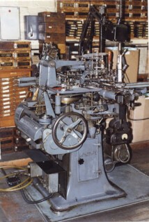
Part of what makes the Type Archive unusual is that it has machines and tools from every stage of the process: those that were owned by Monotype and those owned by the printers who used its system. One room contains the original patterns (metal templates) for different typefaces, the giant machines used for pressing the punches and the pantographs that reduce the size of the template to the desired point or pica. (The floors were long ago reinforced for the animals the building once accommodated, so can bear these many-tonned iron beasts.) Every character in a typeface has a single original pattern, but punches and matrices had to be created in each different size. Italics and bold are made separately too. At the Type Archive, this arena is presided over by Kumar Rajput, who began working for Monotype in 1965 and who, until he started training assistants, was the only person in the world able to work these machines and make new punches. The archive has benefited from the expertise of people from those parts of the world – India is one of them – that continued to use Monotype after it was abandoned in the West. Knowledge is more easily lost than machinery. The original method of turning a designer’s drawing of a character into a metal template, for instance, by use of wax, glass and electrolysis hasn’t been successfully replicated. Instead computer numerical control milling machines are now used – another automated technology that allows us to see how coded languages of numbers and dots once had a physical reality.
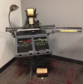
Of the many machines at the Type Archive, which include machines to make the parts for the other machines, the two most interesting belong to the casting room. This is where the real action happens. On one, a pneumatic (in the literal sense) keyboard in black, red, white, green and blue, the typesetter keys in the text to make corresponding perforations in a paper spool. The spool is then run into the casting machine, an amazing thing with its whirring ribbon, its bowl of slowly bubbling molten lead, its matrix-case, which holds the entire font and which moves according to the pattern on the paper. The lead is poured into the right matrix and then the type shoots out, fully formed, into a frame. Not all the characters are the same width: the machine automatically adjusts them (‘kerning’) so that they sit neatly together according to their typeface (this is one of the advantages Monotype had over Linotype, which creates blocks of text rather than single characters). The casting machine is a clattering, chattering steampunk fantasy, but it’s also incredibly refined. It contains more than four thousand parts, creates four inches of text in less than a minute and can run unattended for hours. And it’s no artefact: on my last visit to the Type Archive it was hooked up to a Mac laptop, like a patient on a drip, reading a Word file and sending out line after line of Hungry Dutch (the first new typeface created for Monotype in decades). Words familiar to anyone who works on a newspaper or at a publishing house – ‘leading’, ‘rules’, ‘justifying’, ‘kerning’ – are made real here, substance is given to points and picas, and the business of transposing and reproducing text is connected to something lost but still tangible: inches, pascals, horsepower.
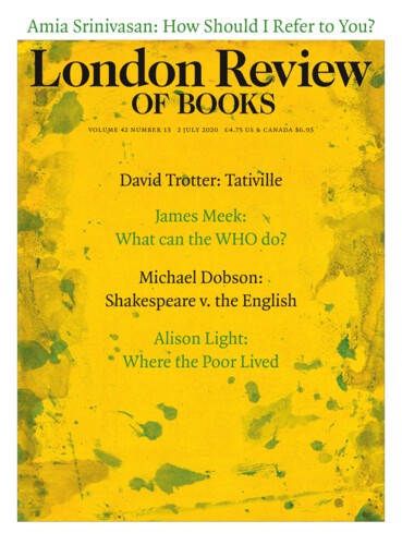
The precision (‘accuracy to two ten-thousandths of an inch’) and clarity of Monotype was a big part of its appeal to publishers: the ease of reading allows you to see the wood, not the trees. If you don’t notice the print, it’s doing its job. The aspirations of hot metal printing – speed, regularity and so on – were met in the computerised technologies that supplanted it. But there were other aspirations inherent in the process, which people hold but machines can’t. We see their echoes in words like these, typed on a computer and printed via a computer. The programme we use at the LRB, InDesign, spaces the words within a line and the lines down a page to be as visually undisturbing as possible, according to a set of rules and algorithms. The pleasingly uneven spaces between characters are written into the typeface. Look at the letters on this page. The gaps between individual characters vary to give the impression of even spacing; to account for the tail of a ‘y’ or the hook of an ‘f’; to stop a paired ‘AV’ from sitting miles apart from one another. Each letter has a kern relationship with its neighbour: o n e f i n d s i t d o e s n ’ t l o o k n e a r l y s o n i c e w i t h o u t k e r n i n g . Or consider this 14-point o (the letter) and this 14-point 0 (the number). The hole in the middle is identical – once upon a time, the same punch would have been used to strike both. The difference lies in their balance: the letter ‘o’ is slightly asymmetrical; the number ‘0’ perfectly even. There are tricks played on the eye all the time, which we read even as we are reading. When the letter and the number run close together, as in the phrase ‘30,000 volumes’ in Neal Ascherson’s piece in this issue, that subtle distinction keeps you on track.
It does something else too. The danger with computerisation is that, as the designer Bram de Does points out, ‘too much harmony is counterproductive in long-term reading, old-fashioned reading.’ You need something to grip onto, something other than the smooth and perfect contrast of a liquid crystal screen. The typeface helps, as does the texture of paper, the richness of ink. Dickens, who like many authors was not well inclined to his printer, wrote that
this feeling of dislike to the printer altogether disappeared from the time I saw my own name in print. I now feel gratified at looking at the jolly letter O, the crooked S, with its full benevolent turns, the curious G, and the Q with its comical tail, that first awoke in me a sense of the humorous.
Fred Smeijers, the designer of Quadraat, the LRB’s typeface, has written a very good book, Counterpunch, which disposes of the myth that the work of the type designer has remained unchanged for centuries. What’s most interesting to me is the humanist attempt to control and know the world mathematically, evidenced in the earliest designers and printers, and today’s pursuit of ‘random inequality’, the crunchiness of reading that we miss onscreen. Quadraat’s ‘Q’ also has a comical tail, and if you put a comma after it they meld together to form a little flourish, ‘Q,’, though no one will ever know that because why would you put a comma after a Q? And it’s nice, too, that the numbers are non-lining, Arabic rather than Romanised, even if it does produces some higgledy combinations: 65 38 14 72. These characters have character. When I see the little opening in the tail of the capital P, I know that this would have been a punchcutting nightmare. Now it’s just bitmaps. But like any frustrated typesetter of the past, we face limitations. There is no yogh [‘ȝ’] in Quadraat, so in Amia Srinivasan’s piece in this issue (and in those square brackets) you may spot the intrusion of the typographically similar Minion Pro.*
The Type Archive is full of unexpected delights (when the original renovations were being made a number of bowler hats were discovered above a false ceiling). It has never had the money or the volunteer numbers to be fully open to the public – and, after all, it’s a living archive: the machines run continually with projects, commissions, tutorials. Its eight million or so items are a long way from being catalogued. But there have been notable exhibitions drawing on their holdings and curious visitors are always welcome. It takes a strong nerve to bring together a collection of this sort and keep it together, to get funding for the humdrum activities that allow other people to see and make sense of these materials; it takes something more to make it a cutting-edge casting carnival. Sue Shaw, the force behind the Type Archive, died a fortnight ago. Her standards of design – unrelentingly high – were informed by physical standards and measures, by long experience at Faber and other places when production was still done inhouse and editors had to give you the measurements of their books on detailed forms, when you really understood what it did both to the machine and to the eye of the reader if you miscalculated. Her aesthetic and philosophical principles were her own.
Send Letters To:
The Editor
London Review of Books,
28 Little Russell Street
London, WC1A 2HN
letters@lrb.co.uk
Please include name, address, and a telephone number.


