Painters born into the sunset of Impressionism who were fated to have long lives saw a procession of styles emerge before they died. Some they invented, others they took up to play their own games with. Joan Miró’s naive realism was transformed by Surrealism and his art later drifted in and out of abstraction. The Miró exhibition at Tate Modern (until 11 September) begins with neat, stylised pictures of the Spanish countryside and ends with four very large triptychs – colour-field canvases with minimal marks. Some of these have equally minimal titles – Mural Painting I Yellow-Orange (1962) – while others, like The Hope of a Condemned Man (1974), imply profundity. Titles of the latter sort are important if one is to take account of the principles guiding the curators of the Miró exhibition. They explain that ‘in focusing primarily upon three periods and the echoes around them – broadly the years 1918-25, 1934-41 and 1968-75 – we have sought to draw out the oscillation of Miró’s sometimes uncomfortable confrontation with social and political concerns.’ The extent to which this decision has done more than provide a solution to the problem of choosing work from the voluminous production of a long life by limiting selection to three windows (the catalogue essays are strong on history and biography) is a question to return to.*
Titles may explain subjects. They can also point to stylistic connections. Surreal titles turn up regularly: Woman Stabbed by the Sun Reciting Rocket Poems in the Geometrical Shapes of the Musical Bat Spittle Flight of the Sea (1939), while others like Burnt Canvas I, II etc (1973) are in the strictly descriptive mode of many American abstractionists. The Farm (1921-22), a picture of the place his parents bought in Mont-roig, near Tarragona in 1911, is in the first room in the exhibition. It is charming, spirited, vigorously composed and neatly painted. Each item or texture – donkey, watering-can, the bark of the tree – is distinctly rendered. It has some of the qualities of a medieval tapestry, both in its design and in the way colours are graded to show form. It may still be his best-known picture and is probably the one most universally liked. It makes you think of art for (not by) children: in the 1930s and 1940s many children’s books were illustrated with similar stylish naivety. You can even imagine The Farm being used as a teaching tool in a nursery school: ‘Where is the rabbit?’ ‘What is the name of the bird sitting on the goat’s back?’ ‘What is the name of the green animal beside the snail?’ ‘What is the roof made of?’
But while he was working on The Farm Miró visited Paris, and from the early 1920s Surrealist excursions into the unconscious transformed the facts of the Catalan countryside into disturbing caricatures. In The Tilled Field (1923-24) the hen’s body has become a bloated pink balloon, the tree’s thorns have got huge; an eye looks out from its ellipse of green foliage and an ear has grown out of the trunk. There is still something tapestry-like in the treatment of the motifs and the way they are dotted over the canvas, but the creatures are fanciful and creepy. The structure – objects, abstract or real, on a plain background – remains more or less the same, from the scattered farmyard paraphernalia in The Farm to the trail of black and red blobs on the blue field of a late triptych, Blue I, II and III (1961). In the Constellations series, quite small works on paper painted in the early 1940s, circles, triangles, stars etc, in red and black, blue and black, and yellow and black, all seemingly threaded on fine, curving black lines, stand out from pale backgrounds. Highly coloured objects are set against white or coloured backgrounds in other pictures too, often partitioned by black thread-like lines or overlapping circles and polygons.
A preference for figures-on-ground to overall compositions, black lines, thin at first, later stronger, primary colours applied to small, often outlined sections can be identified in many of the pieces. Drawn shapes are amoebic. Spreading pseudopodia become limbs. You puzzle out blobby extensions as legs, noses, breasts. Features are added: eyes (often just black dots), teeth (black triangles). These distortions of the human head and body can be fierce or cute and cartoonish; the curators associate a series of aggressive figures in pastel, inscribed ‘Octobre 1934’, with the establishment and dismemberment of a Catalan republic within the Spanish Federal Republic. Although the titles (Figure, Woman) aren’t what Miró promised Pierre Matisse, his New York dealer (‘I will give them titles, since they are based on reality’), the figures are fierce enough to be easily read as expressions of political despair.
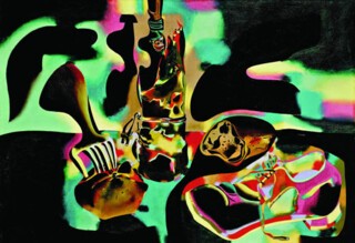
You meet the question of just how art that stayed clear of straightforward propaganda might express the spirit of bad times in a painting made in 1937, Still Life with Old Shoe. The canvas is divided, like many earlier ones, by a horizon – or it could be the edge of a table. Areas above and below are invaded by curved black shapes that loop around objects, as though this was a woodcut in which the background had not been cleared. Colour changes, both within open areas in the background and in the objects (shoe, bottle, bread, apple, fork); red, blue, pink, green, yellow and brown merge iridescently like puddles of oil on black tarmac. The combination of rainbow colours and encroaching blackness, makes it, like much of Miró’s work, both pretty and sinister. ‘Despite the fact that while working on the painting I was thinking only about solving formal problems and getting back in touch with a reality that I was inevitably led to by current events,’ Miró wrote, ‘I later realised that without my knowing it this picture contained tragic symbols of the period – the tragedy of a miserable crust of bread and an old shoe, an apple pierced by a cruel fork and a bottle that like a burning house, spread its flames across the entire surface of the canvas.’
Was the curators’ decision to concentrate on the social and political environment of Miró’s art productive? It has resulted in a selection that is strong on Surrealist figures (bulgy and hairy bits help you read ballooning extremities). The fierceness of many of these figures, the number of compositions that are dominated by large black shapes or scattered with small ones allow even the uninformed to sense that he was an artist whose work picked up shadows cast by the evils of his time. In the late canvases large areas burned out of sloshed and dribbled paint are a violent protest against something; but they give no information about what. Miró’s discovery that tragedy had come to occupy his realistic still life encourages free interpretation elsewhere. Figuring out, quite often with the help of titles, the meaning of faces, stars, suns and moons that emerge in many of the pictures offers a livelier experience than considering them in terms of history or even of biography.
Send Letters To:
The Editor
London Review of Books,
28 Little Russell Street
London, WC1A 2HN
letters@lrb.co.uk
Please include name, address, and a telephone number.


