A ping-pong table in the Ron Arad: Restless exhibition (at the Barbican until 16 May) shows that you don’t need to change the rules just because you’ve changed the equipment. The stainless steel playing surface curves gently down from each end to meet at the steel net. Sneaky top-spin drives would, I guess, bounce high, but I didn’t experiment (bats and balls can be borrowed).
Such sideways thinking has been Arad’s regular modus operandi. His first chair was made from scaffolding tubes and recycled Rover car seats. Other starting points have been simple questions (are there alternatives to bookshelves?) or new tricks with old devices (the camera obscura). Experiments with the latest techniques and materials have produced unexpected mixes of shape and strength. The final result may be handsome, funny, smart, silly, surprising, argumentative, even useful.
Nearly everything is nominally functional but function is not the ruling principle. Oh, the Farmer & the Cowman Should Be Friends is a map of the United States – you’ll need a big wall for it – in which the boundaries of states can be used as shelves. Books will lie in all directions, you’ll have to remember that Dickens is in Nebraska, say, or cookery in Florida if you want to keep any sort of order. The bestseller among his mass-produced pieces is the Bookworm: a flexible strip you can mount on the wall in twists or spirals, leaving the books to flop this way or that between bookend-like dividers. He is not unaware that chairs are made to be sat on, and the word is that even the most sculptural of his are comfortable to sit on, if challenging. The Gomli chair, for example, is teardrop-shaped, very tall, shiny and rockable in any direction, but ballasted so that it can’t topple over. Many pieces are neither furniture nor sculpture but both.
Arad trained as a designer and an architect – his current practice includes everything from light-fittings to buildings. He drifted into furniture-making in 1981. Ettore Sottsass’s Memphis group in Milan were just starting to turn out wild, brightly coloured, oddly angled chairs, shelves and cupboards covered in boldly patterned plastic laminate. At the same time Michael Graves was designing buildings, kettles and chairs that seemed close relatives to things in old cartoon films. Such work defined ‘postmodern’ better than words could.
I wouldn’t call Arad that, but his work seemed to signal the end of the age of the Great Modern Chair. Mies van der Rohe had several of those to his name; Arne Jacobsen, Le Corbusier, Alvar Aalto and Charles Eames had each designed at least one. Together they seemed to cover all the ways to sit down that were acceptable in a modern room. Postmodern chairs were wild, silly even, but you could half-believe that the museum-worthy architect-designed variety, the highest modernist achievement in the world of household goods, had had its day.
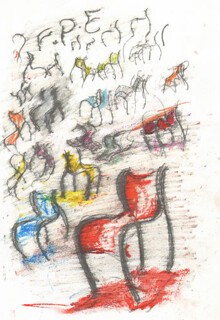
It hadn’t – its lifespan is now way beyond that of a passing fashion. When it comes to furnishing a new office building a Mies van der Rohe Barcelona chair (1929) in the foyer can still look as up-to-date as the architecture, while new designs for serious modern seating can often be read as variations on something Eames or Le Corbusier or Aalto did more than 50 years ago. There are expensive versions, cheap rip-offs and honest variations – check out the Ikea catalogue. And the hi-tech story is not over: the Aeron – a confection which has the smart, predatory look of a fine beetle – takes functionality to a new level: it has several adaptable elements and is available in more than one size. It became a fashionable identifier – a brisk second-hand market in Aerons developed at the end of dotcom and credit bubbles. All of that – the originals, the clones, the new models – constitutes the world of ordinary sitting. Arad has made interesting, useful and economical contributions to it; the FPE (Fantastic, Plastic, Elastic) chair, sketches for which are shown here, is a minimal, curvaceous design in aluminium tube and plastic. It stacks beautifully, although, like a visitor in red high heels and nail varnish, it might be a bit loud in a parish hall.
Arad wouldn’t be the subject of an exhibition like this one if he hadn’t also opened up territory where product design merges with gallery art.* Along the way he has had fun being original. One move is to take a design and see how it works in other materials. When the supply of recyclable seats for the Rover chair dried up Vitra, the Swiss furniture company that was the first to commission a design from Arad, produced limited editions of replicas in steel – called Moreover – one rusted, the other chromed. Arad is an admirer of Claes Oldenburg; the translation of the soft leather of automobile seating into metal reverses Oldenburg’s transformation of a typewriter into a canvas sculpture.
The Well Tempered Chair, his first design for Vitra, began as a prototype in stainless steel: an edition of a thousand (Bad Tempered Chair) was made later in carbon, Kevlar and glass fibre. The shape of MT3, a rocking chair that is essentially a broad plastic loop dented and folded to make a seat, is replicated in MT Rocker Chair, in which the same shape is produced expensively in handcrafted, polished bronze or stainless steel rods. Those labour-intensive works of art are priced in six figures, the plastic version, a piece of furniture, in three. Both can be sat on.
The refusal to set an absolute boundary between the gallery and the store, between art and commerce, is reflected in other things. Whereas Arad admired, and was influenced by, Oldenburg’s drawings, the implied scale of Oldenburg’s renderings in pencil and wash of giant lipsticks and clothes pins was architectural and mocked the ponderousness of architectural thinking. Arad has some brightly coloured, airbrushed sketches of ideas for furniture that share, without irony, the gleaming highlights and big curves of high-end graffiti art and science fiction graphics. He reminds you that ‘good taste’ changed its meaning when pop art, jokes and kitsch blew the certainties represented by organisations like the Design Council out of the water.
Two pieces from 1989 called Chair by Its Cover catch the problem any designer faces: how to avoid reinventing the wheel. In both of them a couple of very ordinary dining chairs – one metal, the other wood – are half-embraced by a curved wall of steel. The interiors are mirror-polished, offering distorted reflections of the chairs. Each carries an inscription: in one case, ‘Why have a dog if you can bark yourself?’, in the other, ‘Why bark if you can have a dog?’
Arad, barking for himself, in useful objects that are also pieces of sculpture, has been able to feed ideas back into furniture and architecture that are more relaxed and stronger than those represented by over-emphatic attempts to outdo classic designs. But the world he has built, lit, decorated and furnished is one that makes virtuoso use of our new ability to turn any doodle into a building or a chair. In the products of older technology supports and joints explain where stresses fall and give hints as to how they were made. Without this information the real world and the virtual world become as one and both architectural and product design merge with computer animation and free-hand illustration.
Send Letters To:
The Editor
London Review of Books,
28 Little Russell Street
London, WC1A 2HN
letters@lrb.co.uk
Please include name, address, and a telephone number.


