Over the last couple of months I have had moments when the colour of things seemed accidental, as though reality comes in shades of grey and colour is a separate, less real addition. Idealist philosophy finds colour the easiest property to reduce to something that exists only in the mind. What is the ‘real’ colour of an object that looks white by day, orange under a street light and pink through rose-tinted spectacles? However, the source of my own moments of disassociation is not, I think, epistemological but a by-product of time spent painting watercolours from life, an activity that has brought with it the habit of judging light and dark while ignoring red and green.
From very early on there were painters who separated the two registers, laying in colour over monochrome underpainting; and old arguments about how pictures should be made are often driven by a sense that they are constructed, and even read, layer by layer, stage by stage. It was an analysis that raised questions like ‘Is correct drawing or true colour of the essence?’
When Post-Impressionist painters abandoned the underlying tonal structure, they flattened the implied (sometimes real) layers of colour and tone that are a common attribute of paintings in the Western tradition. In the Royal Academy’s Van Gogh exhibition (until 18 April) you first look at early paintings of peasants in dark rooms that use colour – browns and greys – to register light and shade; when you go on to late, bright pictures you find shapes defined by colour alone. These are pictures in which pure colour realises its full potential. It comes to have a life of its own that may contribute very little to, even interfere with, other strands of meaning. One influence on Van Gogh’s shadow-free art was the strong, flat patterning of Japanese prints. The colours, however, are closer to those of Indian paintings in which garden parties take place in the same bright, unshadowed space as murders and battles. Van Gogh’s descriptions in letters of the dark resonance he intended some late paintings to have can come as a surprise: certainly there is little in the subject matter to indicate it. His thick paint offers the full power of blue as blue, red as red, green as green. It is only the tight vortex of marks that seems agonised.
While information carried by shadows was being abandoned by some painters it was still of the very nature of photography. And it turned out that the photographs that gave scenes of war, travel and modern life an authority drawings did not have could also be art – as exquisite and affecting, as stark and as shocking.
The history of the art photograph must, however, with a few rare exceptions, be illustrated until well into the second half of the 20th century with black and white images. Even after colour photography became commonplace, it was used mainly by amateurs, magazines and advertisers. The common belief was that a photograph worth considering as a work of art would be in black and white. Colour was an intrusion, a vulgar distraction.
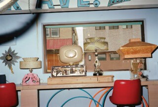
A – perhaps the – crucial date in the story of how colour entered the world of art photography is 1976, the year John Szarkowski, curator of photography at the Museum of Modern Art in New York, organised an exhibition of William Eggleston’s colour prints. Many people were shocked: first because the leading museum of modern art was willing to exhibit colour photographs, second because subject matter and composition seemed so inconsequential. Details (the most famous is the one of a light bulb and electric flex against a blood-red ceiling) seemed arbitrary; figures unexplained, unengaged, often distant. Boring things (a child’s tricycle, a car parked in a dusty lot) are shown casually with no drama of angle and lighting. The inconsequentiality of what is shown doesn’t take away the sense that it is significant. Eggleston’s refusal to explain makes you think of stories. He is a Southerner, from a plantation-owning family. His biography, as you pick it up from notes and the photographs themselves, reads like the blurb for a novel about a rich, louche, bohemian, Southern life. But while many of his pictures are of Memphis, his family and friends, he is unwilling to be labelled as a Southern artist and has found inconsequentialities to photograph well away from Tennessee in Cuba, Russia, France, Japan and the rest of the USA.
In 1976 it was the colour that set him apart. Photographers who rejected the last echoes of painting’s conventions of composition and subject matter already had a standing when Eggleston’s MoMA exhibition took place. In 1967 Szarkowski had curated an exhibition that showed work by Lee Friedlander, Diane Arbus and Garry Winogrand, all of whom severely undermined existing notions of what photographic art could and should be in much the way Eggleston does. Yet when you imagine their pictures in colour you see that it would diminish them. Imagine Eggleston’s photographs in black and white and you know that colour is central to the way they work on your imagination.
Twenty-two of his photographs, taken over the last decade, can be seen at the Victoria Miro Gallery in London until 27 February. These late pictures inspire the same questions as the early ones. ‘Why that?’ Why take a picture of (to take a few of the descriptions offered with the untitled prints) ‘woman wiping van’, ‘rolls of printed fabric’, ‘freezer with ice bags’, ‘newspaper on ground’ and so on. Why do people always come off badly? The camera surely doesn’t love them. The one face shown (‘Leigh in black top’) is miserably unhappy. The unexplained strangeness of the ordinary or tacky that has drawn film-makers like David Lynch to Eggleston is evident, but the colour also registers at a different level. As in Van Gogh’s late paintings it has a life of its own. Purely as coloured objects, the photographs are rich, subtle, pretty even.
The process used to print them in the 1976 exhibition – dye transfer – produced exceptionally saturated, intense colour. Those at Victoria Miro are labelled as ‘pigment prints’, which may mean some variety of the digital inkjet technology that is now more or less universal on the high street. Kodak, once the primary suppliers of material for the dye transfer process, gave up producing it in the 1990s; Kodachrome, once the tourist’s and photojournalist’s colour film of choice, is no longer made. The analogue processes that gave character to photographic prints through different films, papers etc have, like letterpress printing and wood engraving, become revived crafts. We live in a world of digital colour images, still and moving, that blur the distinction between fact and fiction. One reason photographs that have enough individuality and bite to work as gallery art so often bring sweet or brilliant colour and sour subject matter together, not just in Eggleston’s photographs but in those of many who are working adjacent seams (Martin Parr comes to mind), may be that only by mixing the sweet and the sour can photography keep its credentials as a primary source of information about how the world really is.
The shades of grey that I sense below the accidents of colour are those black and white photography captured. Grey-scale had no special claim to truth – frugality did not exclude false drama and manipulation – but some things that are truly grey get lost in colour. Even bad weather looks bright.
Send Letters To:
The Editor
London Review of Books,
28 Little Russell Street
London, WC1A 2HN
letters@lrb.co.uk
Please include name, address, and a telephone number.


