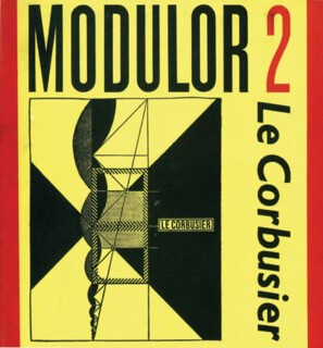
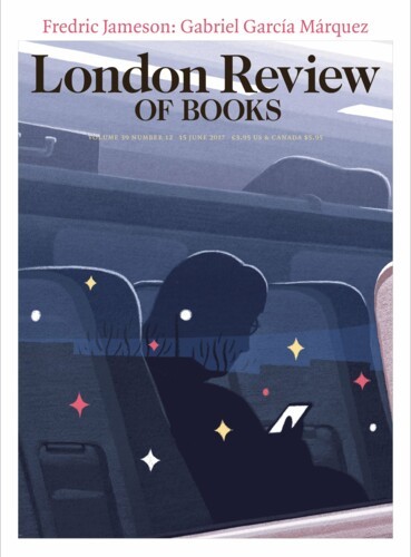
The new titles on the table in the bookshop, a cast of hundreds, gather for a curtain call. Like the chorus girl who breaks rhythm on the night a talent scout is in the audience, they will try any trick to catch your eye. Series and reprints – Everyman, Penguin Classics, Oxford Reference, Persephone, Faber Poetry, the books of any established author, series of textbooks and so on – do their high kicks in matching costume. But there are now too many publishers for any of them to trust to a brand image to sell new ‘trade’ books – the titles that get reviewed in the press and are entered for prizes.
Which is why, over the years, book cover design ceased to be an offshoot of book design (where typographers do their stuff) and became a graphic arena in which art directors commission all sorts of specialists. Photographers, illustrators, calligraphers, collagists, model-makers and typographers, singly or in groups, try to make each title sparkle or frown (or whisper even). They aim to seduce wayward customers who don’t already know the book they came to shop for. If they pause and look, pick up and read, they may also buy. The product and the advertisement are bound up together.
Two books are just out which chart the transition from essentially utilitarian, intermittently decorative covers to more allusive, complicated graphics: Penguin by Illustrators and Eighty Years of Book Cover Design – that is, Faber book cover design, an 80th birthday present from the firm to itself, lavish in its illustrations but short on apparatus. As there are no captions, and no dates beyond decade by decade divisions, the only way to find out who was responsible for what is to search for credits in the five-column index of designers and illustrators. Two of those columns are needed to list designs by Berthold Wolpe. A refugee from Germany who came to Britain in 1935, he was Faber’s jacket designer from 1941. Albertus, the typeface he made for Monotype, based on his raised inscriptional lettering in bronze, became the most common typeface for Faber jackets. When it was not used, Wolpe often lettered them by hand, many in a free condensed style that is half sloped roman, half italic. His covers are strong, simple statements made in a recognisable, resonant tone of voice: think of an operatic bass reading the news headlines. He liked big type and never lost the letter-cutter’s feeling for pattern-making. There is a cover here for The Georgian Buildings of Bristol in which the lines of Fry’s Baskerville are as close-packed as the lettering on a provincial 18th-century memorial tablet; using Albertus Bold on covers for Lowell and Larkin he makes a pattern of rules and letters that has an inscriptional weight and presence. Faber wasn’t just Wolpe, of course. Barnett Freedman’s lithographs are memorable, as are the pen drawings of Edward Ardizzone and Leonard Baskin. In general it is strength, not subtlety, that marks Faber’s covers up to 1975, when Wolpe retired. Later the design group Pentagram took on the job of branding Faber (it was they who introduced the ff logo) and cool, neat inventiveness took over.
The covers from 2000 to 2008 are much more difficult to pin to individual designers. There is hand lettering, but no letter designer of Wolpe’s calibre; there are riffs on old advertising and very well mannered type-and-photograph set-ups. The Wolpe era confidence has gone, so has the Pentagram product-branding. You wouldn’t be able to say of any cover in the last few pages that it could only be a Faber.
Penguin by Illustrators tells a different story, but shows a list heading in the same direction, away from branding and a house style, towards a title by title approach that lets each book fight for its eye-space on the table. It can lead to excess, obliquity and freakishness, to the point where the author’s work can seem to stand as the answer to the crossword clue the jacket sets. In one of a series of brief contributions by illustrators to the Penguin book, Len Deighton (who is rather dismissive of his own cover drawings, made around 1960 to tight deadlines) makes the case against cleverness. A writer now, and on the writers’ side, he says: ‘The cover should bring a subtle and intimate promise of what the writer has contrived: not a display of incoherent pyrotechnics.’ This isn’t just grumpy old man talk, and it’s easy to find authors who are offended by jackets (often showing bits of naked women) that their editors tell them the sales department backed at the cover meeting. It isn’t a new phenomenon; in a scene in The Seven Year Itch, Tom Ewell lowers the necklines on the cover art of an edition of Little Women with, if I remember rightly, sweeping curves of his pen.
The design that really offers a ‘subtle and intimate promise of what the writer has contrived’ is rare. Lettering sometimes does it. Jon Gray, taking a lead from East European packaging, did a cover for A Short History of Tractors in Ukrainian that is a joke about, but also a lead into, the story. And illustration – not just a picture on the theme of the book but a scene or character from it – can also carry you in, but that kind of illustration, which would once have defined the word, is now quite uncommon. The covers Quentin Blake did for Penguin fiction in the 1960s fall into this category. He writes of the books he worked on that ‘they had to be read with a certain degree of inwardness and what I produced was, for better or worse, more like illustration than a cover treatment.’ At that time, though, Penguin cover grids of one sort and another still reigned; the illustrator’s job was to fill the space provided. It freed him from dealing with the words and could sometimes be played with. Blake used Penguin orange or another overprinted colour for jokes: pink for the blushing faces of assembled schoolboys in The Ever-Interesting Topic, and the orange itself for the covers of the old Penguins scattered on the floor in front of the turbaned Indian and his boy on the New Penguin cover of The Mystic Masseur.
The urge to decorate at least doesn’t die. Many of the Penguin covers David Gentleman did, including those for the New Penguin Shakespeare, are wood engravings. The sharp, definite lines, a characteristic of the medium, suits their small scale. The style of some more recent Penguin series – the Gothic Horrors covers by Coralie Bickford-Smith and Tony Lyons’s Penguin Epics, for example – are as strongly marked by the disciplines of scanner, digital camera and Photoshop as Gentleman’s earlier ones are by those of the graver.
Send Letters To:
The Editor
London Review of Books,
28 Little Russell Street
London, WC1A 2HN
letters@lrb.co.uk
Please include name, address, and a telephone number.


