Some time around 1870 Frank Lloyd Wright (b.1867) was given a set of Froebel building blocks by his mother. He reckoned that playing with them set his imagination on the road his architecture would follow. Some sixty years later the grandmother of another Frank – Frank Gehry (b.1929) – poured out a pile of wood scraps for him to make things with. Today you can see him in Sydney Pollack’s documentary Sketches of Frank Gehry cutting and bending sheets of card and sticking them together to make models – inventing on the fly like a child at nursery school. Both men had trouble with received modes of architecture. Lloyd Wright’s work was critically sidelined by the version of Modernism that émigré architects brought to America. He didn’t like it. Gehry’s playfulness comes at the other end of the story. He was one of the postmodern architects whose work challenged the status quo that Frank Lloyd Wright had seen taking hold.
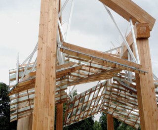
As I write, none of Gehry’s work can be seen in England, but he has been commissioned to design the latest of the temporary pavilions that have been set every summer since 2000 on the lawn in front of the Serpentine Gallery: it will be open by the time this is printed. The reality is much more effective than the photographs of models suggest – large, active and unresolved. You sense that the elements have been shaken about and are still not quite settled. As functional requirements are minimal, the pavilion commissions leave architects free to build for the sake of building. Gehry is as playful as any of them. His game here involves sticks and sheets. From a hundred yards away the pavilion looks like a giant game of spillikins in which the sticks are aluminium extrusions and hefty laminated posts and beams. Among them, like the collapsed remains of a huge house of cards, are the large sheets of glass the sticks support. It is only when you get close that you realise they make a covered way leading from the road to the gallery.
Architects’ games tend to be rule-based, but adjustments keep them alive and much is left unchanged. When a dominant style really is exhausted, tacit agreement about how things should look breaks down. Maverick architects then indulge in all kinds of impropriety. John Nash’s excursions into an exotic vernacular with his Oriental pavilion at Brighton was to the received style of late 18th-century architecture what Gehry’s Guggenheim Bilbao was to minimal white-box museum design.
Innovative buildings are often, unsurprisingly, small, functionally undemanding pavilions or pavilion-like structures – Gehry first made a mark by doing unusual things with houses – and the history of architectural styles is often best illustrated from their small beginnings. In the early 1500s Bramante built his Tempietto of San Pietro in Montorio: a little, round, domed martyrium – Saint Peter met his end nearby. It stands on the watershed that divides the style of the Early from that of the High Renaissance, and announces the feel of much that will follow. The Casino at Marino, the pavilion Sir William Chambers built early on in his architectural career for Lord Charlemont, is an even more perfect representation of his ideals than Somerset House. Mies van der Rohe’s Barcelona Pavilion of 1929 contained more of his architectural ideas than the Seagram Building. As several of the Serpentine pavilions were commissioned towards the end of the architects’ careers, one can’t expect to read in them the seeds of a new kind of architecture, but Gehry’s contribution does give those of us who haven’t seen much of his work in the flesh a better idea of its character than pictures and videos can.
His buildings don’t carry with them the shadow of drawn plans and elevations. In that they have something in common with the huts and tents illustrated in Bernard Rudofsky’s Architecture without Architects, the book and MoMA exhibition that, in 1964, gave Modernist architecture a nudge towards shapes that can’t be drawn with a straight edge and a compass. Like Wright, Gehry admires Alvar Aalto, an architect on the outer edge of Modernism who also built walls and roofs that curve. But it is not just because of the shapes he makes that Gehry’s work is sculptural: he works like a sculptor, moving from scribbled drawings to sketch models, from sketches to refined models and from refined models to buildings. That last step is what separates his work from most past structures. Computers have made it possible to specify and adjust the curves of a scrap of crumpled paper in a model, and eventually to provide the builder with files that will control the milling machines that cut stone to match these curves. In Pollack’s film there is a shot of a monitor on which a wonderful tangle of nodes, lines and numbers is displayed. The computer file that generates this image is the primary set of instructions. Drawings are just the back-up.
A similar tangle underlies the perfectly rendered animated characters Pixar puts on the screen. Lovers of hand-drawn animation know that something has been lost in the smoothing process. The machine-made, large-scale buildings created from Gehry’s handmade models make you wonder if the model wasn’t better. Like the inflated animal floats in Macy’s Thanksgiving Day Parade they can be exhausting. It seems proper that Gehry’s pavilion will, later in the year, go back into the toy box. In the meantime, it is the summer’s most enjoyable architectural excursion.
Send Letters To:
The Editor
London Review of Books,
28 Little Russell Street
London, WC1A 2HN
letters@lrb.co.uk
Please include name, address, and a telephone number.


