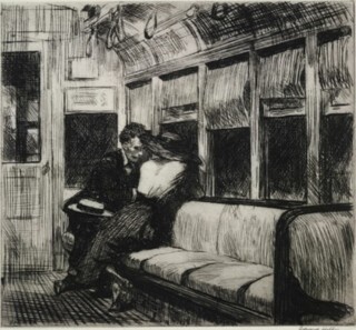
The work in The American Scene: Prints from Hopper to Pollock is from the British Museum’s own holdings. One of the four Edward Hopper etchings is Evening Wind. A naked girl kneeling on a bed looks out through an open window. Curtains billow inwards. Her head, turned from you, is hidden by long hair which is pushed about by the wind. In East Side Interior another young woman sits at a sewing machine by another open window. Night on the El Train shows a couple at the end of an empty carriage. She is twisted away from you, towards her companion and the window behind them. He has a straw boater on his knee. The etchings were done when Hopper was still making a living as an illustrator of magazine stories and advertisements. He loathed the job, but his etchings, like his illustrations, drop you into stories. You can hardly see the faces but these are nonetheless characters. The rooms and the carriage (established by heavy, hatched shadows), as much as the people, make you wonder what will happen next. Although the overt narrative proper to illustration will eventually be replaced by more enigmatic evocations of place, Hopper would go on making you wonder what has happened – or will happen. They are among the best prints made in the 20th century.
The Hopper etchings are a late instance of the link between illustrators and painters of modern life that manifested itself most memorably in 19th-century Paris. So are John Sloan’s etchings of New York tenements and city crowds (he, too, had worked for newspapers) and George Bellows’s lithographs of a prize fight, a psychiatric ward and couples in the park. In London and Paris, the illustrations that painters admired – some reproduced by wood engraving, some by lithography – were done by others. In America the illustrators themselves became painters and printmakers.
While many of the prints here are evidence of the desire to make something of the American scene – the skyscrapers, bridges and brownstones as well as the people – and of the facts of American rural life and history, a push towards experiments inspired by the nature of the print techniques themselves becomes more and more notable as one moves from the 1920s to the 1960s. By the time Hopper was making illustrations photography had mechanised commercial reproduction. When Toulouse-Lautrec was making lithographs the hand craft was still alive commercially. Wood engravers provided the blocks for drawings by Keene, du Maurier, Leech and Doré that were admired by Sickert, Van Gogh and Degas, but the newspapers and magazines for which the American printmakers who were also illustrators worked reproduced illustrations by photo-engraving.
The transition had begun from a world in which different kinds of print – letterpress, lithography, gravure – still existed to the present monoculture of digital text and pictures printed on smooth paper by offset lithography. Some printmakers colonised abandoned or marginalised technical territories, producing work that emphasised their physical qualities. Print media have always been attractive economically, but it is the physical qualities that draw artists to them, even when, as is the case with monotypes (prints taken from a sheet of glass or metal drawn on with ink), only a couple of proofs, at most, can be taken. (There are two monotypes here, feathery, slightly blurred abstracts by Harry Bertoia, the sculptor and furniture designer.)
Etching a plate is very like making a drawing. A needle scratching through resist is like a sharp pen being dragged across paper. If you combine it with drypoint – scratching vigorously enough to throw up a burr – it even replicates the pressure-dependent thicks and thins of a pen-drawn line. Drypoints of night scenes by Martin Lewis exploit the uniquely dense blacks that etching can achieve. (In a number of them a dark ground was produced by first running the plate through the press with a sheet of sandpaper.) These are striking, if conventional, images that stand in a line you can trace back to Whistler and beyond. They are typical of the carefully crafted work produced in Europe and America during the etching boom of the 1920s – it went bust with the Depression. The most recent is from 1939.
Aquatints are made by laying down an even tone on a metal plate, then burnishing it or stopping out parts with resistant varnish before it goes into the acid bath. In two from 1957, one by Franz Kline, the other by Willem de Kooning (they accompany poems written on the plates by Frank O’Hara and Harold Rosenberg respectively), a medium that makes delicate scratching and hatching possible is turned over to coarse brush strokes and crabbed handwriting. Yet both these plates and Lewis’s derive part of their force from a characteristic of the medium: the density of the ink layer dragged from pits and scratches in the plate during its run between the rollers of the etching press.
Lithography, even more than etching, is like drawing on paper. It is easier to see what you are doing when you work with black ink on a pale stone or plate than when you scratch away at a copper plate. Wherever lithographic chalk or ink leaves a mark on the stone, ink will stick and be transferred to the print; some processes add strength or regularity to drawn lines. Lithography may discourage fumbling, but essentially the plate gives back what it is given. Bellows’s Dance in a Madhouse, although it has its origin in a drawing made ten years earlier, sustains the urgency of marks made by a committed observer. In Charles Sheeler’s view of the blank side of the Delmonico Building, neat ruled lines and even shading in chalk emulate the crispness of his architectural photographs and paintings. In Thomas Hart Benton’s evocations of rural America and its myths, dramatic chalky shadows, elongations and mild distortions of perspective give scenes – an illustration to Frankie and Johnnie, a horse racing a steam engine – a cartoonish swing. Abstract Expressionist swipes at the stone with a resist make wild white marks on a black ground in a print by Emerson Woelffer from 1951.
The black and white woodcuts produced in Germany in the 15th and 16th centuries and the coloured ones made in Japan in the 18th and 19th display formidable skill and control. It is reasonable to compare Leonard Baskin’s life-size Man of Peace (1952) and The Hydrogen Man (1954). The Man of Peace stands behind barbed wire and holds a dead bird; Hydrogen Man is a ravaged and fragmented figure. Baskin’s prints are huge by any historical standard, but the sinewy black lines have an antique precision. On the other hand, the woodcut medium is roughed up in Broadway Canyon and Hell Gate Bridge, made by Werner Drewes in the early 1930s. Ragged gouge and knife marks and uneven inking deny craft; the style has roots in German Expressionist prints made a decade or so earlier – the retreat from craft could be justified as a search for emotional force. Woodcuts made by inking areas that are separated by gouged white lines in different colours, though, slip into the category of the palely decorative.
Many of the earlier prints in the exhibition show Americans finding ways to make art of their country, its people, its history and its landscape. In later prints these local references are displaced and international reputations established. In his preface to Stephen Coppel’s catalogue, Antony Griffiths tells how the material made its way into the museum’s collection. The exhibition, which carries on until 7 September, shows how the knowledge, intelligence and enthusiasm of curators made it possible in quite recent years to put together a collection that gives a remarkably coherent account of half a century of American art.
Send Letters To:
The Editor
London Review of Books,
28 Little Russell Street
London, WC1A 2HN
letters@lrb.co.uk
Please include name, address, and a telephone number.


