An exhibition of the work of Prunella Clough runs at Tate Britain until 27 August; it then transfers to Norwich and Kendal. Clough was born in 1919, had her first one-woman show in 1947, and in 1999, the year of her death, she won the Jerwood Painting Prize. The progress of her long creative life can be followed chronologically in a sequence of three modest rooms at the Tate.
By choice she exhibited little and, although well enough off not to need to, taught for much of her life. The designer Eileen Gray was her aunt; Clough was trustee of Gray’s estate and, as Bryan Robertson records in his obituary, she ‘licensed reproductions of furniture, and passed on all the annual royalties to art schools, as bursaries or as equipment, or to impoverished students and hard-up fellow artists’. A combination of modesty, broadly socialist sympathies and creative as well as financial independence goes some way towards explaining her subject-matter and also, perhaps, why she never felt the need to settle on a single identifiable style.
The first room, which contains paintings from 1946 to 1960, is dominated by industrial subjects, in particular paintings of men at work: serious blocky pictures done in dirty white, grime, rust and verdigris. But it isn’t just in Clough’s work that the austerity of postwar Britain and France seems to have dimmed painters’ palettes: so much of the visual documentation of that time is in black and white – newsreels, news magazines – that it’s easy to imagine a pervasively monochrome decade.
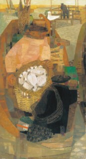
Clough’s engagement with the theme of work also resulted in a series of pictures of fishermen (including Fisherman in a Boat, reproduced here). In them, the weight and opacity of the factory paintings is replaced by delicately faceted surfaces. A light Cubist veil has been spread over a view that is flattened but not dramatically distorted. Colour is more variable, and a tapestry of subdued browns and greys unites the surface. In the catalogue, Ben Tufnell notes that Clough ‘acknowledged that Cubism was something she and her contemporaries had misunderstood, or understood only very shallowly’.
In the later rooms you see her moving further towards what is, at first sight anyway, pure abstraction, by way of pictures like Cooling Tower II, in which a big industrial structure takes on the character of a still-life object, a delicate thing in Morandi-like colours – grey, buff, and the pink of the palest sort of tinned salmon. In that picture the balance between picture-as-object and picture-as-representation is level. The impression you have looking at Industrial Interior V – that the black shapes, emphatically vertical and horizontal, could easily resolve into the spindles and shafts of a machine – brings with it the sense of something it would be dangerous to put your hand too close to.
‘Abstract’ implies an art in which colour, shape and texture achieve their effect without making reference to nameable things. Absolute simplicity (at its most extreme, colour-field painting) or the creation of all-over patterns (like Pollock’s dribbles) blank out or break up (as camouflage does) incipient imagery. Both shut down the eye’s innate creativity – the automatic search for meaning that leads us to find castles in clouds and the face of Christ in an aberrant vegetable.
Not all abstract paintings are of that kind, however. Some are closer to what is denoted by the noun ‘abstract’ (as in ‘abstract of a scientific paper’). Clough’s titles (Cooling Tower II, Industrial Interior V, Electrical Landscape, False Flower, Broken Gates and so on) itemise the things her pictures are abstracted from. Electrical Landscape and Electrical Installation are not pictures of circuit boards, but their syntax of linked lines is circuit-board-like. The bar and brace-like lines in Broken Gates are an invention, but the painting’s title directs one back to the world of things. The habit of finding the seeds of her visual ideas in the world seems to have stayed with her, even when the viewer has to hazard a guess or look at the title to work out what they might have been.
Clough’s exploratory instincts brought some practical disadvantages. For one thing, it made her output too various for any single kind of picture to become clearly hers. Rothko’s blurry rectangles, Morris Louis’s long coloured stains on canvas and Ben Nicholson’s overlapping rectangles, curves and circles are all instantly recognisable. Their invariability gives rise to fruitful comparisons. It can make you aware of the effect of small differences, and sometimes of the surprising width of expressive power achievable within self-imposed limits. It also makes repetition, even mass production, easy – to the point where, in Damien Hirst’s dot paintings, the trademark becomes the work.
So Clough, who seems constantly to have reinvented herself, who could make a picture covered in dots (Still Life), or one with ragged torn-wallpaper shapes reminiscent of Clyfford Still (Samples), does not offer us the pleasure of instant recognition. Her work is not marked by a particular set of brush-strokes, as Howard Hodgkin’s is, or by anything like the self-limited concentration of the imagination with which Bridget Riley has explored the visual effects of regular, hard-edged elements.
There are, however, things that, as you come to notice them, suggest family traits. For example, an overall background is often enlivened by small bright areas in a different graphic mode. In one picture, an even spread of white blobs on a dark ground is interrupted by a rectangle of brightly coloured lines that give the painting its name: Stack. In Samples and Spin-Off, similar bright, geometrically neat arrays are surrounded by unemphatic backgrounds. Little bits of colour are made to go a long way, and the force of the paintings is concentrated on a small area of the canvas. For all that, I can think of few painters of abstract or quasi-abstract pictures who give you the same sense of each painting having been started from scratch as a new idea, not a variation.
In a glass case in the centre of the second room there is a display of fading snapshots, notebooks, letters, an envelope with samples of many kinds of red, scribbles, typescripts and diaries. They confirm what the titles suggest: that for Clough painting was a way of engaging with things seen. Even at her most abstract she explores subject-matter, in particular finds ideas in the look of what is ordinary and unnoticed: a tangle of wire, a rock formation or a plastic bag. Like most of her contemporaries, she was trained as a tonal painter. She went on all her life producing pictures in which no area of colour is entirely flat and in which the way one layer of paint overlaps another makes the surface lively and variable. Hers are not pictures to judge from even good reproductions; many are beautiful objects as well as images.
Send Letters To:
The Editor
London Review of Books,
28 Little Russell Street
London, WC1A 2HN
letters@lrb.co.uk
Please include name, address, and a telephone number.


