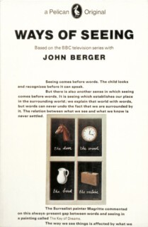
When Hans Schmoller first saw a copy of John Berger’s Ways of Seeing – the book was published in 1972 – he hurled it across the room. Schmoller, who had succeeded Jan Tschichold as designer at Penguin in 1949, was a subtle practitioner of traditional book design. His pages were balanced, proper and elegant. He hated the pages of black sans serif type, punctuated with illustrations, which Richard Hollis – working with Berger and others – had produced.
Beatrice Warde, advocating the kind of tailored designs which Tschichold (briefly, but brilliantly) and Schmoller produced at Penguin, said that a book, like a wine glass, should not draw attention to itself. The sense is what matters, the voice should be the writer’s not the typographer’s. The design of Ways of Seeing has none of that deference. It announces that it has – as an object – things to say about the text it contains. It is a remarkable piece of work which has had a long life, in art college reading lists in particular; a more active one certainly than Kenneth Clark’s Civilisation, to which it was an indirect riposte.
Schmoller’s anger was misplaced. He might have loathed the look, but here at least was a book which was all of a piece. In 1972, the battle for the visual integrity of Penguin paperbacks was already long lost; the insides and outsides of many, if not most of them had stopped speaking the same language. The text pages might have the transparency of a wine glass: the cover was more like the label on a bottle. Ways of Seeing was an unusual monoglot. The main text starts on the cover (the usual preliminary pages appear in the usual place); and you can think of it either as a book consisting only of text pages, or as a book made up of a whole sequence of cover-like visuals.
Integration of that kind is rare. Although Penguin no longer has a text design department, the insides of their books, which now mostly follow a small number of set designs, are still, on the whole, in the Tschichold/Schmoller line. Covers, on the other hand, are diverse. Some titles – for example, the classics and reference books – are in series styles but even those aren’t all recognisably Penguins. In Phil Baines’s Penguin by Design: A Cover Story 1935-2005 (an exhibition at the V&A runs from 8 June until 13 November), one sees plain typography replaced by graphics which illustrate, characterise, make jokes about, or otherwise tell you more about content than the old liveries could.* The generic was driven out by the specific, the livery of orange, green or blue by full-colour free dressing.
Baines’s first sections show how Allen Lane set about producing a branded product. Seeing Tschichold tidy up the original grid without changing the arrangement of the essential elements or the typeface is like hearing a professional orchestra take over from an amateur band in mid-performance. But books of the kind Penguin published could be branded only if customers bought them, as they would a bottle of Chanel No. 5, because they wanted more of exactly the same stuff and didn’t have any reason to try alternatives. So long as Penguin had rights in most of what one class of book buyers was likely to want to read in paperback (and buyers of Penguins mostly belonged to one class), identity was an advantage. By the late 1950s other paperback publishers had authors as desirable as Penguin’s in their lists, and tentative steps towards differentiation began.
Which is why, in the covers Baines reproduces, there are two histories: one of changes in graphic style, the other of changes in the business of marketing cheap books. The cover which shocked Penguin’s established constituency was the one produced in 1979 for M.M. Kaye’s The Far Pavilions. The illustration – a couple kissing, the Himalayas rising behind them – was feeble rather than brash, but the cover itself and the way the book was marketed made it clear that Penguin’s financial troubles were to be solved by selling and promoting books the way its rivals did, which also meant producing books that looked like theirs.
Market forces made the covers both livelier and more intrusive: they became advertisements. Penguin Classics (modern and ancient), where the Penguin name still means something, has kept a series style. Some of these covers are masterpieces of picture research. In 1984 the Pelican imprint was discontinued. The disappearance of the visual puns and graphic conceits which had given a modern gloss to worthy, often didactic non-fiction took Penguin one more step away from the BBC-like status it had once had. The illustrations in Baines’s book prove how good, or at least how memorable, the designs were. Most middle-aged readers will recognise a remarkable number of them as books they knew, or books they have on their shelves, mellowing into crisp, brown-edged age.
Novelists are notoriously sensitive about covers. J.D. Salinger won’t allow anything but type – the memory of one vilely inappropriate cover (a third-rate Saturday Evening Post illustration on For Esmé with Love and Squalor) gives a notion of why. The Penguin Franny and Zooey is black and white type on silver. But readers too are easily unsettled. When Penguin had paperback rights to Anthony Powell’s Dance to the Music of Time, the covers used drawings by Osbert Lancaster. Later, when Powell moved publishers, there were drawings by Marc Boxer. Lancaster’s are less intrusive because they show places as much as people. Boxer’s comic impersonations put his idea of the characters in the way of you finding your own. Visual puns and photographs of clues do well with crime fiction, and some illustrators find other ways round the problem of treading on the author’s toes – Paul Hogarth’s drawings for Graham Greene’s novels, for example, concentrated as much on topography as character.
There are indeed covers which are a good deal more interesting or beautiful than the books they are wrapped around. I’m not sure I want that distraction. Some part of me hankers for a world in which new books are nicely printed on thin paper and issued in plain brown-paper wrappers. Then bookshops would be more like old-style public libraries where, without a visual prod, you had to dip into jacketless books to decide what to read. The blurb for Penguin by Design acknowledges the rationality of retrograde nostalgia when it says that the book, ‘filled with inspiring images’, ‘demonstrates just how difficult it is not to judge a book by its cover’.
Send Letters To:
The Editor
London Review of Books,
28 Little Russell Street
London, WC1A 2HN
letters@lrb.co.uk
Please include name, address, and a telephone number.


