It is a reasonably shabby door at the end of a reasonably shabby corridor in the sort of building that was new about the years the all-tile bathroom became the basis of civilisation . . . Come on in – there’s nobody in here but me and a big bluebottle fly.
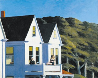
This is the kind of room Edward Hopper paints. There is a man in shirt-sleeves, sometimes a secretary too, or maybe a couple in a hotel room. It is night – the light harshly electric – or, as the bright, low sunlight suggests, the beginning or the end of the day. It might even be ‘one of those bright summer mornings we get in California before the high fog sets in’. Although Hopper was from the East Coast, sentences like the ones I’ve quoted from the opening of Chandler’s The Little Sister, and clips from Hollywood gangster movies in which the photography is high-contrast black and white, best set the scene for his paintings. The paintings of George Bellows, say, who earlier recorded the look of urban America, do not imply narratives in the way Hopper’s do. His magazine illustrations and the drawings he made for his paintings have much in common. Both make you think about what is going on, what kinds of life are being lived, what will follow. The people you see through the diner window in Nighthawks are isolated from each other. Emotions – ‘I’m sad and I’m lonely’ – common in songs do not often get into pictures.
Melancholy has a longer history. Caspar David Friedrich’s young man who stands, back towards you, looking out to sea could be suffering from it. Hopper’s men and women are ordinary Joes away from home or staying late at the office – lonely, a little sad, a bit miserable perhaps. His unpeopled landscapes are not wildernesses, just bits of cities or small towns where you could live cheerfully, but which, turned into subject-matter and noticed for themselves alone, show how a kid who wanted something more from life than life at home might see them. Foreign artists, photographers and film-makers in particular – Wim Wenders, Robert Frank – have a special liking for this aspect of the look of America. Hopper did it better.
The images get stronger as he gets older. The pictures he made during early trips to Paris in the 1920s have a nice feeling for asymmetrical composition; things happen on the edge of the frame as they do in Degas, but you would never know from them that Paris was the centre of a new kind of art. Back home in America he is more an observer of fact than a creator of mood. The watercolours, which are not particularly well represented in the Tate exhibition, and are closer to Winslow Homer’s than to those of his more adventurous contemporaries, are still a pleasure to look at. If there is such a thing as good plain painting, this is it: clapboard houses, a lighthouse, a bit of Victorian Gothic.
Later he stopped working from what he called ‘the facts’. The pictures become larger, and more constructed: there is less observation. If the people and furniture had been made out of papier mâché, put on a stage and lit you would lose very little. His trees and waves were always a little solid, a little lumpy, and now the buildings are, too. The subtlety of painted marks, translucency, handwriting – all the things which give quality to pictures as objects, and which are present in the early paintings – have been abandoned, as has the subtlety of the light. The reward is tremendous weight and presence; the downside emotional crudity. They are built film sets: you know they are not real, but can’t quite work out what has been steepened or exaggerated.
When you look for European comparisons, Magritte is, rather oddly, one which comes to mind. His pictures, like Hopper’s, are not very interestingly painted, and he too created images which can easily be borrowed because so little is lost when the personality of the surface is stripped away. It is the set-up, the idea, which matters. In both cases reproductions are almost as good to look at as originals.
Hopper’s late pictures, like sad songs, deal in emotions which are easy to feel and hard to talk about without seeming sentimental. Even when they are a bit dumb, they get to you. If he had become a more subtle painter, if he had got better at showing the look of real scenes rather than emotionally telling imagined ones, he would not have become the visual laureate of heartbreak hotel.
Send Letters To:
The Editor
London Review of Books,
28 Little Russell Street
London, WC1A 2HN
letters@lrb.co.uk
Please include name, address, and a telephone number.


