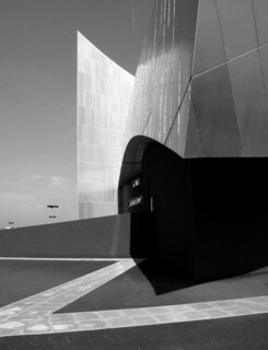
Acouple of miles from the centre of Manchester, on the bank of the Ship Canal, the Imperial War Museum North stands – all bright in gleaming aluminium. A new pedestrian bridge crosses to it from the Lowry Centre’s agglomeration of theatres, galleries, shops, restaurants and bars. Old Trafford, the Manchester United football ground, is a few hundred yards away. On the tram ride out you pass building sites and the gaunt trusses of an overgrown railway bridge. Although the museum that Studio Libeskind have designed is no longer the newest, and was never the toughest or largest piece of architecture in sight, it has an authority the others cannot match. The Lowry Centre glistening on the other side of the canal – it, too, is clad in silver – looks, by comparison, a muddle.
The museum is visually complicated. Only as you walk around it do you come to understand how one part relates to another and to appreciate its sculptural coherence. A model perhaps – something you could take apart and turn about in your hand – would let you understand it all at once. Daniel Libeskind says that the design is ‘fundamentally based on the contemporary world shattered into fragments and reassembled as an emblem of conflict’. In practical terms this means that three ‘shards’, bits of a fractured globe, are arranged to make the three parts of the building: you start with ‘wind’ (an entrance tower and viewing platform); go on to ‘earth’ (the main exhibition space); and finish with ‘water’ (the restaurant, which looks out over the canal). No wall makes a right angle with any other and there are points from which it is not easy to follow the geometry of the curved metal-clad surfaces. I am tempted to read the way the outer walls follow the acute angles of a Vauban bastion and the inner ‘silos’ (which house thematic displays) the twists of Great War trenches as a commentary on military engineering. But even the plan is really much closer to the abstract language of Russian Constructivism than to the geometry of 17th-century fortifications. When you begin to walk about, it is Tatlin’s tower, agitprop and pavilions for world fairs which come to mind, not bunkers.
The tower, which rises over the entrance space, is generous and full of daylight. Once inside, you can see the armature which supports the aluminium cladding and the viewing platform. Looking up, you are reminded of a cathedral crossing. Stairs then take you into the primary exhibition space, as shadowy and dim as a Romanesque nave. Here the curved ceiling is covered with long angled strips of artificial light: the visual equivalent of the strips of windows in Libeskind’s Jewish Museum in Berlin. Despite some major hardware (a suspended jet fighter, a Russian tank) it all seems rather empty until, on the hour, you are warned that the lights are going down and that loud noises will follow. Fifteen minutes of commentary and projected pictures then fill the air and cover the walls – sometimes repeating the same image (poppies, for example) all round, sometimes mixing them. In between times you can attend to the chapel-like silos. Displays of relics, labels and wall-writing point not just to violent, odd or outrageous things, but to the benefits which sometimes follow a war – the NHS has its own show cabinet. At this point you may begin to feel a dissonance between the building and its use: to find that the rhetoric of the architecture and of the sound and light show which justifies its darkness, scale and arrangement is out of step with the dispassionate analysis of war and of the sadness of death and destruction which the Museum’s content examines without dramatic flourishes.
It is not small, but the kinds of building it relates to are architectural pavilions, buildings built for the sake of building: summerhouses, follies, memorials, structures which offer the pleasures of an architecture tied to no important purpose. Bramante’s little Tempietto, a chapel too small to hold a congregation; Burlington’s Chiswick House which was, Lord Hervey said, ‘too small to live in and too large to hang to a watch’; or Mies van der Rohe’s German Pavilion for the Barcelona Exhibition of 1929 (an exhibition building in which nothing was exhibited): all survive in histories of architecture and in the buildings they influenced while the picnics, ceremonies, receptions and propaganda they contained are forgotten. It is in this spirit that the Serpentine Gallery has commissioned the pavilions which have decorated its front lawn for the last three years – it was Libeskind who designed the one for 2001. They are playthings in which architecture achieves the irresponsibility and autonomy of art. But Libeskind is serious even in his play. Marc Schoonderbeek, in a statement which heads a Libeskind website, says: ‘In his view architecture is seen as a spiritual domain, a realm that cannot be visualised, an area of invisible presence since it deals with the unspeakable. Without spiritual content and without a contribution to a deeper understanding of our Being there can be no significance in any building.’
A building which has ambitions like these can be in competition with what goes on in it – can even make the intended use seem redundant. The Berlin museum has won high praise from people who visited it before anything was installed. The commentary of the sound and picture show I wandered through in Manchester was disinterested and calm – which is the Imperial War Museum style. But the big, blurred picture projections lack the specificity an original photograph and caption give. The architecture demands a kind of display which is at odds with the tone both of the words and of the spirit of the institution. Instead of ‘contributing to a deeper understanding’ the windowless space becomes oppressive.
Libeskind has proved that expressive architecture is possible, that you can make wonderful buildings which do not feel empty even when there is nothing in them. But, sitting in the ‘water’ shard, my mind wandering around the concept of a fractured globe, I wondered – as I watched the ducks and took my tea – if it wasn’t a bit like picnicking on the Cenotaph.
Send Letters To:
The Editor
London Review of Books,
28 Little Russell Street
London, WC1A 2HN
letters@lrb.co.uk
Please include name, address, and a telephone number.


