Paul Klee drew many different kinds of picture, and the exhibition on at the Hayward Gallery until 1 April, Paul Klee: The Nature of Creation, arranges them by kind rather than chronologically. The juxtapositions are both logical and illuminating. (‘Drew’ because in most of his work there is more drawing, or drawing and filling in, than painting.)
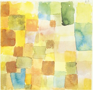
The first kind is pictures made up of more or less irregular grids of differently coloured rectangles: from the tiny Tunisian watercolours of 1914 to Ancient Harmony (1925), and (not in the exhibition) New Harmony of 1936.
Another kind of picture begins with the pipe-cleaner doll figures in the Candide illustrations of 1911. Later, their scratchy lines transmute into string-like tangles and knots in which the wandering line, the ‘point which sets itself in motion’, discovers, like a planchette, motifs which the artist seems not so much to invent as to observe. Yet there is little which is random: in pictures like Bird Drama (1920) and Distillation of Pears (1921) each line has a plausible meaning.
It was in the 1920s that Klee began to use a technique of oil transfer drawing, in which ragged-edged lines make elegant twists and turns like pieces of frayed thread. In Dance of the Moth (1923) and Mountain Formation (1924) these are read over a background of watercolour in rectangles which pale from a dark green border to a cream centre. In these drawings, and others in which perspectives of box-like structures run off into the distance, transparent watercolour builds up overlapping areas, wash by wash. When overlaps are made on a rectangular grid, patterns like those of complicated woven fabrics arise. These effects, natural to watercolour, are hard to achieve in other media: there is no 20th-century artist of equal importance who depended so much on paper and transparency.
Another group is made up of pictures constructed from straight-sided cells. These images could be plans for complicated pieces of marquetry. In drawings like the 1926 View of a Mountain Sanctuary (black line and yellow wash) the process becomes manic. Here Klee’s art meets that of the mentally disturbed and of cartoonists who made drawing itself part of the joke (who, if they did not follow Klee, finished up at the same graphic destination). Some of Saul Steinberg’s games with the conventions of drawing can be mapped, move by move, onto Klee’s.
The marquetry pattern elides into an analogous one in which the lines curve and read as contours (as in Play on the Water of 1935) or as pieces of appliquéd material (as in Fishes in the Torrent of 1926). In another series, rectangular areas of pale watercolour are overlaid by fields of coloured dots – a second layer of pattern to counterpoint the first.
Almost all the paintings, despite their diagrammatic geometry, represent things. In Landscape with the Yellow Steeple of 1920 the ruled horizontal grid (drawn with a pen) is filled in with oil paint. The colour of an element – a hill perhaps, or a roof – changes from band to band. Black trees cross bands but other elements – the clock tower, for example – change colour. It is as though a scene was being looked at through a window of strips of coloured glass. In yet another kind of picture bands of horizontal lines, zig-zagging a little, meet at nodes, to represent man-made grids. In A Leaf from the Book of Cities and Residential District the rows and rectangles are filled with hieroglyphs of houses; in Horticulture with plant signs.
Movement has its own conventions. In Sailing Boats, Gently Moving, Hardnesses in Motion and Family Walk the eye is invited to glide, jostle or step out as it reads the elements (boats, box-like things, family and dogs) from left to right across the picture surface.
The pictures here from the late 1930s, when he was ill, are broader and simpler, the strong, curved lines are heavier – patterns of short marks on pale backgrounds. They still show things – an imaginary alphabet, a face, a landscape – but you read them first as strong patterns of line segments. A decade later, these fields of marks would seem to have prefigured what was happening in New York abstract painting.
From the time he was appointed to the staff of the Bauhaus in 1921, Klee wrote and thought a lot about the nature of art and how it might be taught, and in his catalogue essay Robert Kudielka turns to the writings for explanations. In hers, Bridget Riley tells how they have informed her own thinking about abstract painting. Yet despite its aphoristic power (the expression ‘taking a line for a walk’ suggests so much about drawing that a full gloss could fill volumes), it is hard to extract a coherent theory of art from Klee’s writing. To look at his different kinds of drawing, on the other hand, is not confusing at all. First because common scale and materials suggest that a single enterprise, a coherent investigation is under way.
Here I must declare an interest – I designed the catalogue of the exhibition. Going through the illustrations I had to take instruction on what to show. Should the mount, the neat black rule below (and often above) the picture and the date and title be included? When (as is usually the case) they are Klee’s own way of presenting his work it is now agreed that they should be. The effect is interesting. It is as if he was offering up his work as evidence – like the sheets of specimens in a herbarium or photographs in a criminal trial. Although this is not a list-maker’s work like, say, Claude’s Liber Veritatis, in which he made drawings of all his paintings (these are, after all, the works themselves), Klee’s labelling and mounting adds to the feeling that each is part of a campaign, an exploration of what graphic moves are possible in the post-Post-Impressionist world.
The pictures are also united by an elusive, but distinct, personality. The etchings of 1904-05 – like the Aged Phoenix and the Winged Hero – are sinister in a way which is only partly explained by the fact that Klee had recently seen work by Beardsley, Goya and Blake. Even in his later work, when a human presence enters it is either grotesque, so schematic as to be without mood, or troubled. His output is united by a particular feeling for what is decorative – which is why analogies with embroidery, inlaid wood, copy books, lace and stained glass come easily. He is willing to let a pattern spread over a surface, to make pictures which are not, in the classical sense, compositions – which do not, that is to say, lead the eye firmly and suggest tensions which the image resolves or sustains. Yet there is enough, even in the less obviously disturbed images, of the sense that something is out of order, that the world is odder than we have been willing to notice. It saves Klee from the chill which can settle easily over an Apollonian abstraction of form and equilibrium.
Send Letters To:
The Editor
London Review of Books,
28 Little Russell Street
London, WC1A 2HN
letters@lrb.co.uk
Please include name, address, and a telephone number.


