There was, I seem to remember, a TV quiz in which the contestants watched the prizes – toasters, stereos, food-mixers – go by on a conveyer belt. The new British Galleries 1500-1900 at the V&A are put together on the same principle. Except, of course, that the goodies are stationary and you walk the length of two floors of corridor-like galleries, admiring them. The things you see are oddly familiar. It’s as if the quizmaster had whipped round your own house to find the prizes – which in a sense is what has happened. This is a rearrangement of part of the V&A’s permanent collection, to show some of our (the nation’s) finest things, familiar both from past installation and frequent illustration. Arrangement and labelling are appropriately, if unrelentingly informative. We are shown, period by period, the clothes, furnishings, crockery and knick-knacks our ancestors – the best-off of them anyway – had about them.
There is a well-established pecking order, which puts useful objects below ones made just to be looked at. The come-and-be-charmed assemblages of antique shops and the sparser stand-and-be-impressed walls of dealers’ galleries, like the packed cases of design museums and the spaced-out objects in art museums, bear out the fact that modern eyes demand different kinds of display for different categories, and that these displays imply, in turn, different kinds of attention.
Here, the V&A is embarrassed by its riches. Along with furniture, textiles, metalwork and so on, it has (if one thinks only of European holdings) the country’s leading collection of post-classical and pre-modern sculpture as well as substantial holdings of paintings, prints and drawings. In general, these are herded into different galleries, which obey the usual norms. In the new displays, however, some of the sheep have been stabled with the goats. To take just one example, the marble portrait bust of Thomas Baker – wonderful whether it came from Bernini’s hand or just from his workshop – is shown not in stand-alone art mode but in explanatory design-history mode. Above him to the left is a copy of van Dyck’s triple portrait of Charles I. Baker took this copy to Rome for Bernini to model a sculpture on: the picture was supposed to be in hand at the time Mr Baker’s abundant curls were being carved. Surrounded by contemporary ephemera the sculpture’s timelessness is a little compromised. It does, of course, illustrate the taste of Charles and his Court – which was very much for European imports. Similar attention to the history of taste, rather than to that of British design and manufacture, justifies Canova’s Three Graces making a prominent appearance among our own fine furnishings, although his three flaccidly caressing girls, elegant as ever and clearly on their way to the dressmaker, are given a gallery to themselves. So one moves, not always happily, from looking to questioning – or at least being offered the information to answer questions one might not have thought of asking.
The collections in the V&A were first made to supply patterns, suggest techniques, improve taste and illustrate the history of the decorative arts. The last, incidental role has – as the new displays show – become dominant. But it is fair that this expensive installation should be directed towards the museum’s largest constituencies – the school party, the ordinary visitor and the curious tourist, rather than to craftspeople or design students, who still have the specialist and reserve collections they need, or to those who would rather their additional reading came on a page not on a label.* The explanatory mode comes into its own when curiosity overtakes you on the hoof – as it often does. How did the bedding on the Great Bed of Ware feel? Here are some samples of kapok etc to handle. How do you tell a Meissen porcelain statuette of a bagpipe player from one made at Bow? Here they are side by side, and explained. Anecdotal information can illuminate useful, commonplace things wonderfully. The Norfolk House music room (now with four sides, not the three you used to see) and the Great Bed of Ware are, in the first case, lavishly elegant “and, in the second, absurdly capacious. The vast early 18th-century embroidery from Stoke Edith in Herefordshire is stunning in its expense of labour as well as splendidly confident in its pictorial naivety. But to have Mr and Mrs Garrick’s bedroom furniture and her dress side by side; to have Horace Walpole’s Strawberry Hill Gothickery as well as his limewood neck cloth (carved by Grinling Gibbons, and worn at least once as a joke) and his coin and medal cabinet, inlaid with wood and decorated with little ivories; to have the 17th-century samplers and embroideries made by Martha Edlin, a girl whose pre-teen labours are a testament to the abilities of sharp eyes and small fingers (only documented because her work was preserved by the family over generations) – to have such things as these is the visual equivalent of a paragraph from Pepys or Fanny Burney. Without the explanations they would be as pretty and intriguing, but much less amusing and interesting.
Although the whole four hundred years from 1500 to 1900 are here, they are, more often than not, represented mainly by rich and highly wrought examples. There is taste in collecting as well as in making, and as one top-of-the-range display-piece follows another, right up to the prodigies gathered for the Great Exhibition in 1850, the V&A pudding can seem over-egged. When, near the end of the journey, you come upon E.W. Godwin’s ebonised mahogany sideboard in the Japanese manner and some pieces by Mackintosh, in which decoration has been reduced to almost nothing – things which could have been run up by a good apprentice without looking the worse for it – the eye, gorged on gilt and embroidery, gratefully follows the aesthetes into our own world, where ‘good taste’ is often minimal or, when it isn’t, often seems to be imitating a look borrowed from peasant houses on Greek islands, Indian villages or Swedish country cottages.
The first and perhaps the most influential source of such borrowings – of much minimalist Modernism as well as of ostensible Orientalism – is Japan. Some of the charm the paintings and prints from the legendary Japanese riches of the Boston Museum (on show at the Royal Academy, until 17 February, in The Dawn of the Floating World) surely derives from our ignorance. One of the lessons of the V&A display is that imagination applied to the half-understood influence is sometimes more fruitful than imagination constricted by knowledge (observe, for example, the stages by which classical detailing rises to robust excellence and tails off in unfelt correctness). If, in these Japanese paintings and prints, we could read the calligraphy, differentiate the faces, interpret signals of social class in costume (it would take a long time to absorb the information in the admirably full catalogue notes), we would no longer see them as timeless and beyond fashion, a false notion which ignorance offers as a comfortable alternative to the agitated reality of our visual surroundings.
But it is easy, too, to enjoy the reward of knowing even a little more. Take the note on the perspective view of the interior of Echigo-ya, the most famous draper’s in Edo, made in 1745 when the store was already sixty years old. One learns that it was ahead of Western establishments by a matter of a century or so in manufacturing its own lines, in offering cash sales at low fixed prices (no haggling) and productivity bonuses. Marketing tricks included putting out handbills and lending clothes to famous actors.
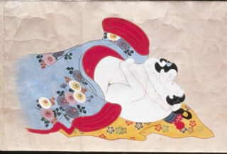
The pieces of cloth from which Japanese clothes were made and the posts, beams and screens of Japanese houses were firmly rectangular, while the patterns which filled them were often flowing and asymmetric. The appearance of perspective is a step towards the three-dimensional grasp of structure which affects anatomy as well as rooms. It is not, I think, just body-type which causes the figures in the images (like the entwined bodies in the Erotic Contest of Flowers, one of the prints from which is shown here) to appear soft, shapeless and dough-like. Their lack of structure is necessary if the flat patterns on the textiles are to be read. You can’t have everything at once, can’t present the flesh and the frock with equal conviction.
Send Letters To:
The Editor
London Review of Books,
28 Little Russell Street
London, WC1A 2HN
letters@lrb.co.uk
Please include name, address, and a telephone number.


