John Nash’s commentary on his 1810 plan for Regent Street was clear about the social implications of what he was suggesting: ‘The whole communication from Charing-Cross to Oxford Street will be a boundary, and complete separation between the Streets and the Squares occupied by the Nobility and Gentry, and the narrower streets and meaner houses occupied by mechanics and the trading part of the community.’
The plan worked. Soho, south of Oxford Street and east of Regent Street, is still largely unregenerate – the close-packed haunt of the libidinous and the frivolous, home to sex shops and food shops, bars and clubs, and small businesses. There are editing suites, film production companies, and publishers. At night an excitable, rough, too often drunk crowd jostles the dwindling numbers of those who actually live there and snarls up the traffic. Although the mix of tastes and lifestyles catered for has changed – Soho is no longer the only source of fresh pasta, copper pans and Toulouse sausages – the main suppliers and commodities are remarkably stable. Prostitutes, artists, meals, food, drink and entertainment were to be found there in the 18th century and they are found there still.
It was not, in the past, a healthy place – morally or physically. If the whores didn’t get you, infections did – which may explain why it gained so many hospitals in the mid-19th century. In 1854, Dr John Snow advanced the cause of public health – and epidemiology – by persuading the local Board of Guardians to remove the handle from the Broad Street (now Broadwick Street) pump. He believed water drawn from it was the source of a cluster of cholera deaths. Cases fell – evidence that the infectious agent was water-borne.
The cholera has gone but Soho still has room for marginal lives and businesses. When urban change is commonplace, why should this be so? One reason is that it’s never known any grand redevelopment. There are runs of office blocks but the commonest building type is the terraced house, with or without a shop below. The close texture and the life it encourages suits the Groucho Club, but would not do for the Athenaeum; it provides letting units which are right for small businesses. There is less room for big ones – will Bloomsbury, rich from the profits of the Harry Potter books, be drawn away from Soho Square, for example, just as the small publishers who once fitted neatly into a Georgian house were forced to move to bigger corporate headquarters?
Look at a new building, like the one going up at the Berwick Street end of Broadwick Street, and you wonder what it presages. Further east, in Covent Garden, a very similar district changed from fruit-and-veg to tourist-and-retail in the aftermath of a substantial change of use. That won’t happen in Soho, where there is no single dominant business. The scale of the buildings is, on the whole, matched by the scale of what they are used for. It would take a scheme of Nash-like proportions to change that, and London has become very protective of its picturesque bits.
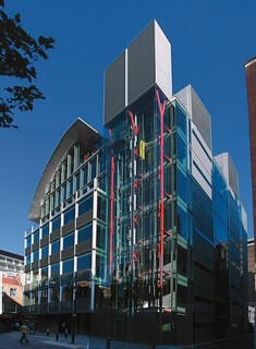
Broadwick House has no desire to be seen as the thin end of a wedge. It aims, to quote the architects’ handout, to ‘integrate with the distinct urban grain of its surroundings’ – despite being ‘a prestigious new office development’. It has to square that circle because it’s in the Soho Conservation Area. The site on which Broadwick House stands can be identified on the map John Snow produced to show the way his cholera cases clustered around the infamous pump. It’s next door to a brewery where the map has no little black marks indicating deaths. Snow found out why: the brewers drank beer.
The new building, designed by the Richard Rogers Partnership, is like a ready-to-wear design from a couture house whose more extravagant exploits are undertaken for private clients: it’s not a bespoke building, and although it’s been reported that the tenants will be the design studio of the Ford Motor Company, the client was a property developer – Derwent Valley Holdings. One can imagine design decisions being made on the basis of picking and mixing from a catalogue. The curved roof (‘the predominant architectural signature’) is an echo of the curved roof of the Partnership’s Hammersmith office; the glazed lifts and lift towers are now regular features in hi-tech buildings, although they weren’t when Rogers used them for the Lloyd’s building. The large panes of glass, unbroken by any sash, casement or air-vent (unless there’s something hidden behind the grills which cover the bottom part of each window) are a Foster signature as well as a Rogers one – and can be spotted in any number of new buildings by other practices. The red on the steel columns in the lift shaft is a Pompidou Centre touch.
Like the best of Soho’s 18th-century houses – the group in Meard Street, for example – this is a vernacular building only a little different from many others, which is all to the good. Of the current off-the-peg styles it’s one of the best. Its bits of showmanship are well directed: the curving roof, for example, gives a little more light to Berwick Street and its market than a wall would have done. At first glance it is a dominant structure, but as you get used to walking past and stop looking upwards, its reflections of the passing life of the street may be what you notice. In Docklands it would look too much like its neighbours; here, it lends a touch of class.
Send Letters To:
The Editor
London Review of Books,
28 Little Russell Street
London, WC1A 2HN
letters@lrb.co.uk
Please include name, address, and a telephone number.


