In
The Dream Colony, a memoir published posthumously in 2017, the gallerist and curator Walter Hopps mentions his first meeting with Andy Warhol, in New York in 1961, when Warhol was a successful commercial artist looking for a way out. ‘We agreed to keep in touch and see what came along. And what came along
It was Warhol’s first series: a single work in multiple iterations, drained of difference, and among the most mechanical images he ever produced – except that they were handmade. Photocopies of soup can images were projected, traced onto canvas and methodically painted, in the abridged forms of graphic convention. Warhol took pains over the curvature of labels, the lettering, the spacing, the gold centres, the fleur-de-lys motifs across the bottom. Apart from their names – ‘BLACK BEAN’, ‘TURKEY VEGETABLE’, ‘PEPPER POT’ – the cans are uniform: one for each variety of Campbell’s soup available at the time. In 1962 the paintings looked mass-produced – that was their conceptual shock. Half a century on, displayed together in the first room of the Whitney retrospective (until 31 March), they look like paintings, full of adjustments, negotiations between hand and eye, tiny failures or refusals to get things right. As always with Warhol, the apparent sameness starts to lift and pucker; repetition involves a play of difference. The soup can paintings are homemade and trying to hide the fact. Their yearning for precision anticipates Warhol’s discovery of photographic silkscreen printing, a few months later, as a mode of mechanical reproduction that could be appropriated for the studio.
What happened before silkscreen – Warhol before Warhol – is one of the Whitney’s priorities. This means the commercial illustrations of the 1950s and the images of his suave coterie that he was producing in parallel to his paid work. Alongside these camp felicities is work that is more private, clumsy and conflicted, but on its way to becoming the real Warhol brand. The allusive early drawings and collages are out-takes from his time at the salon of Otto Fenn, the fashion photographer whose studio on 58th Street was, in the early 1950s, a refuge, a space for collaboration and a dry run for Warhol’s Factory. But an air of wistful insufficiency clings to the drawings of an impossibly remote Truman Capote, the first of Warhol’s distant stars, or the many studies of bare male feet or penises, all done with a flowing Cocteau-like economy of line.
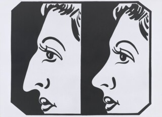
The early rooms show the confidence, and then the awkwardness, as the private atmospheres of Warhol’s early work are purged and replaced by anonymous imagery and a more distanced idiom. Where Is Your Rupture? (1961) is a painting of a medical diagram, showing a torso with arrows pointed towards some invisible stigma. Other works depict prosthetic add-ons: wigs, trusses, advertisements for nose jobs. The black and white images of household brands, dance step diagrams and tabloid disasters are heavy and entropic – many were painted in casein, the medium of commercial illustration before acrylic paint – and left half-finished, scrawled and scribbled with crayon. They convey the distractions of a consumer rather than the agency of a producer (it is worth recalling that passivity in Warhol always does a lot of work).
Photographic screenprinting involved a radical shift: from projecting and tracing an image by hand to reproducing and repeating images ad infinitum. To make the template, a source image – like a photograph from a newspaper – is used to fix a light-sensitive emulsion to the mesh printing screen. This creates a negative: areas of colour or line are left clear on the mesh for the paint to pass through; a stencil, in other words, that can be used over and over again. Accidents of registration or screen slippage (the image not lining up with the separately applied colour or colours) could occur, but were no longer expressive of the hand. Nor were they errors. No mistakes where none intended – a philosophy which would carry over into Warhol’s filmmaking. His illustration work in the 1950s concealed its basis in borrowed imagery. But he later became defiant about thefts, accidents, imperfections, failures. Warhol described the process of screenprinting as ‘quick and chancy – you get the same image, slightly different, each time.’ This introduced the idea of sameness as likeness, rather than identity: it gave Warhol a way to think about sexual and social difference. You could say that the silkscreen image tries (repeatedly) to conform and fails; it behaves in ways analogous to a person failing to conform, or a group of people richly failing to conform to an idea of themselves – whether drag queens or celebrities facing a polaroid camera.
Warhol was too ‘swish’, too extravagantly gay for the company he wanted to join (the straight-acting insiders of the new moment, like Jasper Johns and Robert Rauschenberg and Frank O’Hara). A successful commercial artist, homosexual, Catholic, working-class – the grounds for exclusion, or self-exclusion, were multiple. Warhol’s parents were Ruthenians from the Austro-Hungarian Empire. His father came to America in 1914, worked in construction and died young (there are echoes of Rothko, a generation earlier). Warhol moved to New York after graduating from the Carnegie Institute in Pittsburgh in 1949 and his mother came to live with him soon after. A decade later he was able to buy a house on Lexington Avenue with the money he had earned in advertising (‘The townhouse bought by shoe ads,’ as one friend put it).
As a commercial illustrator his task was to instil in the public an ardour for Americana. This became an adopted ardour, a second nature. ‘The Pop artists did images that anybody walking down Broadway could recognise in a split second,’ Warhol wrote, ‘comics, picnic tables, men’s trousers, celebrities, shower curtains, refrigerators, Coke bottles – all the great modern things that the Abstract Expressionists tried so hard not to notice at all.’ Warhol’s preoccupations are unlike those of any other Pop artist, however, as the prominence of the ‘Deaths and Disaster’ rooms at the Whitney suggests. Ruthenian Warhol is closer to Russian Rothko or Armenian Gorky – a fifth columnist inside Pop art, which had wanted out from the heavy accents of Abstract Expressionism and its exilic atmosphere, its obsession with the brushstroke and refusal to notice ‘things’.
The images on view in these rooms move between famous deaths – Marilyn Diptych (1962), Nine Jackies (1964) – and anonymous disasters. The latter includes deaths from tainted food (Tunafish Disaster, created from a Newsweek article), suicides, car crashes and the electric chair. Warhol wanted his first show at the Sonnabend Gallery in Paris in 1964 to be called Death in America, and it is striking that he first aimed these images at Europe. As he said, in his slightly estranged way, ‘I realised that everything I was doing must have been death’ – in other words that his subject was not only what ‘the great modern things’ stood for, but what they screened or concealed. Photography was a processed and borrowed form, but also the medium of collective witness.
The surfaces of these outsized works are flawless, their monochromes muted and indifferent. Warhol was interested in the forgetfulness or episodicity of silkscreen: that it repeats rather than remembers, which is why it comes up with the same story every time. The death of Marilyn Monroe on 5 August 1962 coincided with his earliest silkscreen experiments, creating an indelible association between loss and the medium itself. In the cases of Monroe and Jackie Kennedy especially, the compositions resemble an attempt to keep something alive by repeating it, as though one could produce a different ending. The merest survey of Jackie images in the Warhol catalogue raisonné takes up 150 pages.
The Whitney choices are crisply decisive and proportionate, one or two key examples from each sequence. But there is much that this fails to communicate about the way these works operate in series. The ‘Race Riot’ series would have been feasible for extended inclusion because it is a limited group – a dozen or so canvases, from which the Whitney has chosen only one. Warhol used three photographs from a Life magazine photo-essay of May 1963 which documented a civil rights march in Birmingham, Alabama, and, specifically, the attempt of one man to escape the police and their dogs. In the prints Warhol dispenses with the verbal frame of caption and headline, and variously rearranges the sequence of images, exposing the contingencies of any single arrangement. The silkscreen enlargement of the newsprint photograph reduces the visual information, as if trying to locate the violence inside the image itself, somewhere within the pixelated dots. In Red [Pink] Race Riot the screen is excessively inked, so that the profile of the main actor is no more than a rectilinear black smudge. This is why it matters to see the different states that Warhol experimented with – single, double, repeated – and the different saturations of red or mustard yellow. Only in series does the link between topicality and monumentality emerge.
The Warhol retrospective at MoMA in 1989, two years after his death, focused on the work of the 1960s; the Whitney gives space to what Warhol produced after he was shot by Valerie Solanas in 1968. The largest canvases are reserved for the last rooms – works of the 1980s, notably Sixty-Three White Mona Lisas, then a Last Supper partly concealed under a net of camouflage, and finally a vast canvas which depicts camouflage itself as an abstract pattern. These have been seen as art jokes, distended exercises in Dada. They also reinforce the sense of a falling-off after the gigantic Mao of 1973, in an earlier room, from the series which signalled Warhol’s return to paint, if not painting.
The loss of visual power is partly to do with film. After the early durational experiments of the 1960s, Sleep and Empire, which are so ravishing to watch, the low-end availability of sound recording became of increasing interest to Warhol. His camera stops looking and starts listening. He began to focus more on the grain of the voice than the grain of the face. This is perhaps the reason for his withdrawal from image-making. His observational preoccupations increasingly took the form of attention to voice and its properties – just as the tape-recorder comes to play a major role – and the written word as a printed voice. The lack of interest in how things look became integral to Warhol’s visual practice, sometimes with striking results.
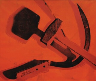
Whatever is going on optically, these ‘late’ works suggest the eventual dangers of scale. It is no coincidence that they are all one-offs: his instincts were surer in serial form, whether as painter or printer. Rather than any gesturing towards a fully fledged abstraction, it is the sly, roaming conceptual alertness, early and late, which matters throughout Warhol’s work. The only images that are conceptually inert are, in fact, his abstractions. But there are traces of humour in the later works: the way he dwells on camouflage as a substance in its own right, rather than as a covering; the way he treats a hammer and sickle as two objects from a hardware store, with shadows so heavy that they can never return to the symbolic sphere.
Warhol said that ‘Picasso was the artist I admired most in all of history because he was so prolific.’ His own output was statistical rather than individual – ten thousand paintings, sculptures and drawings, according to the catalogue raisonné, which doesn’t include the printmaking, the screen-tests and films, the videos and audio tapes, the polaroids and photographs, the diaries and memoirs. Quantity and quality are inextricable here, and the refusal to distinguish between them was axiomatic. The trouble with selecting from Warhol is that he was both unselective yet austere in his reliance on single images – one Marilyn, one Elvis, one Mao. Single but far from unique, and singled out for their ubiquity: the Mao image intrigued Warhol because it was said to be the most reproduced artwork in the world. The same could be said of The Last Supper or Mona Lisa (and one of his serial versions of the latter is entitled ‘Thirty Are Better Than One’).
If the corpus is distilled, the work shrinks – to representatives of a few dozen series, which fit easily into the rooms of the Whitney. Warhol rarely revisited a subject, but worked through an obsession and moved on. He also preferred installations to exhibitions: a tour of one new idea rather than a disparate gathering of recent work. Thus the multiple silkscreen portraits of Elvis at the second Ferus Gallery show in 1963, the box sculptures in the 1964 Stable show, the Castelli showings of flowers or cow wallpaper or Maos, the 1979 exhibition of Shadows.
The Whitney retrospective imagines an artistic career as one thing after another (as opposed to the same thing over and over). Warhol converted the many back into the one, the secondhand into the singular, the copy into an original. We need both the condensation and the sprawl, and in order to achieve this double effect the Whitney show – the first American retrospective in thirty years – would have needed to be rather bigger. It was billed as taking over the whole gallery, but in the event has shrunk to one floor, plus another area a few floors away, some corridors – strange breaks in continuity. The selection of eighty or so commissioned portraits that Warhol referred to as his ‘business art’ are brought together but separated from the main narrative. Yet these polaroid-based works – in which polaroid images were rephotographed with a 35 mm camera, transferred to acetate and then screenprinted, always at 40 x 40 inches to preserve the polaroid framing – occupied him for decades.
Warhol is above all else a portraitist, a maker of likenesses, and the majority of images at the Whitney could count as portraits (including the soup cans). The exhibition moves between entire categories of the genre: photobooth snaps, mug shots, self-portraits, screen-tests (in which each subject sat in front of the camera for three minutes – the length of a film reel – and was asked not to blink and to act naturally). In the case of the commissioned portraits, the business of being Warholised is as complex as elsewhere. A lot of money changed hands, and this was integral to the transactional nature of the portrait, expressed as a facial expression, a posture. If in the screen-tests the subjects gave themselves away, in the commissioned portraits they tried to buy themselves back. Warhol thought of the portraits as ‘one big painting’. They form a great souk of self-fashioning, of preening and posturing and staring.
Send Letters To:
The Editor
London Review of Books,
28 Little Russell Street
London, WC1A 2HN
letters@lrb.co.uk
Please include name, address, and a telephone number.


