The model Edie Campbell, long-legged, mullet-haired, horse-mad and posh, adorns the front and back covers of the March issue of British Vogue. On the front, she’s wearing a chiffon crepon dress by Gucci – a semi-see-through affair with cartoon-effect sequined appliqué collar, ruffles, epaulettes and bow. She’s lying on a pink and gold brocade sofa, half-smiling and biting her thumb. On the back she’s advertising Yves Saint Laurent’s new Black Opium scent, Nuit Blanche, in simpler style: pouting and slouching with an unnaturally dark mop. They form a night and day – the bright inviting magazine cover and the sulky dark advertisement – but they work in the same manner; the syntax where a stance signifies a mood and an expression sets the scene. The cover tells us that spring is here (pinks), that playfulness is à la mode (the outfit, the pose), that it’s nevertheless a grown-up mode – expensive, languorous, ingénue-sexy – and, perhaps, interpreted by Vogue as particularly British: the choice of model, her apparent ‘naturalness’ (in fashion speak ‘British’ means outdoorsy, aristocratic, pink-cheeked and rebellious) and devil-may-care-about-this-dress attitude (not by a British dressmaker, which might have been too much for the foreign advertisers) signified by her just-mussed hair. The Black Opium shot doesn’t attempt nearly so much, and it doesn’t need to; it’s only an advert.
Of course the March issue, which comes out in February, is already out of date, though the appliqué trend seems to be holding. What claim to permanence can fashion photography have, even that as grand as Vogue’s? At the National Portrait Gallery’s exhibition of pictures from Vogue on its centenary, ‘Vogue’ 100: A Century of Style, some, though surprisingly few, of the images are completely unfamiliar. Or perhaps its audience – and this is not a show for neophytes – just knows the types so well: English insouciance, le chic français. The entrance hall is created from columns of illuminated Vogue covers arranged by colour (a bit gauche, non?) and leads into a film gallery, where clips of models dancing and cavorting, pulling faces and rolling their eyes, transfix the incoming crowd. All the footage is recent – made for the exhibition perhaps, or at least for the age of the internet – and tells you little; less even than moving magazine covers. The models play-act themselves as characters, like ballerinas pretending to be gawky. But the audience doesn’t seem to mind, they try to spot the model, or just gaze at them; three giant screens of youthful loveliness. ‘I don’t understand why Jake’s not interested in this sort of thing,’ one woman said to another. ‘He likes photography, but not fashion photography.’
Robin Muir, the curator, and the set designer, Patrick Kinmonth, have no doubt done their best but the Portrait Gallery is an awkward space. From the main corridor and the rooms that usually host the modern part of the NPG’s collection, they’ve created 15 chamberlets, sprouting from two corridors, themselves subdivided for the purpose. One enters near the end of the chronological sequence (every decade has a room); to the right is an eclectic group of images: Kate Moss’s silhouetted profile on gold (the millennium cover), two Corinne Day photographs (one of Kate again) and some earlier monochrome prints, including George Hoyningen-Huene’s 1930 Modern Mariners Put out to Sea, of two androgynous swimmers on a diving board, the old Penguin Classics cover for The Great Gatsby.
The far end of this group is presided over by Alexander McQueen, in a huge image blown up to fill a 12 foot archway. The designer most closely associated with the resurgence of British fashion in the last twenty years broods with cigarette and skull like a troubled Hamlet to Vivienne Westwood’s fairy godmother, both shot by Tim Walker. From this side of the gallery the rooms lead onto the 1990s, 2000s and 2010s as well as a small lightbox room with dayglo scenes by Nick Knight, but one really needs to go all the way in the opposite direction, through the 1980s and some unlikely in-between rooms (including a round-the-wall timeline that ought to be at the start) and then backwards through the 1960s, 1950s, 1940s, 1930s and 1920s, which run parallel to another corridor and a small Vogue ‘library’, in order to start at the beginning.
The beginning. British Vogue was born in September 1916, when German U-boats (really quite chic in their way – silver-blue with muscular lines) prevented the Americans from transporting their edition to British shores. Muir, in his catalogue introduction, points out that Vogue’s inception coincided with Haig’s launch of the tank at the Battle of the Somme, which gives you some idea of the seriousness with which the magazine takes itself. The exhibition is concerned with Vogue and world history, rather than Vogue’s own history; the wall texts summarise the major political and cultural events of each decade and as well as those images that are significant in their own right, there are many that are simply illustrative, and more or less equal numbers of fashion shots and celebrity portraits (do we really need Boris Johnson?). But the catalogue, the real star of the show, gives a thorough account of the magazine’s history. Condé Nast, who had bought the US version in 1909, wasn’t taking any risks by launching a British edition: American Vogue was the second most popular reading material in the trenches (after the Saturday Evening Post) and that was just the men. Its US editor, Edna Woolman Chase, claimed they liked the frills and furbelows: ‘a vastly different diet from mud and uniforms, boredom and death’. Brogue’s first issue looks depressingly parochial now – a dun background, serif lettering and small marionette emblem, the only text promising ‘a forecast of autumn fashions’. It didn’t advertise its new Britishness on the cover; buyers were accustomed to the American edition, which, for quite a long time, provided much of the content of the British one. But there was a shift in tone inside: not just the advertisements for Aquascutum and Burberry in their ethnic vehicle, but the Carrolline introduction: ‘“The time has come,” designers say, “to talk of many things, – of shoes and furs and lingerie, and if one flares or clings, and where the waist-line ought to be, and whether hats have wings.”’
Vogue’s first editor, Dorothy Todd, was indifferent to fashion, a tradition Brogue editors have, for the most part, happily upheld. Her tendencies lay avant-gardewards; sufficiently so that Nast got jittery and shipped her off to New York to learn publishing his way before she’d even begun (his approach was: know your audience). British Vogue’s official history begins not with Todd, or her temporary replacement, Miss Anderson, but with the wonderfully named Elspeth Champcommunal, who took over in time for the 1916 Christmas edition, informing readers that ‘the Parisienne’s day is not complete unless she wears the colour of spring.’ Champcommunal was more fashion-conscious than Todd; she knew people like Paul Poiret – the first person to design a dress, it’s said, that a woman could put on by herself. It’s not clear how the early editors were chosen, or what qualifications were expected in a country where to be fashionable had long meant to be vulgar and new dresses from Paris were kept wrapped in their boxes for two years. Muir says that Champcommunal occupied a senior role at Maison Worth, the French fashion house opened by an Englishman, Charles Frederick Worth (a Galliano avant la lettre), though that wasn’t until after her time at Vogue. Worth plays an important part in the Vogue story, though, and in the story of fashion altogether. Le Grand Worth, the first couture auteur, started the process that led to the catwalk. In 1846, aged 20, he went to Paris with £5 in his pocket, unable to speak French and not knowing anybody there, and before long was the king of dressmakers. Each season he held court, showing several designs in his atelier (on live models!) to select clients, who would choose their outfits and be measured up inhouse. Empress Eugénie, his foremost patron, was still waited on at the Elysée (until the Second Empire fell and she went off frocks), but high society women had made a concession, not just in going to showrooms rather than being attended to at home, but in accepting the notion of the ‘designer’, of being dictated to by a genius and subscribing to a brand (Worth was the first to sew his name into garments).
By the time Champcommunal was there in the late 1920s, Maison Worth wasn’t the only atelier in town: Chanel had worked her way up to couture from making hats for the demi-mondaines; Poiret had jumped ship from Worth in 1903 to start his own house. But the French kept a tight hold on fashion. The Chambre syndicale de la haute couture was set up in 1868 to maintain standards; they insisted that ateliers make outfits to order and present a new collection of 35 looks every season. The British were caught between diktats from Paris and the new authority of money coming eastwards across the Atlantic. America had the glamour of modernity: automobiles, cocktails and beauty, an industry of ‘soaps, skin-foods, lotions, hair-preservers and hair removers, powders, paints, pastes and pills’, Aldous Huxley wrote in Vogue, that had yet to take off in poor Europe. Champcommunal wanted to capture some of this lifestyle, even if her readers couldn’t afford it. And like Todd, who returned to the helm in 1922, she was close to the Bloomsbury set, and an emblem of Sapphic modernity herself (with Jane Heap of the Little Review to Todd’s Madge Garland, her fashion editor at Vogue). Woolf called her Champco, and borrowed her clothes: ‘How odd, it comes into my mind, is Nessa & my jealousy of each other’s clothes! I feel her, when I put on my smart black fringed cape, anguished for a second: did I get it from Champco?’
Todd continued the Bloomsbury association – between 1923 and 1927 there were more than two hundred contributions by or about the group. Clive Bell went to the Paris exhibitions, there were stories by David Garnett, features on Duncan Grant, and Woolf wrote five pieces, including one about Sir Walter Raleigh. Vogue still owed something to the society magazine that was the earliest incarnation of the American edition, and the first frontispiece went to Eileen Wellesley, daughter of the Duke of Wellington, photographed by E.O. Hoppé; one of Vogue’s early star photographers, he had established himself as a celebrity portraitist before the war. Actresses and society women were the first models; more risks could be taken with the actresses. Lady Diana Cooper and Viscountess Maidstone were photographed in contemplation and pearls, but Helen Lyons was captured backlit in a diaphanous white lace dress: as risqué and demure as Diana with the sun behind her legs. Muir has brought the original prints together, so one can appreciate the tints and crackles. The early photographs, from small plates, are romantic but not at all stiff. The actress Maxine Elliott, photographed by Arnold Genthe in 1917, demonstrates the American mood: gazing upwards, body half-turned in plaintive motion, she clasps the halo of her fur collar with diamond-encrusted hand. Her lips and eyes are heavy with make-up, and the light that strikes from the top left corner licks folds of fabric and flattens fur. It bounces off her proto-flapper black waves.
Todd’s vision lasted only three years. Vogue was losing money, and rapidly. Ms Todd was ‘browsing happily in rich pasture’, according to Chase (Todd wasn’t slim so this may have been a double dig), but ‘it was the wrong one.’ She might also have been referring to Todd’s relationship with Garland, who resigned with her but returned in 1932, or her illegitimate daughter, Helen. Alison Settle was brought in from the women’s pages of the Observer to help shift things down-brow: less poetry, more movie stars, and – fashion was shifting too – less couture and more ready-to-wear. The copyists – the wholesale manufacturers – had reached the department stores, and were beginning to exert an influence of their own: fashion was no longer entirely under the control of the Chambre. Young women were increasingly able to buy cheap clothes, and Vogue needed to translate haute couture into what women actually wore. Maintaining the link between upmarket and high street clothing meant maintaining its precious (and lucrative) relationships with high fashion advertisers.
Settle found Vogue awfully snobbish. She wasn’t allowed to travel by bus any longer and her staff thought her affection for the Tube ‘very lowering’. But that haughtiness was fading: Settle made Vogue a magazine for the Bright Young Things, who, according to Lesley Blanch, a contributor, were ‘cropped, plucked and pickled in cocktails and nicotine’. Vogue positioned itself as the authority for the new style. In Rosamond Lehmann’s Invitation to the Waltz, Kate goes to a dance in an apple-green frock (made herself) with a floating demi-cape, green stockings and silver shoes. ‘You look like the girl on the cover of a Special Spring Number,’ cries a younger girl in admiration. ‘Twisting to look at her cape, Kate said placidly: “I just took it straight from Vogue.”’ Garland remembered Huxley asking her, half-impressed, half-disapproving: ‘Are you dressed like that because you are on Vogue or are you on Vogue because you are dressed like that?’ Vogue’s lavishness was possible thanks to its patterns company, carefully managed in the UK by Harry Yoxall. Women still made many of their own clothes and they wanted the flapper dresses they saw in Vogue. Vogue’s pattern books saved Condé Nast from bankruptcy after the Wall Street Crash (he had speculated wildly).
In the images from the later 1920s, the editorial imagination at Brogue seems to come alive. Settle let her photographers build sets and create dramas. Cecil Beaton, Todd’s greatest gift to Vogue, broke new ground, photographing three socialites en fête and en champagne: Baba Beaton, Wanda Baillie-Hamilton and Lady Bridget Poulett in a grotto of cellophane-wrapped balloons, draped in silver baubles and wearing barely-there white dresses. His creations were balanced by the more traditional work of George Hoyningen-Huene, a master of studio lighting and cumbersome camera plates. The slow shutter times made it impossible to catch movement and they weren’t much good out of doors, so Hoyningen-Huene brought the outside into the studio and learned to mimic natural daylight.
In 1934, Settle was dismissed. Lord Camrose, the British press baron, had just bailed Nast out to become Vogue’s biggest shareholder, but New York retained editorial control, and Elizabeth Penrose, Nast’s protégée (and likely mistress) was sent to clear away the clichés. Brogue, she discovered, was ‘excessively sprightly’ and in need of American rigour. She didn’t like having to pay Evelyn Waugh 20 guineas an article either (the going rate was 12). Vogue swung like a pendulum with the moral moment: one issue covered Wallis Simpson’s dresses (by Molyneux and Mainbocher) and aperçus – the former Mrs Spencer serves seeded white grapes with little cubes of Dutch cheese (it’s ‘quite charming’) – before quickly retreating in the face of the abdication crisis. Once it was over, Vogue rushed to the Château de Candé. Beaton recorded the newly vulgarised Duke and Duchess of Windsor, as beautiful and brittle and un-majesté as any model or movie star. She was, Beaton said, ‘as compact as a Vuitton travelling case’.
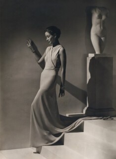
Vogue in the 1930s was in thrall to iconography: the classical lines of Greek sculpture found their way into Art Deco modernity and languorous evening gowns, draped across the front to skim the liberated figure (no corset!), before the dramatic sweep of the skirt. Toto Koopman, the Javanese MI6 spy, who later survived Ravensbrück, will always be, for Vogue, the woman descending the staircase in Hoyningen-Huene’s 1934 image, stepping out of the past (a Hellenic marble torso stands behind her); the nameless creation of a modern Pygmalion. Vogue resisted the future that was emerging in Europe. Its social commentator Johnny McMullin returned from Berlin in 1934 saying: ‘Why, I ask, is all this fuss about Hitler? No one could be more commonplace.’ Two years later, Margot Asquith had the (not) final word on the matter: ‘We do not believe in mock Mussolinis, silly shirts, self-advertising upstarts.’ When war came, Vogue rallied. The October 1939 editorial declared that the magazine would ‘maintain the standards of civilisation’ (and help you find a handbag big enough for a gas mask). ‘We are digging in for a long hard winter,’ Penrose cabled to Chase in New York, although she did not endure many more rough winters herself: she left Vogue in 1940 and the next year returned to the States.
Audrey Withers, who had started at Vogue as a subeditor in 1931, replaced Penrose. Her chief photographer Norman Parkinson described her as an intellectual who knew very little about fashion and thought it ‘slight and ephemeral’. Withers, like Todd, was more interested in writers and artists than clothes: Dylan Thomas, Kingsley Amis, Bertrand Russell and Simone de Beauvoir all wrote for Vogue under her editorship and she ran features on Gore Vidal, Isherwood, Bacon, Freud and Matisse. She employed Elizabeth David to write on food. And she was a socialist. Her serious-mindedness gave Vogue the gravitas it needed during the war. She wrote to Nast in 1940: ‘We try to look at each sentence and imagine how it will read in the face of all the disasters that may happen before it sees the light of day.’ Her agenda was apparent from her first editorial. ‘Women’s duty,’ she said, ‘is to preserve the arts of peace by practising them, so that in happier times, they will not have fallen into disuse.’
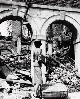
In Withers’s pages, fashion became a weapon, or at least propaganda. One photograph, which ran in 1941 under the title Fashion Is Indestructible, shows a model in Digby Morton suit and neat little hat, gazing away from the camera at the ruins of Middle Temple. The Inn had taken a direct hit, but the façade survived, and she stands arrested between two arches: a pillar before a pillar. Her expression as she surveys the destruction is hidden, making the image still more compelling: there is something happening within which we cannot know. Vogue models were photographed looking defiant in fire masks and pullovers or as land girls in ‘austerity’ trousers (Harrods corduroys and tweeds); one stares morosely at a turnip. Real women were photographed too, doing their bit for the home front, even the staff of Vogue gathered in the unglamorous cellar of their Bond Street office for a feature called ‘Here is Vogue, in Spite of All!’ Withers herself joined the Fire Brigade, and was annoyed not to be given the chance to drive a fire engine.
During the war, paper was rationed more strictly than sugar, and the magazine had to pulp its own archive to survive. It went from a fortnightly to a monthly publication and new subscribers were put on a waiting list – someone had to die for you to get Vogue. The war gave Withers the opportunity to loosen the reins of American control: the reproduction of photographs and features from the US edition almost entirely ceased. And the magazine had two of the most important photographers of the war working for it. Cecil Beaton, sent around the world on Ministry of Information work, had films relayed back to London: images of Chinese commandos and skeletal German tanks abandoned in the Libyan desert. Lee Miller, after spending the early part of the war documenting efforts at home, persuaded Withers to let her go to Normandy, and then to follow the Allied advance through Belgium to Germany. Her reports and pictures – including of herself in Hitler’s bath – are unparalleled. She feared her images of corpses in Buchenwald would be too much for the magazine, but Withers published them, under the headline ‘Believe It.’
After the war, there was Dior. The designer’s talent had already been noted and his first collection, in 1947, led to a frenzy of fashion editors waving their invitations, afraid, according to Brogue’s envoy, Bettina Ballard, ‘that someone might cheat them of their rights’. The romance of the New Look lay both in its strictures – the tightening of wartime dungarees and slacks to the line en huit and corolle; girdles and bustiers and envol drapings – and in the excess of fabric: 18 metres for just one outfit. The designer John Cavanagh sat through the show ‘transfixed … in tears. The relief was overwhelming; the relief of seeing total beauty again.’ The government sent Madge Garland to Paris with £1000 to procure samples for British designers to copy. Garland had been working hard to raise the status of fashion design, forming the London Fashion Group, which later became the Fashion Council. British designers had neither the technology of the Americans nor the expertise and authority of the French, but fashion was a rapidly growing industry, as well as a postwar palliative. Norman Parkinson captured the new romance for Vogue with elegant wit, photographing Adele Collins out of focus in a red hat to mimic Kees van Dongen, and Wenda Parkinson (his wife) casually dangling an umbrella by Hyde Park Corner, her lamb box-coat draped over disdainful shoulders.
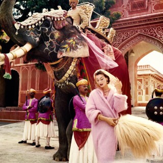
Colour brought the magazine to life in the 1950s, though for celebrity portraits Vogue continued to prefer black and white (it still does). Advanced processing technologies pioneered for the movies in the 1930s, and perfected by photographers like Horst, grew increasingly affordable (many metal-based inks were impossible to get during the war). Colour printing had always been emblematic of Vogue’s modernity and spending power – Nast insisted on full colour covers from the very beginning – and ‘Vogue’ 100’s small darkroom of slides show the luminosity and saturation that were now possible; the hues are as rich as any Boucher. More portable cameras made travel possible too, and foreign locations began to appear, in colour, as opulent backdrops. In 1956 Vogue went to India. Parkinson’s tonal portraits of Anne Gunning and Barbara Mullen – one in pale watery blues, one in dusky green, others in gold and pink – suggested an uncomplicated global elegance. The 1950s also saw Vogue’s attempts at egalitarianism. Irving Penn invited tradesmen into the studio – fishmonger, bricklayer, street sweeper – for a ‘Small Trades’ feature and photographed them in their work clothes. Photojournalist magazines like Picture Post had been publishing such images for years, but there was something different about this version. Penn’s workers have the appearance and attributes of documentary subjects but Vogue made them glossy – they are portraits in the officially sanctioned sense – and in doing so glossed over something.
When Withers retired in 1959, she left Vogue more independent and three times as long. Her successor was Ailsa Garland, (no relation to Madge) who came from the Daily Mirror, and four years later the post went to Beatrix Miller; she’d worked at American Vogue so had already been instructed in ‘adjectival clauses and mincing dactyls’. Miller had proven herself updating Queen, and Condé Nast (the company now, not the person) wanted her to do the same for Vogue. ‘You must write for the most intelligent person you know,’ she told her staff, and ruled them firmly; when her secretary asked why half of them were crying in the toilets Miller shouted: ‘Healthy competition!’
In the age of miniskirts and Beatlemania, Vogue was in danger of becoming outmoded. Miller brought on young photographers – David Bailey and Terence Donovan were both in their twenties – and told them to capture the city, which for Bailey also meant capturing Jean Shrimpton, a new type of beauty: elfin rather than statuesque. The previous decade had started the trend (‘trends’ were a new thing too) for unashamed exoticism; the 1960s saw an equally uncomfortable taste for local condescension. Ros Watkins was photographed on the backstreets of Bradford surrounded by dishevelled schoolchildren (one of them appears to be pinching her bag) and the French model Mouche next to two old women on a London park bench. Vogue was taking fashion into the streets, but it was also using the streets to provide an elevating contrast. Not only is the model always better dressed, smoother, cleaner and healthier-looking, she is inevitably taller or standing on something to make her taller; an awkward intrusion of artifice into the real.
The exaggeration of the model continued in the 1970s, with Guy Bourdin’s sado-misogynistic images of female subservience to capitalism, and Helmut Newton’s confrontational glamour. Their photographs are very glossy, very grown up, and rather mean: the model is made and erased as never before. Allen Jones’s ‘Table’ and ‘Hat Stand’ (1969) appeared in a Vogue shoot. At the same time, the magazine published Angela Carter’s critique of fashion and the mass market and J.G. Ballard’s futuristic visions. Under Miller, Vogue emerged as the polished institution it presents itself as today. The shift away from clothes to bodies continued – photographs were ‘thank you notes to people for simply being beautiful’ according to one commentator. Shoots became stories, high and low culture were mixed up and re-presented with Vogue’s seal of approval, a sort of de-détournement which softened every sharp edge and made bedfellows of punk and Thatcher.
Once Vogue’s approval had signified something – the first bared head on the cover, the first cigarette smoked without a holder and the first black model all marked a social change – but by the 1980s it could no longer expect to lead the charge. Not only were edgier magazines serving the new moment – i-D and the Face both started in 1980 – but designers were taking directly from youth culture, which meant by the time the looks came round to Vogue it was equivalent to keeping a Paris dress in its box for two years. Lofty equalising and a slight out of touch-ness became the dominant tone: ‘It has come to Vogue’s attention …’ Yet the magazine maintains the air of telling you something you might not know, and of a benign didacticism in general. The March 2016 issue says that one should contrast prints, wear a man’s watch (perhaps it makes the wrist look thinner?) and that not only are coats now being worn properly again, instead of slung over the shoulder, but that they should be kept on all night as if to suggest you have somewhere else you ought to be (this might make for some warm parties).
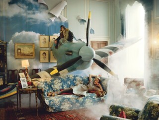
Alexandra Shulman, who took the helm in 1992, must have realised that Vogue still needed to be able to shock. She took Corinne Day and Kate Moss, who had made their names at the Face, and put them them on the cover of Vogue. No one minded Moss in the Face, but her appearance in Vogue led to outcries of grave irresponsibility (‘a nihilistic vision of beauty that mirrors the wasted silhouettes and pinched faces of drug addicts’). But Shulman has also kept the glamour stakes high, even if her version is less complicated and more whimsical than French, Italian or US Vogue, which are all disposed to be solemn about fashion as art. Brogue’s revenue means it can create the most decadent photoshoots, exemplified in recent years by Tim Walker’s fantastical sets (dreamy Alice in Wonderlands with spray-painted Persian cats) and Mario Testino’s hyperreality. The magazine’s many ads bring in tens of thousands of pounds per page, but it’s quickly spent: the cost of shoots goes into six figures, and star photographers charge even more. Shulman has tried to balance Vogue’s extravagance with an unfussy practicality, placing herself in its tradition of contra-fashion editors (though the magazine is less brainy than ever). She sees herself as more of a cultural documenter than a commentator or critic, and her Vogue is high on imagery, low on difficulty and full of tips; a more down-to-earth vision than its American, French or Italian equivalents. Her approach doesn’t earn her many fashion world accolades, but it appears to be working: Brogue’s circulation has grown to more than 200,000.
That British Vogue has reached its hundredth year is no surprise when one looks at its record. Readership figures have always been strong; above 100,000 for most of its existence. Its longevity and financial power – plus the strength of the American brand – has seen it acquire the authority it always assumed it had. The recent March issue sold more advertising than any previously. The threat of the internet hasn’t materialised yet; the allure of the glossy, its ridiculous weight in the hand, still holds. But one wonders, given the proliferation of fashion commentary and creation on Instagram and other websites, whether British Vogue will be able to maintain its status with gentle imagery and self-belief. Like many big print publications, it has been slow to develop online, and it’s now subject to criticism from an audience who demand more cultural engagement and greater representation. Vogue’s imperium grows unPC.
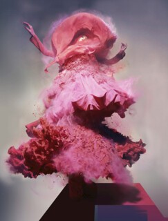
And do the pictures endure? Not as portraits; exhibiting them here and in this manner seems in every way a misconception. The crowd bustled hardest to get into the corridor containing 100 copies of the magazine (an issue for each year); once inside they moved slowly and adoringly, one woman stroked the glass as though itching to turn a page. It’s the magazine format that is loved, and this assortment of images doesn’t replicate that feeling, nor does it provide insights into the world of their creation. The Imperial War Mueum’s recent Lee Miller exhibition included early behind-the-scenes footage of Vogue that would have been useful here, while the V&A’s Horst exhibition two years ago was the model of a fashion photography show: beautifully curated and insightful, an education in the craft not only of photography but of set design, lighting, make-up and picture-editing – an education very much lacking here. ‘Vogue’ 100 cuts the magazine off from its own history, and cuts the images off from the possibility of greater significance. Modern Mariners is much more interesting when you know that it wasn’t taken by the sea at all but in a Paris studio, the horizon created by an out-of-focus balustrade and the woman’s hair slightly blurred to suggest a breeze, or that Nick Knight’s image of Lily Donaldson in Galliano and a cloud of pink dust needed two years of digital refinement.
The final rooms are disappointing. The supermodel isn’t what she was – the audience has trouble identifying them – and the images offer little intrigue, despite (or perhaps because of) the efforts of Photoshoppers and picture retouchers. Many fall flat, the gestures and poses too affected; their tropes grown weary through overuse (ungainly, girlish, vamped-up, languid, exotic, arty, theatrical, ‘real’): saturated novelty lacking in character. There are only really three expressions now: neutral (seductive), seductive (seductive) and faux-animated. The over-contrivance means a lack of drama, and loosed from their serial place in the magazine, they seem like finales without their preceding movements, revealing nothing, going nowhere.
Send Letters To:
The Editor
London Review of Books,
28 Little Russell Street
London, WC1A 2HN
letters@lrb.co.uk
Please include name, address, and a telephone number.
