If you cycle into Central London every day you see a lot of road: tarmac, grit, paving stone, cobble; the skin of the city. Cyclists are supposed to look ahead, and I try to, but as a child I mostly looked at my shoes and now I find I look at the road. The ground beneath our wheels is noisy, full of instruction, and the roads have their own language, even their own typography. London’s streets are much more written on than those in other European cities, and more vivid, with different coloured stripes and lettering; swathes of colour to demark green cycle zones, blue for cycle highways, red for bus lanes. Tarmac itself comes in endless shades, though most of them grey, and textures: smooth and light (good for speeding down); dark and gravelly; a nice mauve for patched-up bits. Great seams are sketched out on the fabric in shiny black latex piping, and the patchwork is studded with manhole covers, each bearing a different insignia, and the rips and cuts of drains.
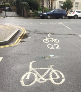
The language of the roads is standardised but the handwriting varies hugely. It’s not Transport, the round sans serif typeface designed for highway signs in the late 1950s by Margaret Calvert and Jock Kinneir. The official script is Pavement, an elongated form of Transport, but it’s only a guide: nearly all the shapes and lettering on road surfaces are hand-painted. Reading the roads every day, you begin to notice the different hands. Some do short, fat-bottomed arrows, with an even triangle for the head; others draw long stems topped with a flashy inverted ‘V’. A few are jaunty, most are austere. Some hands are rather shaky and in need of practice: you can tell where a painter was learning or lazy (Dalston has some terrible – terribly good? – examples). But there’s much artistry too, starting with the straightness of lines and the even dashes of parking spaces. Where there is variety, it’s hard to tell if fashions or individuals have changed. The bicycle symbols that were painted in Islington four or five years ago (that’s as long as road paint lasts) showed rather elegant, long, square-wheeled machines with tapered racer handlebars curving back like ibex horns. They only remain as ghosts now, and have been replaced with a new shape, rounder and with the fussy addition of pedals. Road symbols, like all municipal communication, seem to grow cuter but also vaguely patronising. Perhaps out of respect, the latest shapes are painted a few yards along from the older, fading figures.
The bicycles painted on the road mark cycle routes (I mostly go along Q2) and are the only pictorial figures found on the tarmac, though you very occasionally see a human-shaped character. In Paris the bikes are drawn with riders, which seems too descriptive. Most of our signs are so familiar we don’t think twice about them, and their shapes so standardised we consider them entirely impersonal. But before arrows began to point the way, in the 18th century, hand symbols were used – manicules. North was a fleur-de-lis. The red and white ‘No Entry’ sign is said to be based on the Habsburgs’ heraldic device (like the Austrian flag) and is so old because of the immemorial need to keep people out, or at least control their progress: the first one-way streets in London were introduced in 1617 by the Worshipful Company of Carmen (their cars were carts). Most road signs date from the invention of the bicycle, but the Motor Car Act of 1903 brought in four abstract shapes: a white ring (for speed); a diamond (for information like weight limits); a red circle (for restrictions) and a red triangle (for warnings). Some older signs – like the burning torch (of knowledge) for schools – have fallen from the official lexicon but can still be found here and there.
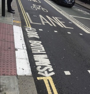
There weren’t any markings on the roads themselves till 1918, when Britain became the first country to paint a white line down the middle to keep cars from colliding. Pedestrian markings appeared later, during World War Two, when the edges of roads were whitened so that people could see them in the blackout. As late as the 1950s many of the markings remained optional – recommendations not rules – and presumably some sort of Brownian motion ensued. Now there are so many markings the roads need constant maintenance and one type of sign has barely faded before a new rule or style supersedes it. Figures are replicated to the point of incoherence: at some places along the cycle routes a bike is painted every three yards. A narrow cut-through I take, not wide enough for a car, has the words ‘Look Right’ on one side of the pedestrian crossing and ‘Look Left’ on the other, so close they’re almost touching. In other places lettering is bunched up, unreadable; arrows point in two directions; a cycle lane runs into a wall.
It can’t be denied that our roads are ugly. The tarmac is poor and patchy, riven with cracks and holes, great craters collapsing. Markings are often crudely painted and blotchy. The old signs are messy, like half-rubbed-out sketches. There isn’t much litter, but at weekends stretches of road sparkle with broken glass; debris gets caught in the seasonal conker and leaf mush and sludge. There’s far more horse shit than you’d imagine, and it stays for a long time, working its way into the texture of the tarmac. (Tarmac might be nastily man-made, but I’m glad we don’t have to cycle through 19th-century dirt.) The colour is depressing: endless grey is endlessly grey. I used to hate roads, with their nannyish impersonality, full of cars that made me sick, associated with life in the suburbs and driving always leading to something unpleasant at the end (all exciting things were arrived at via the Underground). The Tube, joyfully, obviates travelling on roads at all. But there are unexpected delights to be had on tarmac, and not only the delight of looking around. The street passes like a film reel beneath you.
Different London councils take different approaches to their roads; even within a borough the fancier – especially historic – parts seem to be given special and subtle attention. Around Columbia Road, the much gentrified border of the East End, the yellow no-parking lines are thinner and closer together than anywhere else, and more elegant (though the cobbled section is ruined by the new smooth cycle lanes down either side). I avoid the bicycle superhighways, which are often dangerous and indecently blue; but there are streets worth taking for their superior aesthetic – ones where you know that, on winter evenings and bright winter days, there will be stark abstract shadows of tree branches. After summer rain certain roads are full of bright colour, their broad puddles reflecting blue sky, green canopy, shopfronts. There are more idiosyncratic pleasures too: a large smudge of paint that looks like a woman in Victorian dress; an Arts and Crafts-style letter ‘A’ on Rosebery Avenue, with curved sides and a low bar (part of ‘BUS LANE’). As soon as character is ascribed or individuality recognised the script becomes quite human. I have only once come across an individual street painter at work, near Angel, marking out new parking spaces. With his left hand he poured white paint from a small pot on a long handle into a smaller container, like a jug, at the end of another long handle held in his right hand. He then neatly ran the smaller jug in dashes, each time fielding just enough from the container to make the same length and thickness of stripe. Sticks are sometimes used as a guide, though he didn’t have one (there are videos showing the skill of free-hand ‘street writers’ on YouTube). He told me, with disdain, that there is a trend towards machine-printed signs.
There is comedy on the roads too, the comedy of bureaucracy overdoing or undoing itself and especially the pleasure of bureaucracy interrupted and undermined. There are lots of things that shouldn’t be there, and that are worth diverting for, like the places where markings have been dragged or smudged: a repeating tyre, a footprint, a jagged line from a leaky paint bucket. An impossible number of birds seem to land in wet cement, cats too (after the birds?). There are some quite singular additions: a mysterious quincunx on the path in London Fields; hot pink graffiti on the road behind Sadler’s Wells that says ‘I miss your farts.’ It’s the only road graffiti I know, and it’s very cheering. I took an American friend to see it last year, but he wasn’t impressed. So much for him. Twice a year the trees paint the roads at a rate the sweepers can’t contain: first blossom then patterns of orange leaves. Certain routes have to be avoided for the autumnal preponderance of pine cones, horse chestnuts, fruit. Animals spend a good deal of time sitting in the quieter roads – mostly cats and pigeons, but also frighteningly large seagulls in packs and skulking foxes at night. All are reluctant to move or change course for a cyclist, just as I am for pedestrians, and stay where they are until the last minute. There is a natural hierarchy on the roads, beyond the remit of the council.
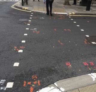
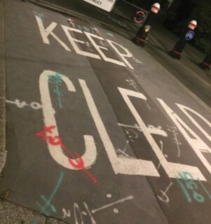
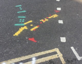
Few signs of anarchy can survive. There is a concordant pleasure, though, in the mysteries the streets still hold. On the borderland – the kerb – in Central London there are strange carved symbols all along the road edge: ‘H’s, ‘X’s, arrows, upside down ‘T’s and ‘V’s, crusader crosses with a dot in each corner, diamonds and triangles. They are probably masons’ marks, a form of authorship on the parts of the road old enough to have been hewn by hand. The history that was once laid down for archaeologists is now swept away, and the roads are largely a practical and unsympathetic affair. Still, there is charm in the language of utility, in the way it continues to betray itself. Ignorance allows certain aesthetic pleasures too: all over the streets are colourful marks made by contractors, instructions for workmen and guides to what lies beneath the tarmac. They take the form of lines and dots, words and circles and symbols, dashes and numbers, in red and blue and orange and pink and green. Because they describe what’s beneath the road, they ignore what’s above it, and so seem wonderfully rebellious, scribbling over pompous regulations. They gather in clusters where, presumably, work is due to begin, and though there is some obvious sense (‘W’ for water, I think, ‘BT’) their spiralling constellations and codes – Top T, HC, 0-44, dot, dot, line, dot, zigzag – read like a glorious childish nonsense. The best in recent months have been near Smithfield, on City Road, at a spot just north of the Barbican, and, conveniently, close to the London Review.
Send Letters To:
The Editor
London Review of Books,
28 Little Russell Street
London, WC1A 2HN
letters@lrb.co.uk
Please include name, address, and a telephone number.
