
The photographer Sally Mann tells a story about being at a dinner party with Cy Twombly – the two were friends from their hometown of Lexington, Virginia. ‘He was writing directions for somebody – how to get to the antique mall or something – and he wrote them and the guy said, “Oh yes, I know where that is,” and they left them on the table, and I swear to god – like Wagnerian harpies out of the rafters these people came swooping down on this little scrap of paper!’ The rapacious guests might have done the same for any famous artist (despite early obscurity, by the end of his life Twombly was being called ‘the most important living artist’) but the idea of a Twombly napkin has a sort of genius to it: so many of his surfaces, painted white or bare material, are repositories of scribbles, dribbles and smears, scrawled with lists and doodles and diagrams, written on then crossed out or rubbed out leaving only messy traces. After spending some time in front of Twombly’s work, you begin to look at your own bits and pieces differently. Post-it notes appear enigmatic, rarefied; full of teasing suggestiveness. In works like Ilium (One Morning Ten Years Later), a large triptych from 1964, Twombly seems to be trying to arrest this sensation, to make us see jottings and drafts as artefacts in themselves, in the same way that preparatory drawings and architectural designs, when hung on a gallery wall, can seem more appealing than the final thing.


But Twombly doesn’t take a napkin or leaf from a notepad and frame it, and he probably wouldn’t have liked the idea that his work draws our attention to discardable things. For all that his paintings groan under the weight of writing about them, and their own allusiveness (many feature lines of poetry or have ‘poetic’ titles), Twombly wasn’t an ideas artist. He disagreed with the notion that his pictures, with their layers of indecipherable words and crude genital drawings, were reminiscent of graffiti or toilet scribblings. Toilets weren’t beautiful, or interesting, to him. The distinction he drew was one of feeling: he used these forms in a different spirit, with a bell’anima. Perhaps this is why his more bodily paintings, like the Ferragosto series with their brown and red smears or Phaedrus (‘blood and shit’), seem less to point to some human comedy than to be funny themselves. Can you be crude and precious? Twombly’s earliest paintings, in thick black and white house paint, aren’t as winsome as the later work, but they already disclose his fondness for the effect bare bits of canvas can have on a painting – and unlike de Kooning’s black and white paintings, which are often invoked in comparison, they have no internal dynamism; he was more concerned with the canvas as an undetermined field.
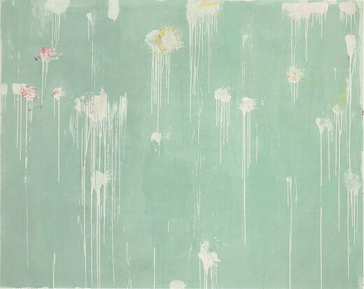
Twombly studied in Boston and Lexington, and in New York, where he met Robert Rauschenberg. The two of them spent time at Black Mountain College in 1951. Twombly’s early works, and many of the later ones, make sense as an offshoot of Abstract Expressionism. But it wasn’t the openness of Kline or Pollock that he was drawn to. Twombly liked working at one remove, obliquely. He always seems determined to complicate our responses to his surfaces; they can’t be read as straightforward action paintings. The retrospective at the Pompidou (until 24 April), which is arranged chronologically, charts the different distances Twombly wants us to have from the work. Part of the problem is literal distance. The white-on-white paintings (all called Untitled) from the late 1950s that open the exhibition are full of tiny pencil details and marks in crayon. When you stand back from them, the different shades of white paint create a strange luminescence under the gallery lights, but it’s only up close that you can see – and try to decipher – the flecks and scribbles. It’s impossible to take in a whole work; every time you approach one something different catches your eye.
Whiteness became a theme: white beneath the picture and more white paint on top, until whiteness and the picture seem indistinguishable. Discussing the Mediterranean, which Twombly claimed was white with mist for three-quarters of the year, he said: ‘I’d have painted it white even if it wasn’t.’ He didn’t add ‘but I’m happy that it was,’ instead he said: ‘but I’m always happy that I might have,’ as though the idea of the sea being white was more pleasing to him than the actuality; that the actuality even took away from the thought. In 1952, he and Rauschenberg travelled to Europe and North Africa by boat, disembarking at Palermo. There is a well-known photograph of Twombly in Rome, standing by the hand of the colossus of Constantine. In 1778, Henry Fuseli drew himself crestfallen, seated by the foot and hand of the colossus, and called it ‘The artist moved to despair at the grandeur of antique fragments’. His figure – lightly sketched – is almost invisible beside the giant remnants of the statue. Not so Twombly, who stands forthright in profile as though measuring himself against the hand. He doesn’t seem fazed by it.
In 1959, he married and settled in Rome permanently, though he would return to Lexington periodically and work there too. His big canvases began to proclaim an overt engagement with European art. The School of Fontainebleau is mostly bare material, with a great tumbling of white and blue paint in the top right and little smudges and pencil drawings; Dutch Interior seems more domestic with its square format and haphazard marks in red and brown (including what looks like a bird); then there’s the less successful School of Athens, which takes elements of Raphael’s fresco: the archway heavily sketched in pencil, blue and white paint for the sky beyond, the brown panels in the foreground, the arrangement of certain limbs and areas of colour. The relationship to the title in these pieces is neither quite straight nor ironic. Perhaps it’s simplest to think of them as personal responses. Twombly’s pictures are always more about Twombly than anything else. Superficially, with their blobs and streaks, they are interesting in the way other people’s mess is interesting: you want to look but don’t want to get too close.
This tactility appears to be missing from the Discourses on Commodus series: nine smooth grey backgrounds each with a double burst of colour, progressing through white, pink, red and yellow. They were first shown in 1964 in New York, where they went down badly. Now they are so revered it’s easy to laugh at the short-sighted critics and contemporaries, who deemed them ‘Europeanised and precious’. But in comparison with his other works of this period, the Commodus paintings do seem contradictory. They have a central object – the whorl of colour. The contrast of the grey gives them a ground: there’s a sudden artificiality about the pictorial space. The colours are so lurid they seem to mock the pretension of the title. Unlike the School of Fontainebleau, which makes the viewer work across its surface to take in all the disparate (and seemingly disconnected) details, here everything happens at once. Twombly’s better pictures, like Ferragosto II, maintain a lively tension between all the different marks and areas of colour; they don’t have any depth but instead launch off the canvas. They continue to be interesting to look at. The Commodus paintings are immobile; the double suggestion of blood and bouquets (they are usually interpreted as a response to JFK’s assassination) too artfully set off.
Twombly’s work begs to be measured on sentiment. Even his more conceptual-seeming pieces, like the ‘blackboard’ paintings with their looping lines of white chalk and little diagrams, don’t really want to relate to things in the world. They might make one think of childhood, of writing systems, musical theory, authoritarianism: Twombly was open to all these associations; but he was happy simply to register them, enjoying the suggestion of meaning itself. Perhaps because of this, the pictures can’t help but seem superficial (unlike Joseph Beuys’s installation of real blackboards from a lecture of 1972). This shouldn’t have to be a problem: the effect of being surrounded by Twombly’s work at the Pompidou – and it does help to see a lot of them together – is to give one a heightened sensitivity to surface detail and colour (strangely, he claimed not to think in colour, only form). The curators have been careful to keep related works together, and to prevent interference from contrasting pieces, though they didn’t account for the view over Paris from the room with the sculptures, which distracts everyone from the dribbly assemblages. But Twombly worked by reference, not seeking simple sensory responses. This often meant painting in series, and the series having a theme – like Commodus or Pan (1980), which features seven pictures, increasing and then decreasing in size, hung in an arc. The first one says ‘Pan’, the second is a red splodge, the third a red and pink smudge, the fourth – the largest – a green and pink and orange scribble, before declining into faded red and green, and the final piece a black dot. Within their series, these pieces have a logic; alone they seem lost. Titles – and all the series could be designated ‘variations on a theme’ – are often the beginning and the end with Twombly; he never seems to get further than the initial affect.
This is part of the difficulty of Twombly’s literariness. Many of the paintings feature lines of Romantic poetry, or classical texts, or have elegiac quotations for titles. Some of these can be read figuratively: Shield of Achilles is a crescent of blueish-purple scrawl with a burnished orange centre; Leda and the Swan could be an orgy of feathers and flesh tones. But this might be taking them too seriously. He was keen on symbolic elements – The Vengeance of Achilles is a pointed A shape with a red tip – but it’s not Twombly at his best. (He complained that no one in America recognised the misspelling in his 1978 series ‘Fifty Days at Iliam’; the ‘a’ is supposed to emphasise the connection with Achilles.) The more interesting reading of the paintings is as a representation of secondary effects: the fascination we have for techne, for the language of any specialisation; the way things sound better in French or Italian; or the emotional charge of the classics, particularly of lines that have come to us partially or paraphrased, like much of Sappho. It’s intriguing to think that Twombly might be trying to capture this lure of the fragmentary; certainly the intellectual discursiveness prompted by his work says something about our continuing desire to romanticise the past. But although he admired the sound of these fragments (sometimes conflated or reworded) – ‘Say Goodbye Catullus, to the Shores of Asia Minor’, ‘Eros, weaver of myths’, ‘Leaving Kyros the lovely’ – the works don’t reflect on this tendency so much as enhance it. He liked having early editions of books, first editions if possible, and he read widely, looking for the right line to stimulate a mood or to attach to a painting when it was finished. Some of them changed title when he found a better line. His working process was to read and think and listen to music and drink wine, then, after some hours contemplating, to paint very quickly – finishing in fifteen or twenty minutes.
In an interview, Twombly said that he fell in love with Italy not out of any scholarly (or art historical) interest but because of the atmosphere: the lazy atmosphere in Rome, la dolce vita, the loveliness of being surrounded by classical ruins. He described a visit by some friends to a house he’d rented on the coast: they came off their boat and the children ‘had a little lamb with a blue ribbon on it and they got off at the pier and all the people were amused … it was all very nice for a young person from Virginia.’ It’s easy to see how that would have affected him, how charming the idea of Italy is in his work. Henry James, a different sort of American aesthete in Rome, wrote about one of his characters: ‘But if his admiration for Pansy were a delusion, this was scarcely better than its being an affectation.’ One doesn’t want to be so hard on Twombly: no artist can invoke the classical without a strain of regret – Poussin does it too – and Twombly’s impishness and abstracted surfaces seem to intimate a new discourse. But then they go no further, or collapse into prettiness, like the late (and lovely) A Gathering of Time, and one wishes, if this has to be the choice, for the prettiness without the affectation, as in his Polaroid photos of flowers and vegetables, where the soft focus doesn’t detract from the strange and peculiar surfaces he enjoys. There are some particularly handsome cabbages.
Send Letters To:
The Editor
London Review of Books,
28 Little Russell Street
London, WC1A 2HN
letters@lrb.co.uk
Please include name, address, and a telephone number.
