In 1942 , the Ministry of Food issued the Emergency Powers Defence (Food) Carrots Order. The ministry had requisitioned all carrots ‘grown on holdings of one acre and above’ the year before, buying them in at twopence per pound, and it now had a hundred thousand tons to get rid of. Before the outbreak of war in 1939 Britain imported 70 per cent of its food. Rationing was introduced in 1940 and the humble carrot, cheap and easy to grow, had many advantages. The principal difficulty was getting people to eat them. In addition to recipes for carrot curry, carrot jam and a nasty-sounding carrot and swede juice drink called Carrolade, there were posters featuring the Ministry of Information’s Doctor Carrot, an avuncular fellow in spats and a top hat carrying a medical bag labelled ‘vit-A’. Like many wartime campaigns it was aimed at parents, particularly mothers, with the promise of healthy food for children. The ministry also resorted to the myth that carrots make you see in the dark, an advantage during the blackouts and, they went so far as to suggest, the secret of the RAF’s success in night-time raids.
The carrot campaign was one of hundreds waged in Britain and the empire with posters, leaflets and films throughout the war. By turns advisory, exhortatory or simply informative they were generally more stoical than bellicose and often humorous. David Welch’s account is based on the Central Office of Information archive in the British Library, with occasional excursions beyond it, and he considers a wide range of material. It was in the summer of 1939, when war seemed inevitable, that a propaganda strategy began to be worked out. A Chatham House report considered the possibilities and set out 86 ground rules. Some of them, such as the need to appeal to instinct rather than reason and to come up with powerful slogans and repeat them relentlessly, were based on a careful reading of Mein Kampf. Many of the resulting catch phrases, ‘Make Do and Mend’, ‘Dig for Victory’, ‘Careless Talk Costs Lives’, went into the language, though the one that is now most famous, ‘Keep Calm and Carry On’, did not. Because that campaign was intended for use in the event of invasion the posters were never distributed, and only became widely known when one turned up by chance in Barter Books in Northumberland in 2000.
Hitler’s hints were of only limited value to Chatham House. Totalitarian states have a natural advantage in manipulating public opinion and the British government was anxious to emphasise the difference between its own democratic constitution and the dictatorships with which it was at war. After a brief experiment with a Press and Censorship Board, serious efforts to control the media were abandoned. Lord Reith, who was briefly minister for information, believed that the news was ‘the shock troops of propaganda’ and that it should be as full and truthful as possible in order to be believed. This became the official position, a change of policy that left the ministry floundering, caught between press demands for information and wary defence staff refusing to give it. For some time the department in charge of boosting public morale was, Welch points out, itself seriously demoralised. Matters improved in 1941 when Churchill’s friend and fixer Brendan Bracken was put in charge. For the rest of the war the ministry produced propaganda that for all its directness and reliance on repetition conveyed subtle messages. It was always going to be a people’s war, affecting civilians as much as the military and, as Churchill warned in a speech in 1901, such wars would be ‘more terrible than those of kings’. Coinages such as the ‘Home Front’ and the ‘Kitchen Front’ acknowledged the dangers faced by the general population, as well as encouraging their efforts. National camaraderie was bolstered by making important figures seem ordinary – Princess Elizabeth in her ATS uniform stripping down an engine – while ordinary people were made heroic. The fire-watcher and the air-raid warden appeared on posters picked out in silhouette as guardian angels haloed by a night sky full of fire and searchlights.
Women were the specific target of numerous campaigns. As mothers and housewives they kept the home fires burning and, according to Fifty Facts about the Women of Britain at War, in 1941-42 they picked two hundred tons of rosehips to make baby syrup. They knitted socks and as instructed applied ‘decorative patches’ to holes in their family’s clothes. But they were also recognised as a valuable untapped resource. Pamphlets with titles like ‘Eve in Overalls’ urged them to take over from the men at the front as factory workers, dispatch riders and bus drivers, and to play ‘the role which they deserve’ in the war effort. One of the most powerful and enduring images of the war itself was created for this campaign. Laura Knight’s oil painting, Ruby Loftus Screwing a Breech Ring, among the largest pictures commissioned by the War Artists Advisory Committee, was shown at the Royal Academy Summer Exhibition in 1943. It was widely reproduced in newspapers, became the subject of a Paramount Newsreel and made Ruby famous. Indeed, the propaganda aimed at getting women out of the home was so successful that after 1945 it required considerable efforts and much emphasis on the role of the ‘housewife’ to get them to go back in again, efforts that were only ever partially successful. The Second World War, like the First, marked a permanent expansion of the possibilities open to women.
The British propaganda machine had one particular advantage over the enemy that Welch does not consider. It is surprising in such a highly illustrated book that he gives virtually no consideration to the images themselves, which owed their effectiveness in large part to the great flowering of graphic design in Britain between the wars. In 1918, Frank Pick of the newly amalgamated Underground Electric Railways Company briefed the calligrapher Edward Johnston and his pupil Eric Gill to create a symbol and a typeface that would give visual identity to the unified network. The Johnston Sans lettering and red, white and blue roundel of the London Underground marked the beginning of a golden age. As well as the precisely detailed stations there were travel posters, which in turn influenced other kinds of advertising, notably the work commissioned by Shell Oil. By 1939 Britain had dozens of designers who knew how to convey a persuasive message in vivid and appealing imagery that was technically suitable for mass reproduction and accompanied by smart, clean lettering. One of the best was the lithographer Frank Newbould. Before the war he supplied designs for posters encouraging people to visit Southend by rail – a scene of colourful deckchairs on the prom – or ‘Edgware by Tram’, which suggested Edgware was little changed since Dickens’s day. Most popular and long-remembered was the jolly fisherman being pulled along a beach by a little girl in a swimsuit over the words ‘Skegness is so bracing; It’s quicker by rail.’ This graphic vocabulary translated easily into a series of war posters: ‘It’s your Britain, fight for it now.’ They included Alfriston Fair, a scene of swing boats and roundabouts, the South Downs and Salisbury Cathedral, a symbol since Constable’s day of English identity enduring in the face of change.
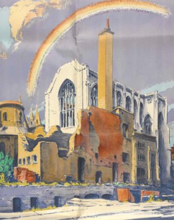
Newbould worked as an assistant to Abram Games, one of the greatest designers of the last century, who was in charge of official posters after 1942. Games had also produced images for London Transport and Shell in the 1930s, and brought a more sternly modernist vision to his work that did not always find favour with Churchill. Games was less concerned with a bucolic past than with an idealistic future, and his images of the present, including a child with rickets, were not thought to convey a sufficiently encouraging message. By contrast, his ATS recruiting poster was altogether too encouraging, featuring such a glamorous blonde that there were worries it would attract the ‘wrong sort’ of girl. His best designs were visual puns: a spade as a ship’s prow, a vegetable garden growing into a family dinner table. The ministry’s exhibition architect was another significant modernist, Misha Black, who had worked on the 1938 Modern Architectural Research (MARS) Group exhibition New Architecture. Overall, the ministry could call on the range of British art and design at its best. Some of the strangest images were by another former London Transport artist, Walter E. Spradbery, who worked in linocut and watercolour and produced posters during the Blitz under the title ‘The Proud City’ that were not obvious morale boosters. St Paul’s surrounded by rubble could be interpreted as a symbol of defiance, but its companion, which shows the Temple Church in ruins, the oldest part all but destroyed, is dispiriting, despite the rainbow in the background. Yet it was one of the designs chosen for use abroad. With its accompanying quotation from Charles Lamb translated into Farsi, it’s hard to imagine what impression it made in the Persian Gulf.
Welch observes a distinct trend in this kind of ‘bloody but unbowed’ propaganda. Even when Britain could rely on the strength of the Empire, and was indeed doing so, much of the rhetoric dwelt on standing alone. Nor, during the first years of the war, was anyone allowed to labour under the illusion that they were winning. Defeats were turned to advantage, most notably by Churchill, whose career as a broadcaster took off with the evacuation of the British Expeditionary Force from Dunkirk. Churchill appealed to those images of Metroland, seaside and rolling downland that the war had co-opted for its own posters, promising: ‘We shall fight on the beaches … We shall fight in the fields and in the streets, we shall fight in the hills; we shall never surrender.’ Dunkirk and the little ships that performed the evacuation became as much a symbol of national heroism as the Battle of Britain, which was also carefully presented, Welch explains, as an exaggeratedly unequal struggle. The ‘few’ to whom so much was owed were in fact ‘the world’s first and only fully co-ordinated air defence system’, and aircraft production was by then greater than the Germans’ by a factor of two to one. It seems that even a real victory had to be presented to the British as being, like Waterloo, a close-run thing.
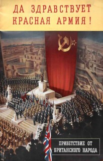
Russia’s entry into the war on the Allies’ side in 1941 caused a screeching of brakes in the propaganda department. Building on existing mistrust of communism, the Soviet Union’s pact with the Nazis had fitted an image that was easy to promote – of two brutal ideologies forming a natural alliance. Only the Daily Worker, which stopped criticising Germany after the Nazi-Soviet Non-Aggression Pact in 1939, had to be suppressed by Herbert Morrison in a rare instance of direct censorship. After 1941 it became necessary to see the Soviets as comrades in arms and to impress on the population that ‘Their Fight Is Our Fight’. Stalin was transformed with only partial success into ‘Uncle Joe’, a character who never exuded much warmth or reassurance, but Welch also includes an extraordinary image of the Albert Hall reconfigured as a Soviet rally, the organ obscured by a vast hammer and sickle and a headline (in Russian) reading ‘Long Live the Red Army! Greetings from the British People.’ In 1943, Laurence Olivier, who was something of a one-man propaganda machine in these years, helped out by starring as a Russian engineer called Ivan Kouznetsoff in the film Demi-Paradise, in which Kouznetsoff comes to Britain and soon settles down and makes friends.
When it came to demonising the enemy the approach seems to have been calibrated according to nation. Japan was unknown to most Europeans. So while detailed depictions of hand-to-hand fighting were generally avoided as more disturbing than encouraging, Allied soldiers bayoneting combatants over the slogan ‘Smash the Japs’ were thought to be effective. Japan could be presented as a buck-toothed bug-eyed spider whose legs spread with the rays of the rising sun to entangle Korea in its web. The Italians were by contrast generally fat, ridiculous and not strikingly less appealing than Stalin. Hitler could be anything from a jolly Fougasse cartoon, eavesdropping on careless talk on the bus, to a figure like Goya’s Saturn Devouring His Son, with the skulls of France, Romania, Poland, Belgium, Greece and Jugoslavia [sic] at his feet. Yet at this darkest end of the range, where many images laid emphasis on the Nazi persecution of Christians, the Holocaust did not feature, even when the facts were known. One reason for this, Welch suggests, was that after the First World War a population that had been fed endless stories of Hun atrocities had been disillusioned to find them exaggerated, and resented having been lied to. The other more potent and disturbing reason was the level of anti-Semitism in the British population. Home Intelligence Reports constantly recorded complaints about Jews controlling the black market and dodging military service. Thus the postwar situation was the reverse of that in 1919. Only after VE day did the population at large begin to understand the full horror of what they had been fighting against.
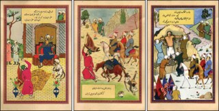
Welch has a good section on propaganda for the empire, which had its own version of carrot-and-stick messages: ‘British Ships Guard African Shores’ and ‘Thank You Sierra Leone’ sounded the positive note. At the same time there were pamphlets explaining why German colonisation would be much worse than British: ‘Germany would make West Africans into slaves’; ‘Britain is your friend and believes in progress for all.’ More cheerful and original were the postcards by the Egyptian cartoonist Kimon Evan Marengo, who worked as Kem. These told the story of the war in images based on the 11th-century Iranian epic the Shahnameh. The three warriors who defeat the tyrant Zahhak, who is Hitler, are drawn in the style of a Persian miniature, except that on closer inspection the first has a cigar, the second a pipe and the third a cigarette in a holder. Just recognisable as Churchill, Stalin and Roosevelt, they have Hitler’s corpse tied over the horse beside them while Goebbels is dragged along at its tail.
Welch’s survey is broad and lively; it is just a pity that he takes so little interest in the imagery and the artists who created it. Not all their names can now be traced but many can, and the style and the ethos they created says much about Britain during the war and after, when Black, Games and some of the others went on to play an important part in designing the peace. Games created the logo of a compass with a helmeted Britannia’s head for the Festival of Britain where Black worked on the architecture. They made good some of the promises of their propaganda as the barbed wire came off the beach at Southend and the lights went on over the Dome of Discovery.
Send Letters To:
The Editor
London Review of Books,
28 Little Russell Street
London, WC1A 2HN
letters@lrb.co.uk
Please include name, address, and a telephone number.
