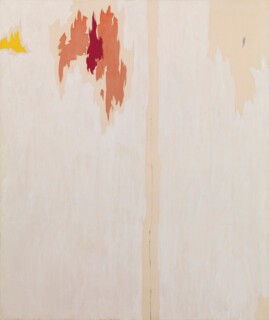
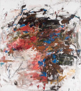
Among the many fascinating questions raised by Abstract Expressionism, on show at the Royal Academy until 2 January, is this: if I renounce depiction, refuse representation and fully embrace abstraction what the hell am I going to paint? The show gives the answers arrived at by 24 painters, not all of them American but all of whom worked in the United States between 1930 (Jackson Pollock’s haunted self-portrait) and 1979 (Joan Mitchell’s joyful Salut Tom, which pulsates with fluid light). One might suppose that the very term ‘abstract expressionism’ – it was coined in 1946 by the art critic Robert Coates writing in the New Yorker about paintings by Hans Hofmann – provides a clue: if one renounces depiction all that is left is expression.
But that would be a mistake, one often made when trying to understand some of the best-known works on show here. It leads to weak and unduly psychologised explanations: about Pollock’s so-called ‘Jungian’ swirling curvaceous abstracts or Rothko’s dark rectangular slabs which he supposedly made because he was depressed. For as these painters were to discover, when one renounces depiction one does not thereby jettison form, structure and content. The paintings exhibited here are not any more or less ‘expressive’ than others in the Western tradition’s vast repertoire, but they are more ‘abstract’, if by this we mean they are a-semiotic, without the support of marks that can more or less easily be taken to be either a deformation of something in the world (as in Cubism) or a visual language or code that by convention represents or intervenes in the world (Surrealism, German Expressionism). The works that these artists began to produce in the early to mid-1940s required a mutation in the grammar of looking. It was no longer possible to ask what this particular depiction looks like, since depiction-less painting looks like itself. Quite how radical, giddying and even disturbing this is can be felt some seventy years later in the rooms at the Royal Academy.
Perhaps the single most significant aspect of the New York art scene in the late 1930s was the presence of European artists fleeing Nazi Germany and its poisonous effluent elsewhere in mainland Europe. Many of them spoke little or no English and quite a few seem to have taken American artists to be hicks or backwoodsmen. Surrealism was the Europeans’ most high-toned calling card – although Duchamp was to push ever further away from any basis in representation as such, as he seeded the bed for Conceptualism. The Americans had to negotiate the all too evident presence of this European avant-garde. One can see the imprint of Dalí et al in the first rooms at the Royal Academy. Indeed Arshile Gorky never managed to get out from under Surrealism’s coded signs and sigla – a rare exception, perhaps, is his Still Life on Table, which gets more of its visual language from Cubism via Miró. De Kooning’s Untitled (1939) could almost be a low-wattage Matisse. These artists hadn’t yet dared to ask themselves what might transpire were they to push yet further and leave semiosis itself behind.
The answers they eventually came up with are remarkable. Once depiction no longer reigns, all the questions that any painting practice must ask, no matter what its era, suddenly land in one mega-dump on the studio floor: how to start, where to start, how to stop, when to stop, what size or scale, which pigments and supports, do I fill the entire surface, how dense should the picture space be, what should I use to apply the pigment (brush, roller, finger, foot), how much should I intervene once the support has begun to fill up? They all found ways of answering some of these questions while warding off others and created – retreated into – their signature styles. Once Rothko finds his chromatically reverberating panels or ‘slabs’, around 1947, he’s home and dry (his solution surely helped Patrick Heron and Howard Hodgkin find their paths out of the maze). The same was true for Barnett Newman with his discovery of the ‘zip’, the vertical line cutting across the continuous and perfectly smooth surface produced by the application of pigment with a roller. Perhaps to preserve the integrity of this signature, Newman destroyed all the work he had made before 1939.
And then there was Pollock. He didn’t invent the drip and pour technique (he joined David Alfaro Siqueiros’s experimental workshop in 1936, in which unconventional techniques such as pouring pigment were being investigated) but he certainly made it his own in the works by which we substantially know him. Between 1943, when Peggy Guggenheim started to take a close interest in his work, and 1952, when he made his masterpiece, Blue Poles, included here, Pollock explored the limits of the embodied techniques of painting that are so evocatively preserved for us in the photographs and film that Hans Namuth took of him in his studio in 1950. No one watching him in action as he dances over the canvas at speed – pouring, splattering, dripping, spilling the paint without any evident hesitation – could really imagine that this was a random and haphazard method: it was something deeply practised, driven by decision and intuition together.
The most pressing question Pollock’s techniques threw up was when to stop? Or, to put that another way, how much is enough? Before, say, 1890 no painter would have been too concerned with this question: when there is depicted content you can’t add to a representational space indefinitely if you wish to preserve its legibility. But once the picture space became ‘contentless’ the question of how much is enough took on a different complexion. Look how Pollock answers the question in 1943 in the mural commissioned by Guggenheim for her Manhattan townhouse: here the application of the pigment is through a brush, and the swirls and curlicues in seven main colours – pink, red, black, blue, yellow, green, white – are given space to breathe. At this point a Pollock canvas is still teeming with allusions and serendipitous depictions. Look at the canvas approximately two-thirds across moving left to right, and at mid-height you will see one of many faces (and inserted into this one there is another, right at its top, with a clear allusion to Picasso). At the far top right there is a form picked out in black that could be a mark found in Miró. Now compare this solution to the one proposed in Summertime (1948), where Pollock creates a sense of perspectival projection by giving the ground far greater mass or density: it provides a base for filigree patterns, swirls and swoops that create an extraordinary sense of rhythm and tempo. You can’t but look at this from left to right, can’t but feel the spring in its step. Sometimes less is more; here, more is more too.
The two stand-out canvases here by Clyfford Still – rarely seen because according to his will very little of his work could be put on public display until a museum was built and dedicated exclusively to him – are the deep black crevassed paintings PH 235 (1944) and PH 605 (1950).* The first shows what happens when painting is put under such pressure that it cracks, splits, fissures. Still has almost entirely given up on painting as such: the black pigment is worked onto the surface in multiple swipes, smears and scrapes of the palette knife, building up a thick layer of light-capturing blackness, as a builder might apply cement or a chocolatier temper chocolate. And in contrast to these to and fro gestures which lay down the support – here the canvas-as-support is dematerialised and rematerialised in front of our eyes – painting returns as red, yellow, green and white brushstrokes are overlaid on the strata of jet black.
Six years later, in PH 605, Still reverses the sequence. First he lays down the intense midnight blue that lies deep in the painting’s crust, and then, again with a palette knife, he applies the impasto black. Heavier than in PH 235, this pigment has reflective as well as absorptive capacity: it creates the sense of looking into deep space, or being embraced in geological deep time. But it doesn’t, really, because Still, even more rigorously than the other artists we call Abstract Expressionists, engaged with the fact that painting now looked like nothing other than itself. Pure abstraction, it turns out, doesn’t get less and less material, moving from objects, things, stuff in the world towards essence, spirit, Platonic Form; instead, it dematerialises only to rematerialise as itself. When semiosis is blocked something always rushes in to fill the void.
By 1958, when MoMA’s loan show The New American Painting toured Europe and gave its gallery-goers the first opportunity to see what had been happening in New York, Pollock had been killed in a car crash but the other artists were all fully settled into their styles. Retrospectives came in the following years – Frankenthaler in 1960, Rothko in 1961, Pousette-Dart in 1963 – but essentially the sense of the new had migrated to the idioms of Pop and Conceptualism. It looked as if it was all done. Not quite, it turned out. In Mandres (1961-62), Joan Mitchell created an astonishing summation of the various answers that had been proposed to the question of what the hell to paint. This is Abstract Expressionism’s greatest late work. Form, structure and content are interrogated and transformed by so vast a repertoire of techniques of pigment application that you lose count: look up close and you will see paint squeezed, trowelled, flicked, smoothed. Mitchell uses and invests with absolute conviction the swirl, smudge, scrub, swipe, smear, swish, scribble, drip, drag, dribble, scrim, splatter, splash, squiggle, wash, wipe, blot, dab, stab. There’s no painting I know like it. I doubt there could ever be one.
Send Letters To:
The Editor
London Review of Books,
28 Little Russell Street
London, WC1A 2HN
letters@lrb.co.uk
Please include name, address, and a telephone number.


