There are so many problems with watercolour. A mistake ruins everything: you can try to blot it out but the stain remains; you can rub it out but the paper bobbles and disintegrates. You have to choose the right paper to start with: cold pressed paper has bumps and grooves to hold the pigment and absorbs water quickly; hot pressed paper is smooth and finished, giving you longer to manipulate the surface colour. Too much water and the paper buckles; you must dampen and stretch it before you begin. And even then, you must know how best to layer the colour and how to control the bleed of one into the next. Eric Ravilious’s watercolours (at Dulwich Picture Gallery until 31 August) are so cleverly executed and reproduce with such finish that you have to get up close to see how they are done. His later drawings (as he called them) do things that shouldn’t be possible – how could he know just how the brush would dry as he made the stroke, so that the fading colour gives a sense of distance, or how that never entirely smooth movement would produce a neat stippled effect to mimic the play of pale light on a field, a stony path, clouds?
Born in 1903, Ravilious grew up in Eastbourne exploring the South Downs (sometimes sleeping out) and surrounded at home by his shopkeeper father’s wares: antiques, drapery, knick-knacks. He studied at the Royal College of Art, in the design school not the painting one, where he met Edward Bawden. The two shared a love of neglected landscape watercolourists – John Sell Cotman, Alexander Cozens, Francis Towne and Samuel Palmer; they made a pilgrimage to Palmer’s Shoreham in 1926. Paul Nash, who taught them at the RCA, described their cohort as ‘an outbreak of talent’ and helped Ravilious and Bawden to find work as engravers, creating bookplates and illustrations for the small presses, especially Curwen. Ravilious was called ‘the boy’ at college. A Pierrot-esque figure, he was good looking, ‘Pan-like’, sometimes otherworldly and distracted but also excited by pub games, ball games, songs, revelry, dancing, whistling. He retained his childhood passions: machinery, aviation, the Arctic, and liked exploring junkyards with his friend ‘Red’ Peggy Angus. Sooty tar engines and old gasometers were what Peggy called ‘the cat’s whiskers’ (she was born in a railway station). Painting the Morley College murals – a medley of English Renaissance plays, Punch and Judy scenes, a doll’s house – with Bawden and others was ‘a riot’, ‘gosh!’ Reading and illustrating Gilbert White’s Selborne distracted him from other jobs: ‘There are bustards on the wide downs near Brighthelmstone,’ he quoted in a letter. ‘Isn’t that a beautiful statement?’
One reviewer of his 1939 show at Arthur Tooth’s gallery said that Ravilious’s childlike power of observation was more important than his fine draughtsmanship, that he made you see the ‘wiriness of wire’. Ravilious did love wire, and telegraph poles, ropes, chimneys, masts, leafless branches, gates and fences. His school sketchbooks take the same subjects as his grown-up work: teapots and kettles, planes and ships, furniture and vases of flowers. He liked big shapes too – ‘definite shapes’. In later watercolours like The Vale of the White Horse (1939) he lets one mass, one swooping line, fill the page – the curved hull of a boat, the swell of a hill – before beginning the busy process of cross-hatching and stippling the surface.
Ravilious’s friends were more opinionated than he was and teased him about his Wedgwood coronation mugs; he was less a modernist than a romantic enthusiastic about modernity – delighting in ‘the still life of buoys, anchors, chain and wreckage’ he found at the docks as a war artist in 1940, not disillusioned and racked by the First World War. The new war meant opportunities to study machinery up close and to fly – his pictures had already been influenced by skewed and elevated perspectives. He was relentlessly cheerful: ‘It has been a wonderful trip with excitements here and there from planes and submarines … and going up into the Arctic Circle with a brilliant sun shining all night,’ he wrote to his wife, Tirzah. ‘The seas in the Arctic Circle are the finest blue you can imagine, an intense cerulean and sometimes almost black.’ He disappeared on a flight off the coast of Iceland in 1942, aged 39, to which the Dulwich show curiously doesn’t allude.
Paul and John Nash were great inspirations, as were Tudor woodcuts, Seurat, Bewick’s engravings. He settled on his palette very early, perhaps influenced by Francis Towne’s Alpine landscapes – dusky browns over yellow, grey blues, flat greens. Towne separated his washes in a way that seems to anticipate Cézanne’s geometry, another influence. Ravilious used to go through the door adjoining the RCA and the V&A to look at the Cotmans and old English prints. He was a prodigious engraver (he had to earn a living) but he was experimental too. He created his own scorpers, and picked up forgotten techniques from his research. As a design student, free from the academic strictures of fine art teaching, he indulged his magpie sensibility, which seems thoroughly modern, unlike his self-discipline: ‘he will spend hours,’ Douglas Percy Bliss wrote, ‘covering a passage with tiny dots or flecks.’ One page of his scrapbook has a photograph of a crown, a little watercolour study (clouds?) and a scrollwork sketch alongside Cézanne’s House in Provence and a scrap of newspaper showing a tennis player in full stride and 1920s dropped waist. He wasn’t so much nostalgic for the past as interested in the bits others weren’t, or hadn’t been. His ambition to ‘revive the English tradition of watercolour’ meant the tradition that preceded and had been swept aside by Turner; the cool, structural watercolours descended from travellers’ records and scientific drawings. Painting as design, painting as report. Ravilious liked improbable juxtapositions. Doing war artist duty on board HMS Highlander in 1940, he wrote about the joyful incongruity of having flowers on tables and chintz curtains – cottage life set against steam and steel. Now he has become something of an anachronism himself, admired for his modernism, dismissed for his parochialism; the nostalgia-fest over the everyday prettiness of his commercial work – the alphabet mugs, the gardening jug, the lemonade set – countered by claims that the watercolours are dystopian, dreamy, suggestively bleak and empty.
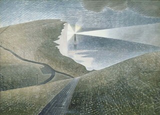
Nash had turned to design out of economic necessity, and thought that artists made the best designers. It was a few years before the reverse occurred and Ravilious’s design skills worked their way into his watercolours. In the early 1930s something changed; design and pattern became structural rather than merely decorative devices, and he began to see how mark-making could be used, over a graduated tonal base, to create a modern watercolour, as well as solving the tricky problem of filling up space in landscapes. He stopped painting in the mid-1930s; perhaps it was this break, his frustration with ‘toothpaste’ oil paint, and the switch from woodcut to lithograph printing for his shop-front series, High Street, that resulted in what Bawden called the ‘intentional completeness’ of later paintings like Beachy Head (1939), where ‘design has permeated the whole painting and conditioned its treatment.’
Downs in Winter (1934) and the 1938 interior scenes were clearly part of the progression, but the 1939 paintings are its culmination. They include the famous chalk figure series as well as Cuckmere Haven, with its surprising debt to Turner’s View along the Valley of a River at the Tate. Beachy Head has a simplified arrangement of one sweeping foreground plane and a second – the cliff edge – rising up, almost at a right angle, to meet the lighthouse, whose triangles of light divide the page again. The ground is bisected by paths and telegraph poles; the declension of colour across the landscape – greenish yellows and pale browns worked into darker greens that bring out the blue of the sea and sky beyond – took two nights of pigment notation to record. Lighthouses provided the (human) interruption of the landscape he often sought; he painted them at Rye, Newhaven and Dungeness too.
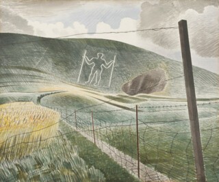
In The Wilmington Giant the landscape occupies two-thirds of the page (when Ravilious wanted to focus attention on a foreground object the picture would be two-thirds sky), framed by fence post and wire. The scene is split by a track which winds up to the giant’s feet, forming one of the strokes that give the hills their heft and curve. The grass underfoot is made up of dark tufty marks with fat golden strokes in perpendicular patches. Behind, the long yellow grass is a dappled wash with detailed cereal heads; dry brush strokes create a grassy fuzz. The short turf along the edge of the field is daubed in a wetter brush, which dries as the perspective recedes to leave the paper exposed – light on the valley. On the hillside the just wet cross-hatchings blend into one fabric; the white shows through as luminance rather than background. It’s hard to imagine now that Ravilious complained about finding landscapes that hadn’t already been ‘done’ by another artist; the South Downs are so entirely his.
The thematic arrangement of the Dulwich show can be frustrating – too many rooms take you back to the earlier paintings so that you chart his progression again and again, yet a masterpiece like Tiger Moth (1942) is placed outside of that context in the first room, ‘Relics and Curiosities’. Ravilious didn’t do much preparatory drawing and threw away something like four out of every five pictures (only ever attempting a subject twice), which makes it especially instructive to see the surviving ones together, but it’s odd that this, the first major show of his watercolours, barely refers to his methods. Did he stop out areas of white with wax or rice paste, as he wrote to John Nash, or could he deploy the dry brush so effectively that he didn’t need to? Did he scratch the surface with a razor or penknife or metal nib? Was he thinking of the Old Master prints at the V&A, or the schrotblatt technique of punched holes used by German engravers to create the background texture that he admired? When did he begin to wet the paper from behind, verso rather than recto, to prevent his pigments pooling?
The war meant addressing the difficulty of the figure again. Ravilious knew it was a weakness and had avoided depicting people since his early engraving days, except as faint shapes in the distance, coolly impersonal. There are plenty of empty rooms among the war paintings, the teleprinter room, the operations room, the sick bay, weirdly divested of human activity. The suggestion of life is always more humanising in Ravilious than people themselves – a roller left in the field, the teleprinter’s chair ajar (he must’ve popped out for a cigarette) – while the actual figures are generic: an imposing silhouette in a doorway, a bleached-out woman at a desk (the names are detached too: Room 29, Home Security Control Room). In De-icing Aircraft, the foreground is taken up with the snow-clad tail of a plane while far beyond the tiny figures go about their work. It’s Auden’s ‘human position’ except that it’s things, and the land itself, whose quiet existence continues against the backdrop of war.
Send Letters To:
The Editor
London Review of Books,
28 Little Russell Street
London, WC1A 2HN
letters@lrb.co.uk
Please include name, address, and a telephone number.


