I didn’t make it to the huge Garry Winogrand retrospective at the Museum of Modern Art in San Francisco but if the very large catalogue is anything to go by the show was obviously … not nearly big enough!* How could it have been? Winogrand is inexhaustible. There’s probably more to look at in a Winogrand photo than in one by anyone else (part of the attraction of a wide-angle lens was the way it enabled him not only to get more people in the picture but also to cram the frame, so to speak, with the space between them) and still we want more photographs. He shot more film than almost any other photographer, so much that he was unable to keep up with the editing, gradually gave up trying to do so and, by the end, had pretty much stopped looking at – or processing – what he’d shot. The much quoted claim that he photographed ‘to find out what something will look like photographed’ became, effectively, ‘to not bother finding out what something will look like photographed, to photograph for the sake of photographing’. Or – this was the high-stakes wager – had he so internalised what photography did to things that he no longer needed to look? John Szarkowski, then the head of photography at MoMA in New York, considered the man he had championed so enthusiastically (‘the central photographer of his generation’) wholly profligate in his last years: a profligacy that was also a symptom of a desperate loss of direction. As the curator of the new show, Leo Rubinfien, points out in the main essay in the catalogue, we can’t properly speak of a late period in Winogrand’s work; he became ill and died too suddenly, at the age of 56, for that. If he had lived longer would what we regard as his last work have proved to be a phase through which he passed on the way to a properly developed ‘late’ period? Or should one speak of terminal overproduction in the way that one speaks of terminal illness?
Part of the idea behind the show is to reconsider the work made in Winogrand’s final years. The enormous deck is reshuffled, the cards are arranged in a new way and the verdict is more nuanced, but the conclusion is not so different from the one Szarkowski came to in the 1988 retrospective: a much smaller number of successful pictures resulted from a larger reservoir of images. And our response remains fundamentally unaltered too: we wanna see ’em anyway! More from the early years, more from the mature period, more from the last years even if much of it’s not worth seeing. Winogrand, the photographer as addict, is the addict’s photographer. The more you feed the Winogrand habit the more Winogrand you crave.
Partly this is because of the sheer quantity of data amassed by Winogrand, the mind-blowing amount of information he provided about the social landscape of America in the 1960s and 1970s: suits, dresses, jackets, lapel widths, hairstyles, body shapes, faces, drinks, food, cigarettes, architecture, airports, pets, cars – everything. But it’s far more than the thoroughness and extent of this animate inventory that makes Winogrand so important. Taking his lead from Georg Lukács, George Steiner wrote of Balzac that when he ‘describes a hat, he does so because a man is wearing it.’ Granted, in photography hats are forever being verbed – worn, carried, tipped – but it’s helpful to see Winogrand as a visual novelist whose work was a sprawling human comedy. Or perhaps as a dance to the stilled music of photographic time, with a cast of thousands, that stood no chance of ever being completed. (Winogrand admired Norman Mailer, rivalled him in scope, energy, ambition – and in a disdain for any internal system of brakes. As it happens, he photographed Mailer at his fiftieth birthday party in 1973, on the receiving end of a finger-wagging lecture from a guest, so that the picture seems silently captioned by the Winograndian imperative: ‘Look!’)
Winogrand turned the canyons of midtown Manhattan into a white-water flow of people, rapids of entanglement giving way to pools of unexpected calm. But he wasn’t simply a New York photographer-novelist. Convinced that Robert Frank had missed out on the real story of America in the 1950s – the story of the suburbs – he made his way across the country, and his travels put him in an entirely different relation to photographic and physical space. He left New York for good, settling first in Austin, Texas, then Los Angeles.
So you look at this wonderful, sumptuous catalogue and feel simultaneously replete – and curiously short-changed. Where, for example, is the colour work glimpsed in the book put together by Trudy Wilner Stack, 1964, the year Winogrand was on a roll, driving through the States on a Guggenheim Fellowship and making brilliant image after brilliant image? Wasn’t there more colour stuff in the vaults of the Center for Creative Photography in Tucson? (How fitting that Winogrand’s archive ended up there, as if only the vastness of Arizona could accommodate the sheer mass of material.) If there’s colour work in the show, how come it’s not in the catalogue?
It’s inevitable but slightly disappointing that many of the pictures that are in the catalogue are already familiar. Naturally, in a retrospective we expect to be treated to an artist’s greatest hits. And part of the reason for the moreishness of Winogrand is that there’s always more to see in – and learn about – an image that one already knows well. Szarkowski’s claim that Winogrand’s best pictures were ‘not illustrations of what he had known, but were new knowledge’ holds good for the viewer too. A few years ago, I wrote about a picture of Winogrand’s in which a hip young woman is putting coins in the cup of a blind and deaf African-American on a crowded street in midtown Manhattan in about 1968. There’s a lot going on in this picture, and I felt pretty smug about having noticed so much of it. Then the photographer Tod Papageorge – an informal pupil of Winogrand who became his friend and who has contributed an essay-memoir to the new catalogue – pointed out that I had failed to spot one very striking thing: the woman is the actress Ali McGraw, a couple of years before she broke the world’s heart in Love Story. So this picture is, along with everything else, a celebrity portrait. Winogrand papped Ali McGraw! (Thus alerted, I went celebrity-stalking through Winogrand’s pictures. Although his face is partly obscured, the guy kissing his girlfriend at an airport – location and date unknown – on page 51 of the posthumously compiled Arrivals & Departures – looks incredibly like the young Bob Dylan. He even has a pen in his shirt pocket! During this deranged phase of research I was also struck by the way that Winogrand himself looked, for a while, rather like Dave Eggers.)
The fact that this picture is not in the current catalogue – it can be seen in The Uneasy Streets of Garry Winogrand – makes one conscious of the opportunity cost of including so many other well-known ones: the absence of photographs we’ve never seen before and are not seeing now. Again I’m talking about the catalogue, often a poor substitute for the show itself, but Winogrand didn’t work on the scale of contemporary giants like Andreas Gursky. And since he was not exactly precious about printing (‘anyone who can print can print my pictures’) the disjuncture between the viewer’s experience of wall and page, exhibition and book, is relatively minor.
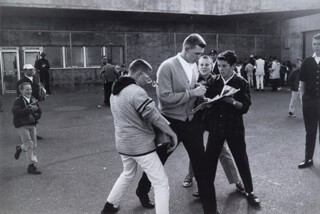
From the images in the catalogue I’d like to consider just two, both from Winogrand’s middle period: one I’d seen before (in 1964) and one I thought I’d seen before but hadn’t. In the first, a baseball player with an astronaut haircut is cardiganing his way out of Candlestick Park in 1964. Hoping for autographs, three kids run an enthusiastic boyish version of interference. He’s hurriedly signing but as he does so one of the boys has his thick glasses knocked from his face. Winogrand captures the exact moment of the glasses coming off.
Lee Friedlander – who, with Diane Arbus, was featured alongside Winogrand in the breakthrough New Documents show at MoMA in 1967 – described him as ‘a bull of a man and the world his china shop’. So this baseball player becomes Winogrand’s surrogate, bustling and striding through the world and brutally altering the way things are seen: knocking the ball out of the park, as they say. The kid in the picture is not wearing glasses for fun, he needs them, so we are witnessing someone in the process of having their vision impaired or disrupted. Which is actually how quite a few people (including, ironically, Walker Evans, the photographer Winogrand admired above all others and whose approval he presumably craved) felt about Winogrand’s work. The pictures didn’t look right, they were all skewed and lurchy, random-seeming and wrong. They were, it was felt, an unprovoked assault on the eye. (A later, more violently emblematic image shows a demonstrator outside Madison Square Garden in 1968, blood pouring behind the lens of his Lennon glasses and streaming down his face. Still, he is in better shape than the bloodied old lady lying flat out on the sidewalk, one eye swollen shut, while everyone else gets an eyeful of the incident.) We were accustomed to viewing the world through a set of conventional lenses that Winogrand wrenched from our face, making us conscious of how short-sighted we had been. That’s what we see happening in this photograph, before our altered eyes.
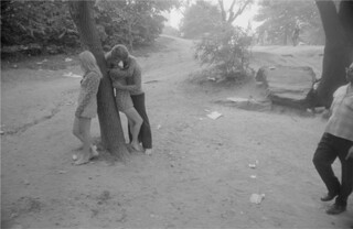
The other, calmer photograph was taken five years later, in Central Park, in 1969. A blonde woman in a short, patterned dress is leaning against the slanted trunk of a tree. Another blonde woman in a similarly psychedelic dress is leaning against the other side of the tree, engaged in a passionate kiss with a man, also blond, whose shirt has the same pattern as the two dresses.
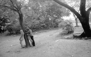
What the … ? A double exclamation of surprise on my part – because of the strangeness of the scene that Winogrand had photographed and because I’d seen the image before. Obviously I’d seen lots of the pictures before, but this one, I gradually realised, I’d seen not in an another book of Winogrand’s but in a book by someone else. This Winogrand picture, surely, was by Tod Papageorge. And there it was: an almost identical picture of the same scene – the very same moment – in Papageorge’s Passing through Eden. What the … ? turned to Well, well …
Evidently Papageorge and Winogrand were out photographing together, so the curious doubling of women was matched by the doubling up of male photographers snapping them. The duplication of images gnaws away somewhat at our tendency to identify a photographer with a particular style – the thing that makes Winogrand Winogrand – even though the style is almost inseparable from content. The temptation is especially strong in the case of Winogrand since his style is so palpably … Winograndian! Except this particular Winogrand, it turns out, could just as easily be a Papageorge. Effectively, it’s a Winogeorge, a Papagrand. Or is it?
Papageorge was a disciple of Winogrand’s. His sense of the possibilities of a photograph was formed by Winogrand. In photographic history Papageorge is not unlike one of the many excellent saxophonists who have devoted themselves to exploring the potential of – and extrapolating from – the giant steps made by John Coltrane (whose peak overlapped with Winogrand’s and whose final torrential performances might be heard as a compulsive search for a way out of a self-generated impasse).
These twinned pictures aren’t the only example in photography of this kind of doubling-up. In the same year Philip Jones Griffiths and Larry Burrows made almost identical photographs of a dying Vietnamese woman lying in a road in Saigon with a soldier kneeling over her. The only significant difference, on this occasion, was that Burrows’s picture was in colour whereas Jones Griffiths’s was in black and white. (It turns out that Jones Griffiths’s was printed in black and white from colour film so the resemblance is even closer.)
Winogrand and Papageorge’s pictures are similar but not quite identical. Both include a fair bit of the surrounding scene (trees in full leaf, bushes, litter), but in Papageorge’s the only people we can see – except a blurred, barely visible figure in the far distance – are the participants in this bizarre triangle. Winogrand shows quite a few people plainly visible in the background, going about their business, and a passer-by just coming into the right side of the frame, closer to the camera. Papageorge isolates the three blondes in a private space, a world of their own: Adam, Eve and her sister in Eden. In Winogrand the moment – what Szarkowski, looking at a different picture, called the ‘ordered pattern of fact’ – is being intruded on and seems, as a result, both pervier and more fleeting. By comparison Papageorge’s picture looks almost posed. Like the baseball player, the voyeur stumbling unwittingly into Winogrand’s frame is the photographer’s – or photographers’ – accidental representative. Since it’s not clear that this bespectacled fellow even notices what’s going on, he might even be seen as premonitory – since Winogrand himself became increasingly oblivious, even indifferent, to what he was seeing and shooting.
Either way, this almost intrusion nudges Winogrand’s picture in the direction of other famous photographs of scenes in a park by Kohei Yoshiyuki. Shot at night in Tokyo in the 1970s using infrared film, they show not just couples having sex but groups of men who have sneaked up to watch, like nocturnal tourists gathered round mating animals in a safari park.
Cartier-Bresson once said that ‘the difference between a good picture and a mediocre picture is a question of millimetres – small, small difference. But it’s essential. I don’t think there’s so much difference between photographers, but it’s that little difference that counts, maybe.’ The difference here is not between great and mediocre but it’s revealing all the same. The fact that these pictures are almost identical forces us to attend to the smallest differences of framing and their surprisingly disproportionate psychological ramifications. Almost every one of the four hundred pictures in the catalogue repays a similar degree of scrutiny. It’s just a shame there are so few of them.
Send Letters To:
The Editor
London Review of Books,
28 Little Russell Street
London, WC1A 2HN
letters@lrb.co.uk
Please include name, address, and a telephone number.
