QAplomb
Ben Campbell
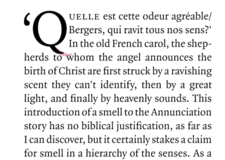
Very small problems that occur infrequently are doomed to remain unresolved. The dropped capitals at the beginning of each piece (and elsewhere) in the LRB are the depth of three lines of body text. These enlarged uppercase letters, and their preceding punctuation if the sentence is a quotation, sit in a notional rectangular box, aligned with the top of the first line and the bottom of the third, and as wide as needed to accommodate the letter. In Quadraat, the typeface we use, the only capitals that break the bounds of their rectangles are J and Q. The J is easily managed: reducing the size by a few points brings the tail up to the baseline. The Q isn’t so easy. The tail of the letter escapes its box both vertically and horizontally. This is quite common in old-style seriffed typefaces, as the tail of the Q is designed to cup the u that follows it.
Sometimes the problem can be made to go away by editing the sentence so it doesn’t begin with a Q. If that isn’t possible, we usually reduce the size of the drop cap and put up with the slightly inelegant result. Sheila Fitzpatrick’s piece in the LRB of 15 July didn’t only begin with an editorially immovable Q (and quotation mark) but was also the first piece in the issue – a bad place for a typographic solecism – so I looked for a better solution.
The only specific advice I could find, in Marshall Lee’s compendious Bookmaking, was: ‘Be careful of Js and Qs that descend below the baseline.’ Well quite. Looking at the ways other magazines deal with their Qs didn’t help. As a relatively uncommon letter, in English at least (Scrabble score 10), it doesn’t turn up often, and most places probably try to avoid it as we do. I might have done better if I read more French or Spanish (Scrabble scores 8 and 5).
We tried replacing the Quadraat Q with a Q from another typeface but couldn’t find one that worked well. As Quadraat is in all other ways exemplary, the imperfect but more-or-less satisfactory solution was to make an adapted Quadraat Q with a shorter tail that doesn’t extend quite so far vertically, and not at all horizontally, from its allotted space.
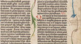
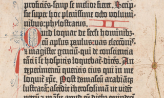
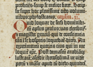
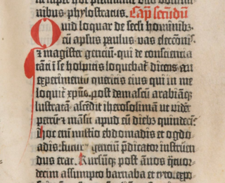
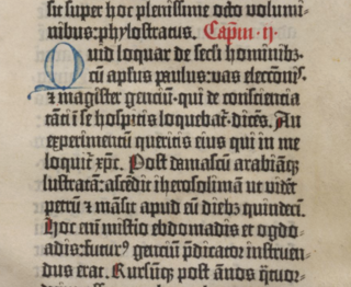
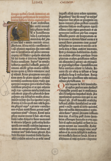
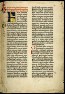
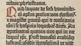
The Q’s dangling tail is not a recent problem, but dates to the first page of the first substantial book printed using moveable type in Europe. Gutenberg’s 42-line Bible was printed with blank spaces for the versal initials and, for most copies, the rubrics – the chapter headings, usually in red ink – too. Some books may have been sold finished, but most would have been delivered to their buyers without rubrics or initials, with printed instructions for rubrication by hand (Gutenberg was a notoriously unsuccessful businessman, and the production of the Bible bankrupted him, but the seed of Ikea’s flat-pack distribution method was developed alongside his innovations in mechanical reproduction).
In the second column of the Bible’s prologue, the epistle of St Jerome to Paulinus, is a two-line initial Q. Images of the page are easy enough to find online and they show that there was little consensus about how to cram the letter into a space it didn’t fit.
Printing the rubrics in red ink seems to have been abandoned fairly early in the production of the book, probably because of the time involved, and the technical difficulty of positioning the sheets on which the major part of the text had already been printed in black. But in leaving spaces for the initials, Gutenberg wasn’t dodging the problem. The immediate success of the Bible was in part due to mechanical reproduction being made both familiar and luxurious by hand finishing. If the taste of the age could have borne a sparer style, and one of Gutenberg’s own Qs had been used, perhaps later designers of the humanist typefaces that succeeded Gutenberg’s textura blackletter would have recognised that a very small problem had already been solved.

Comments