On George Mackie
Ben Campbell
George Mackie is 100 years old today. I first met him a few years ago, at a party celebrating an earlier birthday. My father, Peter Campbell, was in his last year, and not feeling up to the train. He asked me to drive him and my mother to George’s house in Lincolnshire. Peter and George had been writing to one another since George had sent what he describes as a ‘fan letter’ praising the design of the London Review of Books. They had both had long careers as typographers and illustrators. If these jobs are done well, it’s often by being as unobtrusive as possible. As Beatrice Warde argued in ‘The Crystal Goblet, or Printing Should Be Invisible’, ‘almost all the virtues of the perfect wine-glass’ – ‘crystal clear’, ‘thin as a bubble’, ‘transparent’ – ‘have a parallel in typography.’ George thinks that as his eyesight deteriorated, his typography improved. Some of the lost clarity of vision can be repaired by making clearer pages.
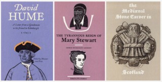
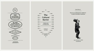
One place where book designers can, and are sometimes allowed to, please themselves is on title pages, though even there the constraints of house styles, the requirement that logos be given their allotted space, don’t allow much scope for games (many typographers are not fond of logos). Peter only got this freedom when he was designing festschrifts or books for small presses. George was more fortunate in this while working for Archie Turnbull, the publisher at Edinburgh University Press, as he faintly acknowledges in his essay ‘Designing for an Enlightened Publisher’:
I discovered, for I had never heard of it, a copy of The Nonesuch Century, in Rota’s bookshop on Vigo Street, and bought it, gritting my financial teeth. I saw it as a series of object lessons, and a beautiful object in itself. Lucky [Francis] Meynell, working in the 1920s, with the typographic renaissance crackling all around him, and the finest book printers in the kingdom all anxious to do his bidding, even unto 37 varieties of title-page for one book. Turnbull occasionally allowed me a second revise.
Not that he would run riot:
Alas, many title pages today, from publishers once respected for good manners in things typographic, shout and importune the reader like commonplace placards. A book is never more than an arm’s length away. I agree with [Stanley] Morison’s dictum (whether he said it or not) that two sizes up from text size is enlargement enough for all purposes.
For much of his career George was designing books made using hand-set and machine-composed letterpress type. Experimentation with designs was made easier with photocomposition – one could simply order some extra setting to cut and paste at little extra expense – and easier still when type became a predominantly digital technology. In letterpress printing, layouts have to be imagined, sketched and minutely specified before pages can be (expensively) made. The precision of George’s layouts was probably the reason Turnbull allowed him the second revise:
For me, working in Aberdeen for an Edinburgh publisher who used a variety of printers across the country, layouts were the means whereby he got to know what I was proposing; the means whereby he and I got from the printer exactly, or almost exactly, what we wanted, with no expensive changes of mind. I was discovering Ruskin about this time and I used to have an occasional qualm because I was treating the comp[ositor] as an unthinking and unfeeling artisan, and not as a sentient and creative individual. I consoled myself with the thought that Ruskin had little appreciation of books as physical objects. Besides, the faster the comp completed the job, the larger his eventual bonus.
George is rare, probably unique now, in being both a Royal Designer for Industry and a recipient of the Distinguished Flying Cross. As well as the delights of Monotype’s 1935 revival of Christoffel Van Dijck’s 17th-century typefaces, he can describe the relative merits, for a pilot, of a Stirling Bomber (hard to get off the ground, but nimble in the air) and a B17 Flying Fortress (takes off almost on its own, but once airborne flies smoothly but unresponsively).
During the Second World War, after more than a dozen combat missions in Bomber Command (most as co-pilot, the last few as pilot) he was transferred to Training Command, then, towards the end of the war, Transport Command, puddle-jumping Imperial supplies across Europe via Tel Aviv to Karachi. When he started at Training Command, bomber crew casualties were around 50 per cent. It’s as likely as not that the move saved his life, this meant that while still in his early twenties, with little experience, he was teaching even younger men, knowing that many of them would be killed.
The date I arranged for my most recent visit to him was 6 June last year. I was only reminded by reading the news on the train to Lincolnshire that it was the 75th anniversary of D-Day (I blame my absent-mindedness on having insufficiently patriotic New Zealanders for parents). I apologised to George and asked if he would have rather spent the day differently. ‘I was on leave,’ he said.
In 2012 he wrote to the LRB responding to Jonathan Meades’s assessment of the Bomber Command Memorial at Hyde Park Corner:
As one who had the audacity to respond in kind to Germany’s bombing campaigns, I write to applaud Jonathan Meades’s demolition of the recently built monument to Bomber Command, which I find trivial and irrelevant. The long absence after the war of any formal recognition in stone was creating an increasingly powerful silence where all manner of feelings of revulsion or acclaim were felt. No solid memorial could express so clearly today’s ambivalence.


Comments