Too Much Light
Gillian Darley
Artists’ impressions of yet-to-be-made architectural designs show impossibly pristine buildings, their materials innocent of wear and tear, the images (let alone the weather and the light) adjusted, enhanced and cropped into submission. In this honeymoon period, no one questions performance, or durability, or if the architecture will necessarily deliver the desired outcome. (In the early years of her career, as she shifted from constructivist imagery to international practice, nobody nudged the apparent limits of the possible more consistently than Zaha Hadid, who has been awarded the 2016 RIBA Gold Medal.)
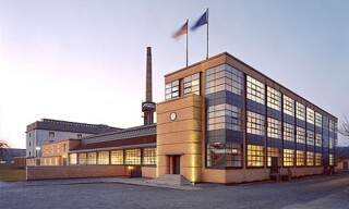
The earliest phase (1911) of Walter Gropius’s Fagus factory at Afeld in Saxony is apparently curtain walled, the glass wrapped clean around the corners, every junction framed by scant ironwork. On closer examination, the metalwork proves to be a lot stouter and more supportive to the glazing than it looks at first glance, especially at the point referred to by the client, Carl Benscheidt, as ‘the difficult corner’. It broke definitively with the past, but the Fagus-Werk was considerably less revolutionary than it claimed to be – as became clear when a rolling programme of renovations began in the early 1980s.
When a further extension was added in 1913-14, the curtain glazing made it attractively light and open to visitors arriving in the public areas, but demonstrably impractical for the production process. The bottom panels of the windows were quickly coated in opaque paint. A luminous building without hard edges, its interiors bathed in light, it came into its own at night and proved to be an inspired form of advertising, as Benscheidt intended. Observant travellers going to and from Hamburg by train would get an impression of Fagus, manufacturer of beech shoe lasts, as a beacon of progress. Once the building was more complete after the First World War, Benscheidt ensured that every inch of the factory was photographed and the results publicised exhaustively. He ordered 1500 copies of a book lauding the new works: the modernist factory suggested itself as a model of innovation and precision. The closely edited photographs showed no sign of the awnings that had gone up hurriedly to deflect the blinding sunlight that often poured through the glass and had made the workers’ tasks at their benches very much harder.
Around Europe, the interwar rage for ‘white modernism’, especially in commercial and industrial architecture, marked a high point in 20th-century architectural style. The translucency of glazed curtain walling went both ways – allowing light to pour in, regardless of the practicalities, and, thanks to electricity, to blaze back out into the night. By the time the Van Nelle food packaging headquarters in Rotterdam was designed in the late 1920s, industrially prefabricated curtain walling was available. It looked like an ocean liner – even though berthed on a canal – and remained fully lit all night twice a week, reflected in the water below.
If any single object was essential to modernism, especially Nordic modernism, it was the light bulb. In Sweden, just ahead of the 1930 Stockholm Exhibition that was to knock Scandinavian classicism into the shade, the Co-operative Union commissioned a handsome modernist light bulb factory in the capital. High above it was a rectangular glazed eyrie, where the bulbs were tested and displayed. Down below, where the filaments were wound, things were less happy. Again, the building proved disappointingly unsuitable for its purpose. Eye-level light flooded in through the generous windows, making work impossible until blackout blinds and screens were installed. In such a sensitive manufacturing process, only top light would do. Presumably by 1939, when the International Co-operative movement opened a second light bulb factory, in Glasgow, a very similar white modernist building surmounted by a glazed testing turret, the practical and specific details of the process had been ironed out. Innovation often needs a dry run.

Comments
Gropius would have approved on the basis that the aesthetic of waste should be managed as part of a necessary design brief.
I worked for several years in the basement of a legal publishers in Fetter Lane and found the solution to lack of light was to get to the Kardomar for coffee four times a day. I believe Eliot did something similar in the City and this may account for his frequent peregrination of the London Wren churches. At least such problems do not melt the finish on the parked limousines as does the reflected light from modern tall buildings.
Thomas Pynchon in Gravity's Rainbow