On the Tube
Alice Spawls
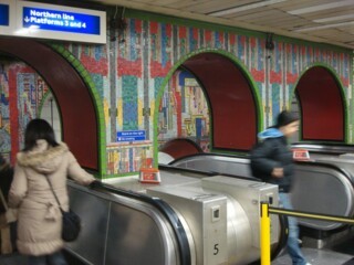
There was general upset earlier this year when TFL revealed that the redevelopment of Tottenham Court Road station would lead to the removal of portions of Eduardo Paolozzi’s 1984 mosaics. The 20th-Century Society called – again – for a register of public art and bemoaned English Heritage’s failure to list them (as they had the water fountains at the station, also removed). Most of the murals, TFL says 95 per cent, remain in situ and are being restored, but the arches at the top of the escalators, which made going underground look like descending into Ali Baba’s futurist cave, are gone.
Paolozzi’s designs were a response to the bland corporate uniformity he saw sweeping through London in the early 1980s. The mosaics, part Mayan-revivalism, part-gaudy technological grid, include images of saxophones and butterflies (in honour of an all-night Turkish bath he took at the Russell Hotel). In the rotunda – the former lift shaft – the pattern of circles (wheels, film reels, architectural designs?) surround and overlap the figure of a man, a chicken and a cow: Paolozzi called them ‘an Orwellian commuter, a fast-food chicken and hamburger’.
They wouldn’t exist without Frank Pick, the utopian publicity man who became head of the Tube. At London Transport’s private precursor, the Underground Group, in the early 1900s, he cleared away the old advertising, which was plastered all over the stations. The Underground’s own posters, of which he commissioned so many famous examples, were smaller and displayed separately to distinguish them; the first was No Need to Ask a P’liceman by John Hassall in 1908. Pick also commissioned the roundel logo and font still used today for the Tube, and in extending the lines into the suburbs in the 1920s he enabled the creation of beautiful Modernist and Art Deco stations in places like Sudbury Town and Arnos Grove.
This year TFL are celebrating the Victoria line with art and music commissions to be shown (and performed) in the stations, the first of which, Giles Round's Design Work Leisure – an Arts and Crafts-inspired 'design office' creating prototypes clocks, tiles and signs for the Tube, as well as free Oyster card holders – opened two weeks ago. As a project it’s a sort of tribute to William Morris, who lived at the top of the line in Walthamstow (apparently Pick admired him so much he used Morris’s favourite shade of green for his writing ink).
But the Victoria line already has the best art on the Underground. Misha Black of the Design Research Unit was put in charge of the aesthetic of the entire line when it was being constructed in the 1960s. Each station was to have a tile motif inspired by its location: Walthamstow has a Morris & Co-style leaf pattern (by Julia Black), while at the opposite end Brixton has a ton of bricks in a red octahedron by Hans Unger. Also by Unger are the designs for Green Park (5 x 3 dots in yellow, green and blue to represent a bird’s eye view of the park), Oxford Circus’s circle and dot motif in the colours of its three intersecting lines, Seven Sisters (the eponymous seven trees) and Blackhorse Road – a paper cut-out of a horse against a background of Pantone 299, the blue of the Victoria line.
The neoclassical arch at Euston, which was lost to the building of the new station, was memorialised in Tom Eckersley's design (there’s a campaign to rebuild it). Vauxhall’s alludes to its pleasure gardens, Victoria to its namesake (a cameo profile of the queen). Edward Bawden, who designed Victoria, also created the woodcut at Tottenham Hale of a medieval passenger being ferried across the River Lea, complete with eggs, chicken and dog, and the image at Highbury and Islington: a bury – or ‘fort’ – on a hill (the original high bury was destroyed during the Peasant’s Revolt).
Warren Street (by the design firm Crosby, Fletcher and Forbes) is a red maze, a warren; King’s Cross a cross of crowns; and Finsbury Park, which hosts Annabel Grey’s marvellous hot-air balloon mosaics on the Piccadilly side, has a pair of duelling pistols in green and yellow. Pimlico’s grid of yellow dots by op-artist Peter Sedgley refers to the nearby Tate, when it still housed modern art.
Best of all is Abram Games’s swan at Stockwell (the Swan pub still stands above). As in his 1956 poster for Guinness, Games adds a little flourish to transform the image: a small orange triangle and a small black one make a swan appear in the zig-zag of white and blue.

Comments
The fact is the mosaics at Tottenham Court Road station are oppressive in their colouration and somewhat twee in their ideation; completely unsuitable to the cavernous Tube. I always avoid if I can an interchange there.
Modern buildings should not be stuck with later add-ons and it is much better if architects are given responsibility for all structural surface changes in design. If we are to exhibit art on the Undergrouhnd let the art-objects be set against bright neutral surfaces and changed regularly - but not too near the trains. Oh, and please do not keep rolling out Frank Pick etc - it is just old tatt.
And, oh I am an obsessive curmudgeon for detail, but that’s one too many t’s in tat.