At Tate Britain
Gillian Darley
‘Poor Tate! It seems to get the rough end of every stick,’ Ian Nairn wrote in Nairn’s London, trapped in its ‘pompous, confused building’. The early 1960s had no patience with 1890s histrionic classicism, the work of Henry Tate’s more or less in-house architect, Sidney Smith.
By 1969 the trustees had decided on drastic action, blanking out the Millbank frontage with a weak, sub-Brutalist façade designed by Llewelyn-Davies, Weeks, Forestier-Walker and Bor (architects did not hide behind acronyms then). To their apparent surprise, the bland design and the implied scorn for the original building provoked an outcry. The 1897 Tate, its portico surmounted by Britannia flanked by her lion and unicorn, survived.
The columned, temple-fronted entrance rearing above its torrent of steps is now centre stage once more. As the architect Adam Caruso puts it, ‘the distinction between new and old is less interesting to our generation than the previous one,’ and Caruso St John’s approach is to ‘sustain and amplify’ the key aspects of the existing building. Logic is back, but so too is ornament.
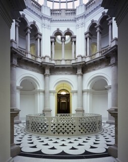
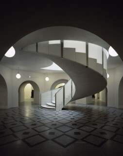
The heart of the revamp lies beyond the greatly clarified entrance hall – new doors and windows, bringing back natural light, clear, uncluttered space and a much better view back to the river – and is entirely new. Under the Rotunda, Caruso St John have punched in an eye-catching Fred-and-Ginger swirl of staircase leading downstairs. The stairs peel down out of a vortex of black and white scale-patterned terrazzo flooring, the same motif used on the punched stone balustrade. The monochrome palette follows Smith’s 1890s example.
Past the stairs, the way to the galleries (the south-east section was reopened in May) leads through the central octagon and, beyond, into the Duveen Galleries. The ground floor is now admirably legible.
Downstairs, the scheme includes education spaces and the archive. Through the windows of the new vaulted café there’s a glimpse of the Thames; the restaurant above is wrapped in Rex Whistler’s entrancing 1927 murals, restored and relit. High above, just below the Rotunda, there’s a spectacular (members-only) balconied café bar – in an area out of bounds since the 1920s – while the Grand Saloon, once more, is just that.

