In Magnificent Maps at the British Library (until 19 September) you are surrounded by splendid, if overbearing peaks of cartographic art: an atlas as tall as a man, wall maps of similar size, photographs of palace corridors where every wall is a painted map. There are smaller, curious, handsome and instructive things as well, but nothing is here just because it is a significant piece of scientific cartography. Johann Christoph Müller’s 25-sheet map of Bohemia (‘arguably the greatest cartographic achievement of the Central European Baroque’) isn’t here for the sake of its excellent representation of terrain. The book accompanying the exhibition (British Library, £12.95) wants you to attend to the implications of the picture of St Wenceslas, seen above the view of the city of Prague, which fills one corner of the map, and to the symbolic figures and scenes of abundance surrounding an elaborate cartouche that fills another. They are showy pieces of engraving: things to be read in quite a different way from the precise and comprehensive array of symbols (‘over 50 signs for human settlements, physical relief, military installations and so on’) that fill the topographic map that lies between them.
The divisions of the exhibition (‘The Gallery’, ‘The Audience Chamber’, ‘The Bedchamber’, ‘The Merchant’s House’ …) and its subtitle (‘Power, Propaganda and Art’) prepare you for ways of reading that are a long way from ‘map-reading’ as taught to the school cadet corps. You could doubtless have used Jacopo de’ Barbari’s stupendous woodcut of Venice of 1500 to find your way about, but it wasn’t made for that, and it wouldn’t have been very practical – it’s more than two metres wide. It was a great and luxurious work of art that advertised the glory of Venice. Being available as a print, it could spread the message across the world. Henry VIII had a copy.
Great maps are serious undertakings. It took de’ Barbari three years to piece together and engrave his aerial view from individual drawings and sketches. The result was expensive (three ducats) but the economics of a map that requires a new survey have often been problematic. Royal and municipal subsidies were one solution. Gathering subscribers who part-paid before delivery was another. Jacques Callot’s etched map of the siege of Breda of 1627-28 was a royal commission. The siege was the Infanta Isabella’s greatest military victory. Within weeks of the fall of Breda she had obtained the Duke of Lorraine’s permission for Callot, his court artist, to prepare a map celebrating the event. The result is a work of art of a high order – as well as an interesting solution to the problem of how to combine vertical and perspective views. In the foreground there are groups of soldiers, animals, houses, carts, butchers at work etc. As the eye moves towards the more distant part, the scene rears upward, like a huge backcloth, showing a plan view of Breda and its fortifications; further on, at the very top, it goes into perspective again. It is as though the backcloth had been folded over, to show a distant landscape getting smaller and smaller as it spreads towards the horizon. Callot’s depiction of incidents in the siege (they reappear in his later collection of etchings The Miseries of War) doesn’t spare the viewer any horror. It seems bitter stuff for the conquering party to use in celebration of a victory. (In Velázquez’s painting of the surrender of Breda – the background of which draws on Callot’s map – the opposing forces gathered on either side look more bored than aggressive.)
The question of who the grandest of these maps were made for is sometimes answered discreetly: the coats of arms of a single noble patron can be quite modest – you have to look around a bit to spot the Medici arms above a cartouche on the plan of Florence commissioned by Grand Duke Francesco de’ Medici in the 1580s – but sometimes they are as dominant as the logo on a Formula One racing car. The map of Sussex of 1724-25 by Richard Budgen has the arms of no fewer than 184 subscribers, arranged hierarchically. Maps like this were surely a way of building status, items to display rather than use, like the maps that hang on walls in Dutch 17th-century interiors. They make handsome decorations, relevant doubtless to the lives of merchants in a trading nation, but they are also evidence of a great local map-printing industry.
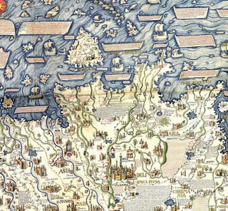
A drawing of a meeting of the directors of the Dutch East India Company shows a map-lined office, but how often was a pointer called for? A map which was certainly more for symbolic than practical use – it is incidentally one of the most impressive in the exhibition – is the copy made in 1804 of the world map commissioned by the Venetian Senate from Fra Mauro in 1448. The copy, by William Frazer, was commissioned by a consortium of individuals associated with the East India Company, which saw the British as heirs to the Portuguese in Asia. Fra Mauro’s was the first map to draw on the travels of Marco Polo and its whole left half is given over to Asia (some of the Asian section is shown below).
Land is a constant theme, its ownership and boundaries set out on estate maps, its borders on national maps, its broadest extent on world maps that point to or follow imperial expansion. The very earliest maps, however, try for something less mundane. The medieval mappa mundi tied ancient history, theology and fanciful anthropology to a diagrammatic and symbolic geography. Of all the maps here these are the ones that seem to expect to be read line by line. This is the world and its history from the Garden of Eden onwards, an illustrated encyclopedia. Grayson Perry’s large etching called Map of Nowhere, a map of ‘the beliefs, headlines, clichés and monsters that populate my social landscape’, is based on the Ebstorf Map of 1300. (There is a photographic reconstruction here: the original was destroyed by Allied bombing in 1943.) Perry himself takes the part of the Ebstorf Christ whose head and feet stick out, as though from under a great round bedspread. ‘This piece,’ Perry says, ‘reflects my concerns at the time, late 2007-early 2008, about everything from class and turbo-consumerism to green politics and intellectual snobbery.’ You can’t just look at it; you must read it too.
Paintings and illustrated books usually have an optimum viewing distance; you may peer at details but most of the time you choose a position that takes in the whole. With maps it is different. Walking round the British Library galleries you are forever moving in and out, scanning the whole and reading the detail. When you are reading the smallest lettering you are made aware both of how much there is that you are not attending to, and how it relates to the whole map. The GPS satellites that wrap the globe in space-defining signals have led to the development of maps that move along with you and tell you only what you need to know to get where you are going. Maps shown on the television news zoom in from a global view to the exact spot where the latest suicide bomber struck, but show little else. The map you see on the cabin screen on a long-distance flight shows direction, distance, speed and height, but only the most rudimentary geography. The maps in the exhibition from a less accurate but richer cartographic culture hint at what we may be losing.
Send Letters To:
The Editor
London Review of Books,
28 Little Russell Street
London, WC1A 2HN
letters@lrb.co.uk
Please include name, address, and a telephone number.


